Motorola’s low-range phone is a good device, but buyers in this segment may opt for other models with enhanced features.
by Manik Kakra | @Manik_K on Twitter
It would not be wrong to say Motorola’s comeback has been a successful one, but the company has been doing really well to storm into at least the budget segment of the smartphone market. With the original Moto E and Moto G, it was clear that Motorola was here to make an impact, giving a good experience without costing a bomb. With the new Moto E, the objective seems to be the same, but expectations are now higher. Does the Moto E (2nd Generation) live up to those expectations or not? Let’s try to find out.
The looks. Motorola’s new Moto E (XT1506) isn’t too different from the original Moto E in terms of looks and feel. It follows the familiar Motorola curved back design, except the new Moto E doesn’t have a removable back cover; instead it has a unique rubberised band across the edges, covering the micro SIM card and microSD card slots. You can change this band with another band of your colour choice (called Motorola Bands).
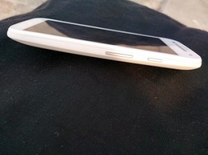
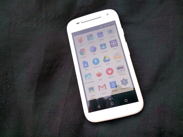
The entire front panel is covered with Gorilla Glass 3 and the screen has anti-smudge coating that is quite effective. On the front, the big silver stereo loudspeaker and ear-speaker grill stand out, sitting next to the front-facing VFA camera and sensors; while there are no physical keys at the screen’s bottom. On the right side panel, you have volume rockers and Power/Lock key, which are tactile and firm to press.
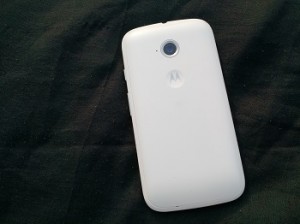
 At the top, there’s the 3.5mm headset jack, and the microUSB sits at the bottom. On the rear is the Motorola logo inside a little dimple, while the 5 MP rear camera (encircled in a chrome ring) is placed on the top-middle. The phone is compact, nicely built with no loose points.
Screen. The device features a 4.5-inch (540 x 960) IPS LCD, so it’s a little bigger than its predecessor but has the same resolution. The screen has good colours and viewing angles for a phone at this budget. It’s quite bright but just about okay outdoors. Where it lacks is sharp resolution for images and videos. It’s probably the biggest downside to the new Moto E, not bumping the screen resolution or improving outdoor visibility when there are better screens on phones priced similarly.
Camera. Here are few sample images from the phone’s 5MP rear camera (f/2.2).
The camera takes decent bright images outdoors, but struggles in low-light, whether it is to focus or capture details. It can capture still shots quite well, but don’t expect good performance for objects on the move. The camera app is similar to the previous Motorola Camera app, smooth in use, with basic options like HDR and Panorama to choose from. By default, it captures by a tap, but you can choose to focus by a tap and then capture an image by tapping again.
Audio and reception. Basics like call quality, dual SIM handling, 3G, WiFi and Bluetooth 4.0 connectivity are all in place. In-ear call audio is quite loud and clear, while network reception was never a problem throughout my usage. Audio quality from the front-facing stereo loudspeaker is actually pretty good, and one of the loudest outputs from a phone in this price category, so your audio needs for video and games have been taken care of well. The in-ear headsets, though, are just about okay, which is what you would expect from a budget smartphone.
Battery. As far as battery is concerned, the Moto E has a 2,390 mAh battery unit, and it lasted me about 18 hours on moderate usage. With two SIM cards in use, battery life decreased by two hours. The phone was kept at 30 per cent brightness with Email, Twitter, a few calls and music in use.
Software and performance. The phone runs on Android 5.0.2. Under the hood, there is the Qualcomm Snapdragon 200 (1.2 GHz quad-core processor, Adreno 302 GPU) coupled with 1 GB of  RAM. In general, the new Moto E is reasonable. I wasn’t really blown away with how it fared in day to day usage. The original Moto E, running Android 4.4, was noticeably snappier. The new Moto E struggles slightly while running a few apps at once or while switching between a couple of heavy apps. It might be because of the new Android Lollipop and how it is more focused on animations and design, but I won’t call it the smoothest Android phone out there.
The new Android 5.0 OS is really refreshing and better-looking than Android has been. With flatter Menu icons, status icons, Settings, UI elements, there’s Material Design everywhere. The notification bar shows you notifications in one swipe and you have to either swipe with two fingers to swipe once again to access quick toggle buttons. You can now check and access notifications from the Lock screen, though Widgets are not supported on the Lock screen. Volume Settings have also been changed a bit, as you can now choose what type of alerts are allowed to notify you or not. There’s obviously the Google Now launcher in place with Google Now cards accessible by just swiping left to right on main Home screen.
The style of pop-up dialogue box, the dialogue box (appears near the bottom) have also changed and look much better now. There’s also multi-user support, so you can switch to Guest when you are giving your phone away to somebody and don’t want them to have access to your phone’s data.
Motorola Display is on this phone; as soon as you pick the phone, the Lock screen previews any notifications and you can access the relevant message right from there. There’s no need to unlock and light the whole screen up. Very neatly done, but if you already have the phone in your hand, you would have to unlock it and Moto Display doesn’t work then. The user gets a little under 5 GB of storage space, which is expandable up to 32 GB via a microSD card. Motorola hasn’t touched or changed stock Android much, as expected, but has done the usual and a few new touches to keep the experience good.
To sum up, the new Moto E (3G) is a decent buy at Rs 6,490, but it seems to lose out when compared to new phones in the Indian market, and even when you compare it to its predecessor. Still, it is a good phone for somebody buying their first Android smartphone and not wanting to shell out a lot. However, potential buyers in this price range are looking for much, so don’t be surprised if this phone is overlooked for a phone with a better overall package – even the Moto E’s 4G variant.
