We study the world’s slimmest smartphone, its overall performance and how well it stacks up against its competition. Hint: not too well.
by Manik Kakra | @Manik_K on Twitter
Gionee launched the Elife S5.5, the slimmest smartphone, about five months back. A lot has been said and written on the device since then. Here’s my review of the phone.
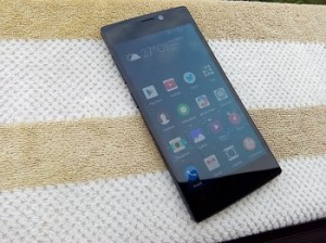
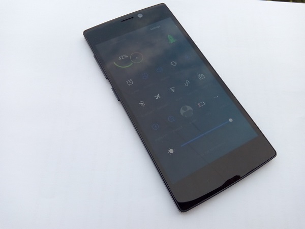
During the five months of its launch, there have obviously been several smartphone launches in India, but Gionee’s ‘slimmest smartphone’ title remains intact with it. The Elife S5.5 is just 5.5mm thick and is quite a looker. With glass on the back and front panel, this Gionee phone doesn’t follow ‘run of the mill’ material and design.
 The first thing you will notice is how light and slim it is, and how well the glass has been put along on the back. Though both the front and back are prone to dust and smudges, there’s a slight oval shape with curves on the top and bottom of the phone’s body and edges, which are matte. The front also houses the 5 MP front-facing camera, receiving speaker grill, three capacitive buttons – Menu, Home, and Back – on the screen’s bottom.
The left side panel has the volume rockers and Power/Lock key, and the buttons don’t really gel well with the body. Plus, you have to press them a little firmly in order to operate. The right side panel only has the micro SIM card slot. Oddly enough, the 3.5mm headset jack has been placed at the bottom; while the microUSB port is on the top.
Apart from aluminum edges, one interesting thing the company has done on the sides is this slanted sides that join the sides with the rear. This should probably help you grip the phone better. Coming to the back, the 13 MP camera, along with the LED flash and secondary mic, are tucked on the left upper corner and the Gionee logo is in the middle, while the speaker grill is near the bottom. The overall look and feel of the phone is very nice and you won’t feel like there’s a loose part anywhere on the body.
The Elife S5.5 has a 5-inch 1920 x 1080 full HD AMOLED screen, which does its job well. The colours look vivid, videos look pretty decent and viewing angles are also not really bad. Though the screen doesn’t impress when used under the sun, it is more than capable for you to watch high resolution videos, or play games.
Coming to the camera, the phone is equipped with a 13 MP snapper. Gionee has done a good job with the camera. You can take a lot of good, sharp images with this phone. It tends to struggle a bit in low-light conditions and can give noisy images when used indoors. Having said that, this camera doesn’t disappoint and is capable of taking really nice photos. Here are a few sample images.
The phone’s audio quality is its weak point. The sound quality, whether loudspeaker or in-ear, is not much to appreciate. The volume misses the required ‘punch’ and watching videos on it is not  a good experience, especially with how much it can distort at times.
As far as connectivity is concerned, the smartphone packs 3G connectivity, Bluetooth 4.0, WiFi a/b/g/n, and microUSB (supports USB on-the-go). Connectivity options work just fine and signal reception is also okay.
Coming to the phone’s battery life, it paints a rather sad picture. Packing in a 2,300 mAh battery unit, the phone usually gave about 16 hours on a single charge. There surely needs to be a better hardware and software combination in place so as to give improved battery life.
Talking about the phone’s performance, the smartphone is equipped with the MediaTek MT6592 SoC (1.7 GHz octa-core processor, Mali 450 GPU) and 2 GB of RAM. The phone runs on Android 4.4.2 (recently updated) with Gionee’s Amigo 2.0 UI on top. The software follows a similar pattern we have seen on a few other OEM skins. There’s no separate app launcher and all your apps’s icons are placed on various Home screens. You can lock the screen by swiping the clock downwards or by pressing the lock button. You can unlock the screen either from the button or by double-tapping the screen.
Gionee has made a few changes with its Amigo UI. The default music player, notification bar and icons look much better and go well with the overall look and feel of the OS. Having said that, the Amigo UI still has a lot to catch up when it comes to performance and fixing bugs. You will be disappointed to note that the phone isn’t very smooth for day-to-day usage and there are a few bugs, like the music player exits or lock screen stops to respond, that need to be fixed. With the likes of the Moto X and Mi 3 giving this phone a run for its money, it will lag behind given how slow it performs at times and how less responsive the whole software feels.
All in all, the Gionee Elife s5.5 again shows that Gionee is rather capable of producing great hardware and that they need to really pull their socks up for the software part. The phone has a lot going for it – screen, camera, design appeal, but, on the other hand, its software doesn’t give a very satisfying experience. Available for around Rs 20,000 (includes a flip cover, two screen guards), the device has a hard battle up its sleeves considering how the Indian smartphone segment is shaping up lately.


