We take a look at the OnePlus One’s hardware and software specs, and come away impressed by CyanogenMod 12 OS.
by Manik Kakra | @Manik_K on Twitter
OnePlus’ story in the Indian market has been quite unique. The company gained popularity on the social media for its invitation-based buying procedure (which the company has now stopped). So, when I got a chance to try the phone (64 GB sandstone black model) for more than just five minutes at my own leisure, I was obviously interested in checking how well its hardware and software really stack up for its price of Rs 21,999.
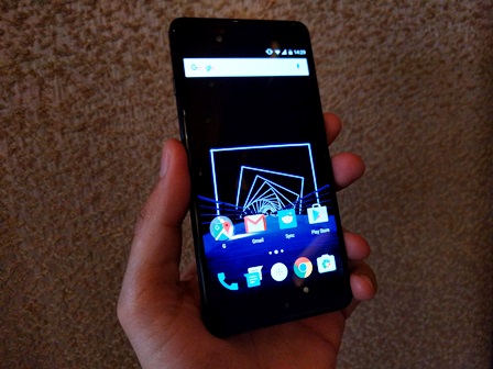
 The looks. As soon as you pick the device up, you realise how different it is to other smartphones and how well it fits in your palm. The phone is not small, which has a lot do to with its thick bezel in the front. The front has a 5.5-inch full HD (JDI) panel (Corning Gorilla Glass 3 on top) with three touch keys at the bottom and ear-speaker grille, sensors, LED notification and 5 MP front-facing camera above. The top and bottom have a silver ring all across and a noticeable curve to them and gel well with the overall look of the phone.
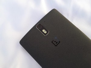
The left panel has the SIM card tray – you get one nano SIM card tray inside the phone and one micro SIM card tray in the box, so you can use whichever you need. The right panel gets the Volume rocker and Power/Lock key – I just wish these keys had more tactile feedback for pressing. The top has a nicely-drilled 3.5mm headset jack and secondary mic; while the bottom gets the microUSB 2.0 port in the middle and speaker grilles and primary mic around it. The back sports a 13 MP oval camera module with a dual LED flash, and the OnePlus logo near the middle. The more you use it, the more it seems the company had a good idea on the paper for its design.
Software and performance. Under the hood, the One carries a Snapdragon 801 chipset (2.5 GHz quad-core processor, Adreno 330 GPU) coupled with 3 GB of RAM. The phone had CM11S (Android 4.4.4) out of the box, but I flashed its official CM12 zip file (though the official OTA update must have started rolling out when this piece goes up).
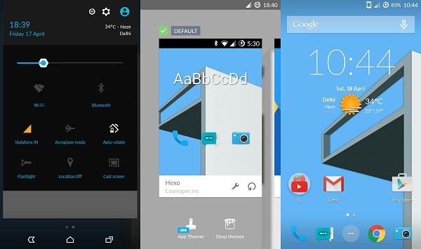
The first thing you notice on getting CM12 (based on Android 5.0.2) is the new Cyanogen boot animation. On getting the phone started, I liked how refreshing 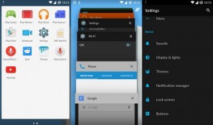 the new icons looked. There are no shabby or ill-fitted icons here. The default launcher has been assigned to the Google Now Launcher. The OS supports Ambient Display, which gives you a glance at notifications as soon as you pick the device, something we have seen on the Moto X and the new Moto E. It also supports double-tap to wake and double-tap to lock the screen. In the previous OS version, you can choose to either have on-screen navigation keys or keep using the physical touch keys.
As soon as you enable on-screen keys, the touch keys fade out and become non-functional. The pull-down notification and toggle button has been tweaked a bit. You can pull down to check notification and if you pull it lower you get toggle buttons, something that requires two swipes in stock Android, and this one feels better to use. You also get to see downloading speeds when updating or downloading an app from the Play Store, another thing that might be useful for a lot of people.
CM’s App Themer allows you to apply themes from their store, and also change icons, font, sound options. Using your Cyanogen Account, you can choose which ones you want to download and apply. Another interesting feature is Privacy Guard, which gives you full control of what apps (whether a system app or a third-party app) on your phone are required to access your location, network data, messages and phone resources.
The recent app Menu is same as card-like stock Android with an added clear button for clearing all apps from the list at once. Though I was a bit disappointed by the camera app, which could do with a bit of work on its viewfinder, focus and even sharpness, there’s some work in progress for the same, apparently. It won’t be wrong to say that CM looks cohesive and nice on the OnePlus One. There are not too many changes done, but quite a few useful changes and addition made to Android that many will like how their phone functions. The phone works smoothly, is able to load u and exit apps just as one would need and can handle multiple Web browser tabs without struggling. The phone’s battery life is also satisfactory.
The verdict. Overall, the OnePlus One’s OS is cohesive, smooth, well-designed and has many options users will like. You get a good 64 GB (54 GB available space) smartphone for these many bucks (and about Rs. 19,000 for 16 GB), an active community if you’re interested in tinkering with your phone, which makes it even better than several other phones for some. The invite system is still the procedure you would have to follow (can’t say I like it), though there are now also no-invite normal online sales once every week.

