Categories
Tech

Review: Xiaomi’s Redmi Note

With the new Redmi Note, Xiaomi sets its eyes on large-screen phone buyers, with a modest under-Rs 10,000 price tag.
by Manik Kakra | @Manik_K on Twitter

Xiaomi’s entrance into the Indian market was quite a news story. While the company didn’t sell as many units to set the market on fire lots of users, especially who were active over online portals, heard and talked about them. If you remember, we were quite impressed by the Mi 3, which performed really well despite in most departments despite priced under Rs 15,000. And with the Redmi Note, Xiaomi has set its eyes over large-screen buyers with a price tag of under Rs 10,000.
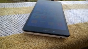
Looks and design. Xiaomi’s Redmi Note (HM Note 1W) follows the large-screen-that-isn’t-high-end trend. Weighing almost 200 grams and not being a thin device, the front has a 5.5-inch HD screen with Corning Gorilla Glass 3 on top. Three capacitive buttons – Options, Menu, and Back – below it, which glow in Red but aren’t very bright. Above the screen are the front-facing camera, speaker grill and sensors along with a tiny LED notification light.

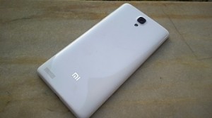
The back has a glossy thin plastic cover, removing which reveals two SIM card slots, microSD card slot and the removable battery unit that also stretches to the sides. The back houses the 13 MP camera with the LED flash next to it, loudspeaker towards the bottom and the Mi logo in silver. No doubt had the back been a little less slippery, or with a better finish, one would have found gripping the device more comfortable.

While the sides are plain, the right side has the Volume rocker and Power/ Lock key. These keys are not very premium to look at, but they are tactile to press. At the bottom is the primary mic and microUSB 2.0. On the top, you have the 3.5 mm headset jack and secondary mic. You could say the phone looks nothing extraordinary, and we would have liked the phone to be less bulky.

Screen. Its 5.5-inch (1280 x 720) screen is just about okay when it comes to resolution for phones in this price range. Images and webpages look quite sharp on the screen, though videos tend to appear a little washed out. The screen has decent viewing angles and can brighten when needed under various conditions. Games that support the given resolution, on the other hand, look just as nice as you expect.

Camera. The Redmi Note sports a 13 MP camera with an LED flash. Here are a few sample images.

The camera is no match for even a mid-range phone and just as good as most phones priced under Rs. 10,000. It takes sharp images under favourable conditions, but don’t expect a lot. Photos in low-light, as you’d expect, are not at all worthy and you should avoid using this phone when it isn’t bright with your subject being still.

Audio. Both in-ear and loudspeaker perform decently. You don’t get any headset in the box, so you would have to get one yourself. Using a basic pair of earphones with the phone, expect a decent quality, quite loud but not too great. The loudspeaker on the back is also just okay and just about does its job while watching videos.
Battery. The device is equipped with a 3,200 mAh battery unit and it is the best thing about this device. You get more than a day of juice even with a bit of heavy usage. Having always sync on, watching videos for about half an hour, checking Twitter, playing a game like GT Racing 2 for half an hour, the phone’s battery life stretches over a day, and with moderate usage, it should go even further. Being a large device, this is definitely a plus point.

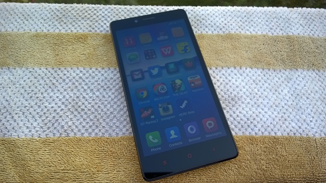
Software and performance. The device runs on Android 4.2.2 coupled with MiUi. Under the hood, there is MediaTek’s MT6592 SoC (1.7 GHz octa-core processor, Mali 450 MP GPU) along with 2 GB of RAM. The user gets about 5.8 Gb of available storage out of the box. All the apps are on your Home screen as there’s no separate app launcher. You can make folders, change widgets on it and uninstall an app right from a Home screen.

MiUi is one of the active ROMs in the Android community and there are a lot of tweaks and mods available for it, if you want to try. It has been designed well with most things, like the Notification center, toggle buttons, icons, which go well with the OS’s overall look and feel. Long-pressing the Options key gives a horizontal list of recent apps from where you can remove it; lock it apart from opening it. Or you can also remove each of those apps from the recent list and memory. Lock screen is simple yet useful: with a simple swipe-down gesture from a particular point to unlock it, or swipe it in other sides to directly open Messaging, Camera or Call Log.

The general performance of the phone leaves a lot to be bit desired. Initially, it seemed smooth to scroll, open apps and watch videos, but within two days of use, I saw quite a few issues. Many times when you come back to Home from an app, the launcher reloads; or if you go back to an app, it goes blank (works fine on other phones), which is a little surprising considering there’s 2 GB of Ram in place. Plus, the phone is running on Android 4.2.2 that was released two years back and there’s no word on when it will be updated to Android 4.4 (leave aside 5.0). Scrolling between Home screens, Settings, Dialler is mostly fine but you see signs of lag every now and then. Having said that, the phone handles games and HD videos without any troubles, this is one area that isn’t going to disappoint you. To sum its overall performance, it is not really bad, but it’s certainly not on par when you have used something like the Moto G (1st Generation) that is its competitor.

Concluding our review, the Redmi Note is a decent start from the company to kick off its ‘phablet’ plans. With a good screen, great battery life, decent camera and sub-par performance, anybody coming from a Mi 3 won’t be very happy, but for those looking for a large-screen phone under Rs. 10,000, this could become a device to consider only if the company releases OS updates for it that includes a lot of performance improvement.
Categories
Tech

Review: Lenovo Vibe X2

It is almost love at first touch with the Lenovo Vibe X2, which scores with its design and software performance.
by Manik Kakra | @Manik_K on Twitter

Lenovo has been a dark horse in the smartphone race; the company has steadily been leaving its mark in various smartphone markets. Now, it seems to be focussing on the mid-range segment of smartphones, with the Vibe X2.

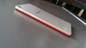
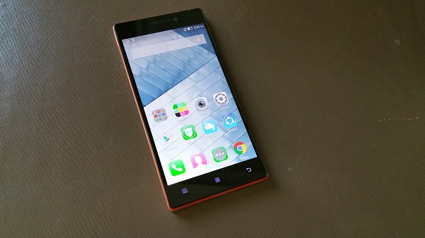
The looks. Vibe X2 (X2-AP) has quite a unique design language. With three layers (all different and bright orange, peach and light bronze) besides the screen, the manufacturer gets credit for the first look. Further, you can attach a couple of accessories like an external battery unit or speaker making it the fourth layer minus a shabby look. There’s a lot of Magnesium in use here, the phone weighs about 120 grams and is 7.3mm thick, which makes it comfortable to carry around.

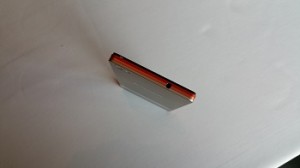
Around the sides (with the three stripes running), you have the dual SIM tray (houses a nano SIM and micro SIM) placed underneath the left side panel, and the volume rocker and Power/ Lock key on the other side. I would have liked these physical keys to be a bit more tactile and less flushed to the body surface as you will often find them inconvenient to spot and press without having to look at them. The microUSB port and primary mic sit at the bottom, and the 3.5 mm headset jack is at the top.

On the front, there’s the 5-inch full HD panel, along with the 5 MP front-facing camera, sensors, speaker grill, and a tiny LED notification light on its top; while there are three capacitive buttons – Option (Menu), Home and Back button placed below the screen, which are not very dim. The rear seems usual – Camera and LED flash on the right corner, then the secondary mic, Lenovo logo in the middle, and loudspeakers towards the bottom.

Display. The phone boasts a 5-inch (1920 x 1080) LCD touchscreen. The display of the phone is sharp, quite bright and decent for using under sunlight. The colour reproduction, though, does not pop as a high-end device, but it’s not bad. Viewing angles are also on par with most full HD panels, and videos and high resolution images appear pretty nice on the screen.

Camera. The Vibe X2 sports a 13 MP (AF) camera along with an LED flash. Here are a few sample images.

The phone’s camera isn’t its best feature. More often than not, pictures turn out to be just okay. Colours sometimes appear washed out, and only decent when the camera is able to focus well, which is another place where it struggles. Low-light shots aren’t much to talk about. With decent conditions, you can get a few detailed shots, but don’t expect more. You are better to try taking shots in the HDR mode than normal as it turned to be more than useful on several occasions. The 5 MP front-facing camera is not bad for making video calls or taking a selfie. The camera app, in contrast to the rear camera, is smooth and simple to work around.

Battery. With a 2,230 mAh battery unit inside, you will have to charge it up in about 15 to 16 hours. With brightness level at 20 per cent, and always on WiFi, the phone’s battery is not a great performer. Also, the Vibe X2 doesn’t support fast charging.

Audio. Audio on the phone is also not that great. Though loudspeakers are on par with most smartphones when it comes to videos and games, in-ear sound quality is average. Using the bundled headset with another phone gives you a noticeably better sound, meaning the Vibe X2 (with the bundled headset) isn’t much of a standout.

Software and performance. The device is equipped with MediaTek’s MTK 6595 SoC (1.7 GHz quad-core and 2 GHz quad-core processor, PowerVR GPU) along with 2 GB of RAM. It runs on Android 4.4.2 with Lenovo’s Vibe UI in use.

If you have used another Lenovo phone from last year, you are going to notice and mostly like what changes the company has done to its software. There’s no separate app launcher like before and all your app shortcuts appear on Home screens, but the whole look, icons, arrangement of UI elements is much better. The phone is fluid to open apps, reboot, responsive to play games on, and hardly ever stuttered during my entire usage.

The notification center and Settings have also been given a facelift. You can edit which toggle buttons appear above the notification bar, and also take a screenshot. Lockscreen now allows you to directly jump into Call Log, messages or open the Camera app. Status Bar changes its colour depending upon the app you are currently on. It is white by default, but, for instance, if you move to Settings (which has a White background), the status bar and icons turn black.

You can also double tap to wake the screen, which works well. Long-pressing the Options key brings up recent key (in iOS manner), and long-pressing the Home key pops Google Now up (by default). The user gets about 26 GB of accessible storage space. All in all, one can sum up the software and performance experience by saying Lenovo has done a lot of good work in improving its software and making the phone a stellar performer.

To sum up, the Lenovo Vibe X2 seems to be a great value for money purchase about Rs 20,000. With a good screen, great performance, average battery life, if you aren’t too concerned about the camera performance, this smartphone surely comes as a great option for this price.

Categories
Tech

Celkon and ZTE launch two new phones

Celkon’s first Windows phone, a low range device, comes to India; while ZTE’s mid range phone is named the Grand SII.
by Manik Kakra | @Manik_K on Twitter

As announced by the company a few days back, Celkon has launched its first Windows Phone device in India two days ago. The phone is named WIN400, and caters to the low-end smartphone segment.

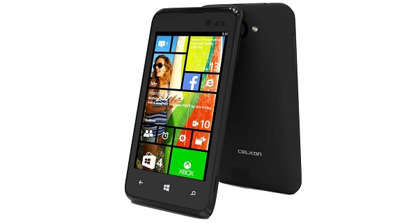
The WIN400 (in image above) features a 4-inch (800 x 480) screen and runs on Windows Phone 8.1. Under the hood, there is a Snapdragon 200 chipset (1.2 GHz quad-core processor, Adreno 203 GPU) along with 512 MB of RAM. On the back, there is a 5 MP (AF) camera (with an LED flash), while the front has a 1.3 MP camera. The phone comes loaded 1,500 mAh battery unit and with 4 GB of internal storage, which can be expanded up to 32 GB using a microSD card. Connectivity-wise, there’s 3G, Bluetooth 4.0, WiFi, GPS, and microUSB 2.0. The phone comes in black, and is available for Rs 4,979.

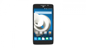
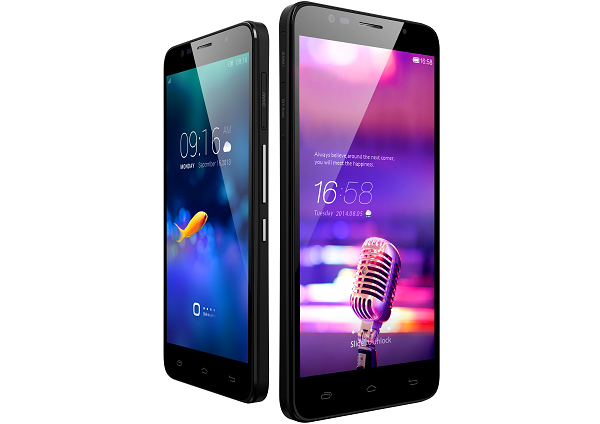
ZTEZTE also launched its new mid-range smartphone, the Grand SII (in pic on left). The device runs on Android 4.2 with Mi Flavor UI on top. It’s powered by Qualcomm’s Snapdragon 800 chipset coupled with 2 GB of RAM. The Grand SII features a 5.5-inch (1920×1080) screen and is equipped with a 2,500 mAh battery unit. There’s 16 GB of internal storage, which is expandable. The rear sports a 13 MP camera, and the front has a 5 MP camera.

It also boasts 3G and 4G LTE connectivity options along with Bluetooth, WiFi, GPS, microUSB 2.0, and FM Radio. The phone comes in only silver-black colour, and is available exclusively from Amazon at Rs 13,999.

Categories
Tech

This just in: Microsoft Lumia 535

Launched in India at a price of Rs 9,199, this smartphone is Microsoft’s first Windows handset under its own brand.
by Manik Kakra | @Manik_K on Twitter

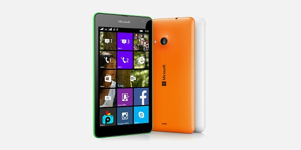
Microsoft’s first Windows Phone handset under its own brand, the new Lumia 535, has been launched in India two days ago. The phone marks the beginning of Microsoft phones in the Indian market, while the low-end feature phones will continue to be under the name Nokia.

Running on Windows Phone 8.1 (with Lumia Denim Update), the Lumia 535 features a 5-inch (540 x 960) screen with Gorilla Glass 3 on top, and comes loaded with many Microsoft apps and services like Offices, OneNote, OneDrive, Xbox app, and more. Under the hood, there is a Snapdragon 200 SoC (1.2 GHz quad-core processor, Adreno 302 GPU), along with 1 GB of RAM.

On the back, there is a 5 MP (AF) camera (with an LED flash), while the front has a 5 MP wide-lens camera. There’s 8 GB of on-board storage, which can be expandable up to 128 GB, plus, 15 GB of free OneDrive storage space.

This dual SIM handset sports Bluetooth 4.0, GPS, microUSB 2.0, WiFi, 3G connectivity, and 3.5 mm headset jack. Weighing about 146 grams, the phone packs a 1,905 mAh battery unit.

The Lumia 535 goes on sale later this week at Rs 9,199, and comes in bright green, bright orange, white and black colour options. The user will also get free 500 MB of 3G data from Vodafone for the first two months, 2 months of BoxTV subscription, free recharge from PayTM worth 600 bucks, and free EBooks from Flipkart worth Rs 1,500.

Categories
Tech

Review: Samsung Galaxy Note 4

Samsung’s newest smartphone has everything you need and much more – and it’s larger, with a smarter S Pen, too.
by Manik Kakra | @Manik_K on Twitter

Just about every smartphone manufacturer is coming out with large phones. And why not, people want to consume more content, watch videos, see more high quality images, and more. It won’t be wrong to say that if there’s one company who started this trend and is leading it, it’s Samsung. The Korean giant’s Note series is one of the most popular smartphone names, and they’ve just come out with the Galaxy Note 4 priced at Rs 55,000.

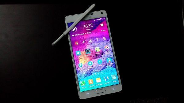
The looks. Samsung’s Galaxy Note 4 (SM-N910G) is (after the Galaxy Alpha) is what the company’s design will be for its near future. The phone comes with a different chassis that you wouldn’t find in any of the previous Note handsets. With dual chamfered edges (squared at four angles) and polycarbonate rear cover with textured surface, the phone feels very different and better from the Note 3 or even the Galaxy S5.

Of course, the device is really large (which is a given for a Note smartphone), but it is nice and not too uncomfortable. The front, with the 5.7-inch Super AMOLED, also sports sensors on top, 3.7 MP front camera, ear speaker grill in the middle next to the Samsung logo, and the LED notification light on the other side.

The screen’s bottom has the physical Home button with Recent apps key on its right and Back key on its left (no Menu key). At the bottom, apart from the noticeable curved back cover, you see two mics, microUSB 2.0 and the S-Pen slot that embeds in the rear neatly. The top has the 3.5 mm headset jack, another mic, and the Infrared port.

On the back, the textured surface houses the 16 MP camera with LED flash and Heart rate monitor, Samsung logo, 4G sign and loudspeaker grill (going from top to bottom). There are volume rockers on the left; and the Power/ Lock key on the other side, finished similar to the Galaxy Alpha. The Note 4 is a large device, and Samsung has done most things right to get the design correct including thin bezels and durability, and it’s a good thing if Samsung follows up on this design line for its upcoming flagships.

The Note 4 is a lot about that 5.7-inch Super AMOLED that has a curved Gorilla Glass 3 on its top. The glass on top gels very well with the phone’s body to give you a smoother experience while scrolling on the screen. While there’s some difference between the body and the glass at one side of our review unit, which might welcome some dust at prolonged usage, it isn’t much of an issue and probably even sorted with current retail units.

The screen. This is Samsung’s AMOLED at its best. With a 2560 x 1440 high resolution screen, watching videos is a great experience. What makes it better is reading text, where even finer text would appear very nice and a joy to read. The colours look vibrant, sharp and different from an LCD, which is expected, and the deep black levels are very high. Using the screen under direct sunlight is good too, as it’s readable without having to crank the brightness level to maximum.

Camera. Another interesting feature in the Note series has been Samsung’s camera, which is often the best that the company offers in its line-up. The phone boasts a 16 MP (AF) camera with an LED flash, which can reconrd 2160p at 30 FPS videos, or even 720p videos at 120 FPS. For images also, there are various resolution settings you can choose from. Here are a few sample images.

The camera on the Note 4 can take good, detailed shots. Thanks to the OIS capabilities, its low-light performance is not bad (but it can be dodgy). The camera app is smooth, has plenty of options, and quick to change and select modes from. The selective focus, HDR, etc. work very well, better than on the S5. For those who find it uncomfortable to use the Note 4 to take photos, they have the option to try switching to taking shots by pressing the volume buttons. You could say that the Note 4’s camera is one of the best to come out this year and every kind of user will find something useful in there.

Battery life. Powering up all those bells and whistles is the 3,220 mAh battery unit that is accessible by removing the back cover (and also reveals the microSD card slot and micro SIM slot). More often that not, battery life on the Note phones is said to be among the top few smartphones, but the story is a little less sunny with the Note 4. More often than not, the Note 4 just about lasted me a day, which isn’t bad, but you expect a Note phone to last you a little longer than that. With brightness level at 30 per cent, lots of Emails, S Health, Twitter, half an hour of gaming and music playback, you should be fine for about a day long usage. The phone comes with a higher-capacity for charging the device quicker. The Note 4 gets charged from zero to 50 per cent in half an hour, and fully charged from zero in about 90 minutes, which is great.

Connectivity. The Note 4 has plenty of options and all of which I tried worked just as they should. The network reception on the Note 4 is as good as you need. In-ear call quality is top-notch, too.

Audio. Audio quality of the phone with the loudspeaker seated on the back is pretty good. It is not bad at all for games and videos, but it would have been certainly better had Samsung not gone with mono speakers and also placed them at the front.

Software and features. The Note 4 boasts a Snapdragon 805 SoC (2.7 GHz quad-core processor, Adreno 420 GPU), along with a whopping 3 GB of RAM. Specifications-wise, you need not look elsewhere. The phone runs on Android 4.4.4 with TouchWiz on top.

One of the USPs of the Note series has been its S-Pen. The Note 4’s S-Pen is actually much improved and has a few handy features to work with. As soon as you pull out the S-Pen, after a brief vibration, you get four options in a pop-up. From here, you can choose to make a memo by writing with the S-Pen, take a screenshot and edit it, or take a clipping of what’s currently on your screen and share it, or share an image from one app and paste into another.

The Note 4 also has Samsung’s popular multi-window feature that lets you access and check on more than one app at once. The Multi-Window mode can be enabled by long-pressing the Back button. You can make an app window smaller by swiping from one of the top corners. Many pre-loaded apps like Gallery, Chrome, S Note, Twitter for Android support this functionality and it actually works better than ever. The whole experience of running two apps on your screen at once offers much less stuttering than before.

Performance. The phone is smooth to watch videos, navigate through Home screens as it should be, but it lags a little in Settings. It is smoother than the S5, in my opinion, but with multi window and Gallery opened (just an example), the phone starts to slow. For the most part, the experience is quite smooth and almost lag-free. Samsung has also done a few changes to its software’s look; Settings now shows you most used options at the top followed by the usual list order. You can now lock the screen while watching a video in order to not have any screen operations by mistake by just tapping the Power key within the native Video app.

As far as Home screens and Menu launcher are concerned, the look and feel is the same. The functioning is no different, and I would still say that Samsung could really do with a step up on their icons and font in use. The 32 GB variant has about 24 GB of storage space for the user.

Concluding our review, the Galaxy Note 4 is surely one of the best smartphones out there. It has an excellent screen, a great camera, decent battery life, and improved design and S Pen functionality, so if you are looking for a large screen device and have the required budget, you should surely take Samsung’s latest Note in consideration.

Categories
Tech

This just in: Celkon Millennia Epic Q550

The new Android smartphone comes only in a black variant for now and will have a Windows version in two weeks.
by Manik Kakra | @Manik_K on Twitter

Celkon has launched its new Android 4.4.2 KitKat smartphone in India called the Millenia Epic Q550. The phone sports a 5.5-inch (1280 x 720) screen, is 8 mm thick and weighs about 143 grams.

Q550 Under the hood, there is MediaTek’s MTK 6582 (1.3 GHz quad-core processor) along with 1 GB of RAM. For connectivity options, there’s Bluetooth, microUSB (supports USB On=The-Go), WiFi, GPS, FM Radio and 3G.

On the back, there’s an 8 MP (AF) camera that can record HD videos; while the front has a 2 MP camera. This dual-SIM phone comes loaded with 16 GB of internal storage, which is expandable up to 64 GB via a microSD card. The Q550 is powered by a 3,500 mAh battery unit.

Commenting on the launch, Y Guru, Chairman and Managing Director – Celkon Mobiles, said, “At Celkon, we have always believed in upping the ante, each time we launch an offering. With the new Millennia Epic Q550, we have raised the bar one more time. At just 143 gm weight and 8 mm thick, we have been able to pack  a powerful battery for longer life in a uni-body design at an astounding price tag. We aim to become one of the largest in the country and with many such exciting offerings lined up, we are sure to achieve significant growth this fiscal.”

The company is also planning to launch a Windows Phone device in a couple of weeks, and an Android One device early next year. The phone comes in only black colour, and will be available from retail stores as well as online channels for Rs 10,499.

Exit mobile version