Categories
Tech

Review: Nubia Z9 Mini

We take a look at Chinese company ZTE’s new phone and find a great camera and just about passable features.
by Manik Kakra | @Manik_K on Twitter

ZTE is a Chinese company that’s into 3G dongles and smartphones, but like a few other brands (Micromax has YU), ZTE too, is now out with a separate sub-brand that caters mainly to online retailers. The Nubia Z9 mini, available exclusively on Amazon, is a mid-range Android 5.0 smartphone that the company says is more than any other smartphone launched in this price category. But is this claim really true?

The looks. The Nubia Z9 mini (NX511J) follows a rather premium design and feel. As soon as you hold it, you will notice its double glass back and front (both are prone to smudges) as well as metallic rim across its sides, and if you don’t spot that rear-cover slot, you may conclude the cover doesn’t come off. The front has three backlit capacitive touch keys — you can change what function other two buttons perform (Menu/Options or Back), the circular Home button is more prominent and doubles up as LED notification.

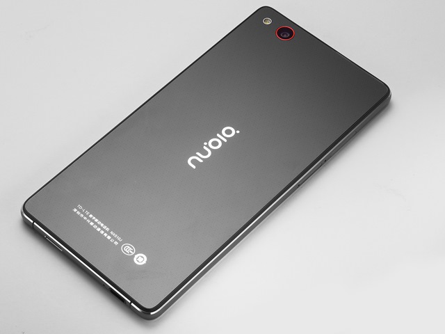
Above the 5-inch full HD screen, you have an 8 MP front-facing camera, speaker grille and sensors. On the back, the 16 MP camera as a Red outline, LED flash, Nubia logo in horizontal all over a nice dotted pattern from the phone’s black colour. Removing the back cover reveals the microSD card and non-accessible 2,900 mAh battery unit. The right side has volume rockers and Power/ Lock key (both are tactile), and the left side only has SIM card tray (two nano SIM card slots). At the bottom, there’s the chrome-outlined microUSB port, loudspeaker jack and primary mic; while the top has 3.5mm headset and secondary mic.

The screen. The phone’s 5-inch full HD LCD has good bright colours. It can handle HD content, but struggles with its viewing angles. For general photo viewing and Web browsing, it is just as good a screen as any in this price range.

Camera. The phone boasts a 16 MP (f/2.0) camera, and here are a few sample images.

The camera is the best thing about this phone. The rear camera takes detailed shots with good contrast levels. In daylight, photos came out saturated, while low-light, too, wasn’t bad. There’s a Pro mode that lets you play around with camera settings among other modes like Field of Depth and HDR. This is surely one of the best phone cameras available under Rs 18,000 today.

Audio. The loudspeaker at the bottom isn’t great. It performs well for pop music, but is extremely inadequate for rock, something that I haven’t seen on phones for a while. In-ear voice quality, though, is on par and so is network reception. The only connectivity issue I found was that the phone just won’t switch off location (GPS). It will keep showing you the GPS icon in the status bar even when you have manually switch it off.

Battery. The phone struggled to last 20 hours on a full charge. With brightness at around 25 per cent, two Email Accounts in sync, a lot of Twitter and some YouTube videos, this phone’s 2,900 mAh battery is not meant for a full day’s use in case of heavy usage.

Software and performance. The phone is equipped with a Snapdragon 615 SoC (1.5 GHz quad-core + 1.1 GHz quad-core processor, Adreno 405 GPU) along with 2 GB of RAM. The device runs on Android 5.0.2 with Nubia 2.8 UI on top. In terms of general performance, I found the phone to be initially pretty responsive. But once you have a few apps opened and Webpages on browser, it starts to slow down a little. It worked fine for baisc apps but does get a little hot when playing games.

Nubia UI follows no separate app launcher pattern, and is mostly made of Red and White gradients. Apart from a few grammatical errors in the OS and weird-looking pop-up box for Shut down and battery low message, Nubia UI seems aesthetically nice. Nubia UI has similar customization options as most other Android OEMs today and nothing much that stands out or is worth mentioning here. However, the company could certainly try and fix bugs like clearing Recent Apps list doesn’t work from the clear button in horizontal list or from the toggle button. The user gets about 11 GB of storage space, which can of course be further expanded using a microSD card.

Thus, the Nubia Z9 Mini is a mixed bag. It has a great camera, good screen, standout design for this price range, but average battery life and passable software. It really depends what your priority is — camera, looks and screen, but if not, you may prefer looking somewhere else.

(Picture courtesy www.gizchina.com)
Categories
Tech

Review: Teewe 2

We test the recently released and improved streaming dongle Teewe 2 and come away pleased with its performance and features.
by Manik Kakra | @Manik_K on Twitter

More and more people these days want their TV to be a bit more than just an idiot box. We have had smart TVs in the market for a couple of years now, but haven’t seen anything that provides any extra utility. This is where the likes of Teewe and Chromecast come in. Teewe, an Indian startup (MangoMan), came out with its first streaming stick last year; got good reviews, and is now out with the new Teewe 2, apparently better since they have listened to a lot of customer feedback.

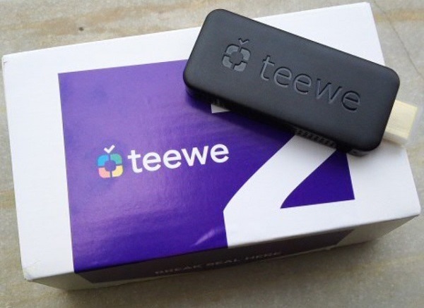
What is it? Teewe 2 is a streaming dongle. It allows you to mirror or throw something that you’re watching on your phone or PC or have it stored right on your TV’s bigger screen. In the box, you get an HDMI cable, a relatively longer USB cable, power adapter, the stick itself and a setup manual. The stick is a little bigger in size than a usual thumb drive, but a bit smaller than the original Teewe.

The looks. It is all-black, made out of plastic, with the HDMI port right at the top and microUSB port on one side. Its internal hardware comprises a 1.6 GHz quad-core ARM Cortex A9 based processor, quad-core GPU, 1 GB of RAM and 4 GB of storage space (not accessible). It is essentially based on Android 4.2’s development tree and the company provides firmware updates in the background.

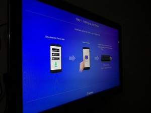
Teewe_2Setting up the device. It supports Windows (requires Java installed), Mac OS X, Linux (JVM), iOS, Android, Windows Phone, and even has a plugin Chrome along with a Web app. Insert it in your TV’s HDMI port, put the smaller microUSB side into the Teewe 2 dongle and its charging USB side either into a power socket (through the power adapter) or your TV’s USB port.

While most TVs will provide for power through a USB port, if yours doesn’t, you would have to make use of the long microUSB cable extending it to power socket. As soon as you switch your TV’s HDMI mode and fire up the app on your device, the dongle will search for the device while connecting to a WiFi network. Keep in mind, both your device and dongle need to be on the same network.

What’s good. I tried the device on Chrome and an Android smartphone, and found the app to be pretty decent. The Android app shows you content from YouTube (you can search further), local content on your phone like images, videos, and audio files. Using the Chrome plugin, you can either play some video or audio content from a Webpage or mirror a tab, so whatever is playing on that tab exactly mirrors on your TV. For movies stored on your PC, you can even have subtitles streamed and synced with any movie playing on your TV, but this feature is only available on Windows for now.

Performance. The stick streamed up to 720p at 60FPS for me. The Android app allows you to select from HD or SD, though you cannot do it while playing a video and have to select it from the app’s main page once. Streaming worked smoothly and I rarely found a stutter. If you’re streaming from, say, YouTube, its loading and playing time obviously depends on your Internet connection. If you’re playing local files, the dongle uses FTP, and it worked well for me, whether high quality images, audio files or a video. I couldn’t get the Teewe 2 stick to do full HD 1080p, though. For now, it doesn’t mirror your entire phone or PC, but the company is working on it. Buyers also get 60 GB of additional broadband data if they’re using an Airtel connection, and two months of free EROS service via the Teewe 2 apps.

The verdict. All in all, I think the Tewee 2 does its job really well. It is mainly for streaming content from the Web or local and has no fancy, useless features that would make it perform poorly. My only concern is with the ChromeCast 2 launching quite soon, but if you aren’t bothered to wait, and are looking for a good option to make a better use of your HD TV, the Teewe 2 could well be a good buy for you under Rs 2,400.

Would you try this device? Tell us in the comments section below.

Categories
Tech

Review: ASUS ZenFone 2

Priced at Rs 24,000, the phone has some great features and some minor quibbles, but is a good device overall.
by Manik Kakra | @Manik_K on Twitter

ASUS has been slowly and steadily climbing up the smartphone ladder in the Indian market. The tech company got rave reviews with the original ZenFone. Continuing the trend after the ZenFone 5 and 6 is now the ZenFone 2 that has a lot of things going for it – 4 GB RAM, 5.5-inch full HD screen, 3,000 mAh battery, among others. Let’s find out if this Intel-powered device can hold its own in its price segment.

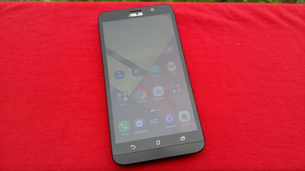
The looks. The ASUS ZenFone 2’s (ZE551ML) unique design is not massively different from the Zenfone, but is sufficiently different. The phone has volume rockers (similar to those on LG G3 and now the G4) on the back right next to the camera sensor and dual tone LED flash; other than the loudspeaker and ASUS, Intel and ZenFone logo complete the rear. The back has a nice brushed (almost faux aluminum) plastic material.

The phone’s back has a noticeable curve and with the smooth dual shade plastic sides and curved edges, it is comfortable to hold and carry. Having said that, its sheer size, bezel and weight (about 170 grams) will be a bit too much for some. On the front, the phone has a nice brushed aluminium chin just below the three capacitive touch keys — Back, Home and recent Apps key.

Right above the screen, other than the ASUS logo (second one) you have LED notification light, ear-speaker and 5 MP front-facing camera. The microUSB port and primary mic are placed right at the bottom. Plus, those slim volume keys are not the most tactile ones, but you will get used to them. The Power/Lock key is at the top along with the 3.5mm headset jack and secondary mic. The Power button placed, at the top right, located in the middle, is also hard to press.

Asus ZenFone 2Display. The phone features a 5.5-inch full HD (1920 x 1080) IPS LCD. On paper, it is on par with most other smartphones in this price category today. The screen looks sharp and, while it is not the most pixel-dense display, does a good job for most tasks. I thought the phone performed well with videos and images. You can change the screen’s colour calibration using the inbuilt colour temperature app.

Battery. The phone has a 3,000 mAh battery unit. On most occasions it lasted me over 20 hours on a single charge (with a little over three hours of screen on-time). The usage included one SIM card inserted, two Email Accounts on sync, about half an hour or HD YouTube videos and music playback each. The phone takes a little under two hours to get fully charged from zero using the bundled charger. The battery is a solid point for the ZenFone 2; it hardly drained more than usual.

Audio. The loudspeaker on the back (designed to look longer than the speaker actually) isn’t very punchy for videos and games output and you would often have to use your hand to cup the speaker and get better sound. I didn’t any bundled headsets, so I can’t about in-ear sound. Call quality and in-ear sound were on par, and there were no problems with voice or sound during calls. One SIM card slot has 3G and 4G LTE supports, while the other has just 2G. Basics like WiFi, Bluetooth, GPS, and network data didn’t require any troubleshooting.

Camera. The ZenFone 2 boasts a 13 MP rear camera with dual tone LED flash. Here are a few sample images.

The camera can take detailed, sharp photos, especially in broad daylight. The camera app has loads of options, in particular HDR and Depth mode work well and can be pretty useful at times. In low-light, the camera gives noisy photos and you may want to opt for low resolution photos. Having said that, it usually gave bright coloured shots better than most smartphones in this price range. There’s also a software feature called Super Resolution that lets you take 50 MP photos – by combining four shots and stitching them together.

Software and performance. The ZenFone 2 comes with an Intel Z3580 chipset (2.3 GHz quad-core processor, PowerVR G6430 GPU) and whopping 4 GB of RAM, which is surely one of the USPs of the phone. It runs on Android 5.0 with ASUS’s own ZenUI on top. The phone feels a lot smoother and snappier to work on than its predecessor. There are not too many Intel-powered Android phones, but this one certainly does its job without lagging.

ASUS has loaded plenty of options in every nook and corner of the OS. With a dedicated themes center, you can now choose the overall look of the phone – from wallpaper, lock screen, scrolling effect, option to change how your Menu launcher shows app icons or arranges them, to even changing icons from one of the icon packs from the Play Store, yep. Contacts app allows you to select certain contacts under the tab VIP, for whom you may contact frequently or just want to view separate from the rest. There are dozens of ASUS apps pre-loaded as well as annoying third-party apps, which you can uninstall. There is a dedicated ASUS support app you can use to chat and get help from the company’s customer support, so that you don’t have to wait holding calls.

ASUS has done a really good job with the ZenFone 2. With a good camera and screen, feature-heavy and relatively smooth OS, decent battery life and innovative design, the phone seems to be up there with other heavyweights when it comes to phones under Rs 24,000.

(Pictures courtesy Manik Kakra)

Categories
Tech

Review: Coolpad’s Dazen X7

The new Chinese smartphone is a good buy at its price, but needs to sort out a few software niggles.
by Manik Kakra | @Manik_K on Twitter

We recently reviewed the Coolpad Dazen 1, which is the company’s sub Rs 7k smartphone, just a few days back and now we take a look at Coolpad’s flagship device, the Dazen X7. The Dazen X7, priced a little under Rs 18,000, comes as a direct competitor to the popular Xiaomi Mi4 and Lenovo Vibe X2. This price segment is already full of a lot of good options, so how good is the Dazen X7?

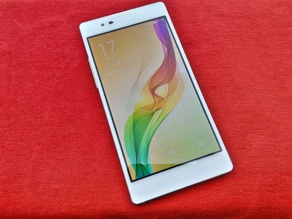
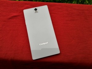
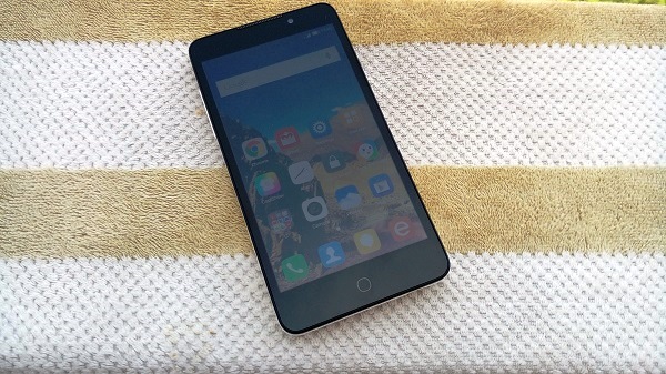
The looks. The Dazen X7 has a glass back and front and metallic sides. The front has a noticeable metal-clad earspeaker grille above the 5.2-inch AMOLED, sensors and an 8 Mp front-facing camera. At the bottom, you have the microUSB port with loudspeaker on the one side and primary mic on the other. The top houses the 3.5mm headset jack and secondary mic. The right side consists of two SIM card slots (nano or microSD card and micro SIM card slot as well the Power/Lock key towards the top; while the left side has the volume rockers, both keys are just a little sharp for my liking, but have decent tactile feedback.

The back has a 13 MP camera with a protruding broad metal cover that might get a bit scratched a bit with usage; then there’s the Coolpad logo near the bottom. The phone is light to hold but it is a bit slippery and sides and glass back mean it may not be very comfortable to hold.

Display. The Coolpad Dazen X7 features a 5.2-inch full HD (1920 x 1200) AMOLED. There are not many companies who use AMOLED and especially not at this price range. The display is pretty nice, actually. While it doesn’t have vibrant colours like a high-end Samsung device would, colours are still quite sharp and bright. It is noticeably less mellow than an LCD, has good viewing angles, full HD videos appear well on it and it does a decent job under sunlight.

Camera. The company has been quite vocal about the camera experience and how well they have tweaked its software for better shots. Here are a few sample images.

As you can see, the phone can take pretty detailed photos. While I wasn’t too impressed with how laggy the camera app can be at times, it does have a lot of options including a Pro mode, which gives you options to choose from various ISO, exposure settings to select from. In daylight, the app performed okay, but when shooting in low-light, it really struggled to keep up. It may struggle with exposure and take a really long time capture shots. To say the camera is among the best would be wrong, but it isn’t bad; it just needs some software tweaking to make it fly in low-light conditions.

Dazen X7Sound. Audio quality fared well. The bottom-facing speaker does a decent job for videos and games, but thanks to its placement, you may shut them with your hand while holding the phone in landscape. You don’t get earphones bundled with the phone.

Battery. Powered by a non-removable 2,700 mAh battery unit, the phone’s battery life seemed just on par with most phones. The company claims they have done some hardware-software optimisation to give 33 per cent extra juice from the phone. It lasted me around 18 hours when used moderately, but went below 14 hours when used heavily. Putting a high-quality all black wallpaper helps a bit considering this is an AMOLED.

Software and performance. The device runs on Android 4.4.2 with CoolUI 6 on top. It’s equipped with a MediaTek 6595 SoC (1.7 GHz octa-core processor, PowerVR Series6 GPU) as well as 2 GB of RAM.

The phone handles most tasks quite well. Going in and out of apps doesn’t lag, videos play without stuttering and scrolling is good. Having said that, at times Settings and the pre-loaded Cool Store (still don’t know why have they bundled it) struggle to provide smooth performance, but it is not so frequent. The phone does heat considerable once you play games for about 20 minutes, or simply put it on charge and the phone’s back heats up in matter of few minutes.

The whole OS is pretty much identical to what we have on the Dazen 1, except for the multi-window feature. If enabled, you get a small arrow on your Homescreen. In pressing, it gives you a list of apps that you can open – two at times – and you can edit this list. I found every app I installed could be put into multi-window. It can be a handy feature for some for sure, but I didn’t find much utility for it. Having said that, it does work fairly well and there wasn’t any performance issues with multi-window switched on under Settings.

You get about 10 GB of available storage space. There are four onscreen keys – Back, Home, Recent apps key, and one key to make the navigation bar disappear. In order to make the navigation bar reappear, you have to swipe up from the bottom of the screen. The phone still runs on dated Android KitKat and the company has said its Lollipop upgrade should be out soon. This is one obvious shortcoming of the phone as of now, had it been updated to Android 5.1 (or even 5.0), it would have given this newcomer a significant lead over quite a few players.

All in all, the Dazen X7 seems like a capable smartphone. It has a great screen, average battery life, good camera and fine design. While the software side could certainly be improved, the hardware department if the phone is decent enough at about Rs 18,000.

(Pictures courtesy Manik Kakra)

Categories
Tech

Review: Dazen 1

The Chinese phone has a satisfactory performance but it will face stiff competition from the other phones in its category.
by Manik Kakra | @Manik_K on Twitter

Coolpad is one of the latest entrants into the Indian smartphone market. The Chinese firm came out with a couple of phones a few weeks ago – Dazen X7 and Dazen 1. Today, we check what the Dazen 1 have to take on the already competitive budget smartphone category with the likes of the RedMi 2, YuPhoria, and Lenovo A6000 Plus.

The looks. We have the phone’s white colour, it also comes in complete black. The front looks pretty similar to any touch slab phone you pick today with the sensors and ear-speaker grill above the screen, and three capacitive touch keys — Option/ Menu, circular Home and Back — below it. The Volume rocker is placed on the left, and the Power/ lock key is on the right side at the same height as the volume rocker. On the top, there is just the 3.5mm headset jack, and the bottom gets the microUSB port and primary mic. The back has the Coolpad and Dazen logos, apart from the camera and, secondary mic and loudspeaker.

The device’s matte, smooth finish from the back to sides gives you a comfortable grip. You can remove the back cover to reveal the removable 2,500 mAh battery unit, two SIM card slots (both micro SIM cards), and microSD card slot.

Display. The phone sports a 5-inch HD LCD, which has become a standard display for phones in this price range. It is good to see more and more users aware about a phone’s screen aulity, including resolution, and not just blindly going by its sheer size. The Dazen 1’s (1280 x 720) IPS LCD comes as one of the best in the price segment. It can handle 720p videos well and colours and sharpness are not lost when viewing high quality images. While it struggles a bit when used under direct sunlight, overall impressions, including text, are good.

Camera. The phone is equipped with an 8 MP rear camera. Here are a few sample images.

The camera on this phone can take detailed shots and is capable of sharp pictures in daylight.It tends to over-expose at times, but daylight performance and general experience is good. Its low-light photos are subpar – noisy and not worth looking at.

The camera app also includes a Pro mode, which gives you more control over your picture settings like ISO, exposure and White Balance.

Sound quality. There are no earphones inside the box. The audio quality from the loudspeaker on the back seemed just okay to me. You will have to regularly cup your hand on the phone’s back in order to get slightly better audio for videos or games. It is one of the low points of the phone’s hardware.

Battery. On the other hand, battery life of the device scored better. The company claims its software enhancements stretch the device’s battery life 50 per cent. While I didn’t really find it to stretch this long, the phone quite often lasted me over 20 hours with normal to heavy usage. Its idle standby time for overnight saw battery going down by about 5 per cent, which was good to see. As soon you start watching videos or playing games, the battery takes a beating, but I didn’t see less of a drain than usual.

Basics like network connectivity, call quality and WiFi, Bluetooth were never a problem while using the phone.

Software and performance. The phone runs on the dated Android 4.4.4 OS with Coolpad’s CoolUI. Under the hood, there is a Snapdragon 410 SoC (1.2 GHz quad-core processor, Adreno 306 GPU) as well as 2 GB of RAM. You get about 3 GB of storage space, so you should insert a microSD card as soon as you start using one of these.

With scrolling, closing and opening between a couple of apps or documents, the phone fared well. Having said that, don’t expect it to handle tasks like watching an HD video on YouTube video and going into Chrome with multiple tabs, smoothly. I was quite satisfied with its scrolling in Settings, Chrome with a couple of tabs, but found it stuttering every now and then when trying a couple of heavy apps back and forth.

Talking about CoolUI, it follows a bit of colour shades between MiUI and iOS. All your apps and shortcuts appear on Homescreens. The notification bar and toggle buttons have a translucent background, showing you shades of what’s running in the background. Long-pressing the Options’ Menu key brings up toggle buttons (haven’t sent them here before) and your list of recent apps in that can be scrolled horizontally or cleared all at once along with clearing memory.

The OS’s biggest letdown on the looks was how it changed native apps’ icons like Play Store, Twitter into its own weirdly-shaped icon. For instance, the Play Store icon is still the old one and seems odd to look at, at least to me. The lockscreen gives you direct shortcuts to dialler, camera and messaging. With a shortcut named Rock Wallpaper, you can change your Homescreen wallpaper with a single tap. Themes are supported, but there are not many available in the store right now. There’s also a Private mode in which apps and content that you don’t want anybody else can access, say Gallery or WhatsApp, would be hidden, which might come in handy when giving your phone to somebody else.  CoolUI is decent otherwise, but it’s high-time they upgrade the phone to Android Lollipop.

All in all, if the phone gets updated to Lollipop soon, I wouldn’t mind recommending it to somebody looking for a budget smartphone provided the company is working hard on its after-sale service centre and support.With a good screen, satisfactory battery life, software that can get better at performance and certainly requires some update work, the Dazen1 has an uphill battle in this price range where the likes of Motorola, Yu (Micromax), Karbonn, and Lenovo are getting a lot of attention from consumers today.

(Pictures courtesy Manik Kakra)

Categories
Tech

The 4 best smartphones under Rs 20,000

We list four smartphones you can get under Rs 20,000, complete with all the features and specs you would need.
by Manik Kakra | @Manik_K on Twitter

Chances are that you are using a smartphone right now, or are looking to buy your first one. If you don’t want to spend a bomb on a new phone and yet can’t afford to miss out on the good chipsets, decent memory, latest features, OS updates and smooth experience, this mid-range handset line-up is for you. We give a list of the best smartphones in the Rs 12,000 to Rs 20,000 price range today.

Lenovo Vibe X2: Lenovo’s past few launches have been really up to the mark. The company has sorted out a lot of its software glitches, has been more prompt with OS updates, and seems to be serious about this price range. And the Vibe X2, priced at Rs 19,990, shows this. With its smooth performance, stylish and unique layered look, this device is surely worth checking out.

Specifications: 5-inch (1920 x 1080) screen, Android 4.4.2 with Vibe UI, MediaTek 6595 chipset, 13 MP and 5 MP camera, 2,300 mAh battery.

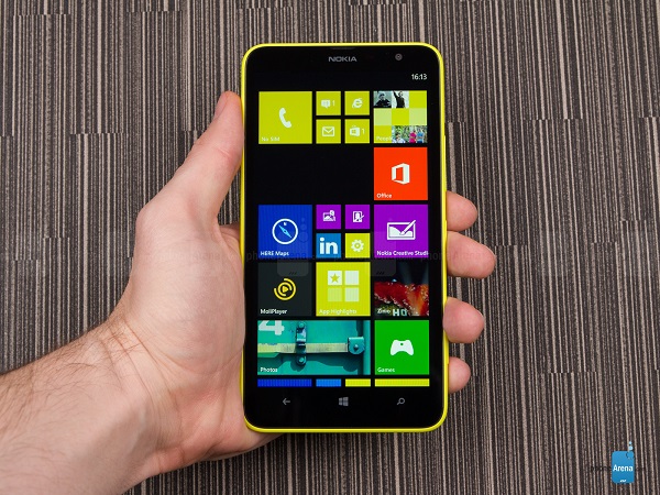
Lumia 1320: If you want a large-screen device and don’t want to sacrifice the performance as well as battery life, the Lumia 1320 could well be for you. Currently available for about Rs 13,500, this ‘phablet’ comes in a range of the usual Lumia colours, and has a lot going for those who don’t mind carrying a big phone, especially considering it’s one of the Lumia phones to get full features of the upcoming Windows 10 for Phones OS.

Specifications: 6-inch (1280 x 720) screen, Windows Phone 8.1, Snapdragon 400 chipset, 5 MP and VGA camera, 3,400 mAh battery unit.

HTC Desire 820Q: Successor to the popular Desire 816 and 820, the Desire 820Q is a great dual-SIM device that doesn’t compromise on performance, and gives big bang for the buck in the camera and audio departments. With a price tag of Rs 19,000, this HTC device is surely worth considering.

Specifications: 5.5-inch (1280 x 720) screen, Android 4.4 with Sense 6 UI, Snapdragon 410 chipset, 13 MP and 8 MP camera, 2,600 mAh battery.

Micromax Canvas Gold: This device has been one of the more popular phones in this price range, and its performance, screen quality and thinner looks addMicromax Canvas Goldto its appeal. The phone comes in gold colour, has a good camera, and doesn’t carry a lot of bloatware, which is a plus.

Specifications: (1920 x 1080) screen, Android 4.4.2, MediaTek 6592 chipset, 16 MP and 5 MP camera, 2,300 mAh battery.

Another phone worth mentioning is Xiaomi’s Mi 4, while I suggest its 64 GB model, which is priced at about Rs 22,000, a little over our budget here, it seems worth spending that extra much, making it among the best phones to buy today.

Have you tried any of these phones? Tell us about your experience in the comments section below.

(Pictures courtesy gsmarena.com, www.phonearena.com. Images are file pictures)

Exit mobile version