Categories
Tech

Karbonn launches three new phones

Launched last week, the company’s three brand new phones will be available for sale in India come late April 2014.
by Manik Kakra | @Manik_K on Twitter

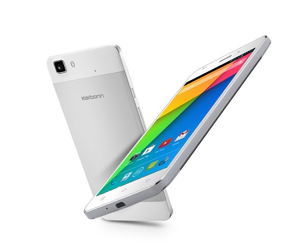
Karbonn has come out all guns blazing in partnership with MediaTek, showcasing as many as three Android 4.4 (KitKat) dual-SIM handsets. The three phones launched are the Karbonn Titanium Octane Plus, Karbonn Titanium Octane and Karbonn Titanium Hexa.

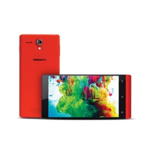
First, the Karbonn Titanium Hexa (in pic above) is the biggest announcement from the company. This is a 1.5 GHz hexa-core phone – MediaTek’s 6591 chipset, along with 2 GB of RAM. Sporting a 5.5-inch full HD display, the phone has a fairly new display quality used called LTPS. It boasts a 13 MP rear camera; and a 5 MP front-facing one. The Titanium Hexa packs in 2,050 mAh battery, and has 16 GB of internal storage, which is expandable via microSD card.

Coming to the other two phones – the Karbonn Titanium Octane Plus and Karbonn Titanium Octane – both are pretty similar in hardware specifications, except the Plus model is a bit on the beefier side. Karbonn’s Titanium Octane Plus features a 5-inch full HD screen. RAM. Under the hood, there’s a MediaTek 6592 chipset (1.7 GHz octa-core processor), and 2 GB of RAM.

The Karbonn Titanium Octane has the same 5-inch screen as the Plus. It has a 13 MP snapper on the back; and a 5 Mp front-facing camera. Packing in 2,000 mAh battery and 16 GB of internal storage, expandable up to 32 GB via microSD card.

Shashin Devsare, Executive Director, Karbonn says, “With this partnership we seek to raise the bar of smartphone experience in the country. Our new portfolio of smartphones is designed in collaboration with MediaTek to provide a powerful mobile experience.” How good the experience will be, is going to an interesting thing to watch from here.

While the Titanium Hexa has WiFi a/b/g/n, the other two support WiFi b/g/n. All three have got Bluetooth 4.0, 3G connectivity, microUSB 2.0 port, and 3.5mm headset jack. All these phones are going hit the market in late April. As far as pricing is concerned, Karbonn Titanium Hexa, available in white and black colour options, will be on sale for around Rs 16,990; Karbonn Titanium Octane Plus for Rs 17,990 and the Karbonn Titanium Octane around Rs 14,490. 

Categories
Tech

Motorola’s Moto X launches in India

The device has a starting price of Rs 23,999, has new features like Active Display, and comes in five colours.
by Manik Kakra | @Manik_K on Twitter

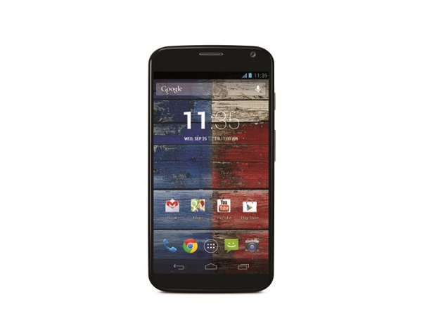
Motorola launched its Moto X smartphone in India today. The launch has been done through the same way it was with the Moto X – available from Flipkart. The Moto X was among the first crop of phones released by Motorola after being acquired by Google.

The phone has a dual-core Snapdragon S4 Pro SoC (1.7 GHz dual-core processor and quad-core Adreno 320 GPU) coupled with Motorola’s own two separate processing for always-on processing, along with 2 GB of RAM. This flagship device boasts a 4.7-inch 720p AMOLED, which means a slightly larger screen that its budget avatar – Moto G. On the back, there is a 10 MP camera (with flash); while the front has got a 2 MP one.

Moto X_woodenApart from the always-on voice feature, the Moto X also comes with something called Active Display, which is similar to Nokia’s Glance Screen, showing you notifications even when the display has been turned off. Other features include the usual ones for an Android 4.4.2 smartphone – WiFia/b/g/n/ac, Bluetooth 4.0, microUSB 2.0, and NFC. Users will also get, just like with the Moto G, 50 GB of free storage on Google Drive for two years.

Flipkart has said that it will only be selling the 16 GB model at launch, and there are five colours available. The eCommerce portal is providing EMI payment schemes for buyers as well as official Moto X cases on discounted prices. While there’s no Moto Maker available for the Indian buyers, Flipkart confirmed that it is selling both the plastic as well as wood (teak and walnut finish) variants of the device. The 16 GB model (plastic) has been priced at Rs 23,999, and the wood finish variant has been launched at Rs 25,999.

Categories
Tech

Nokia launches Nokia X in India at Rs 8,599

This smartphone is Nokia’s first to run Android, and was recently launched at this year’s MWC held in Barcelona, Spain.
by Manik Kakra | @Manik_K on Twitter

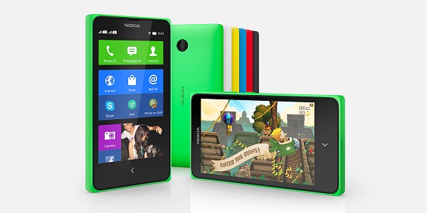
Nokia yesterday launched its Android-based smartphone, Nokia X, in India. The device was first seen at this year’s MWC, and is the company’s first ever smartphone that runs Android (AOSP 4.1.2, to be specific).

Nokia’s X sports a 4-inch 800 x 480 screen, and is powered by a Snapdragon S4 chipset (1 GHz dual-core processor) along with 512 MB of RAM. On the back, there is a 3 MP fixed focus camera. The phone packs in 1,500 mAh battery and 4 GB of internal storage and has microSD card slot too.

Nokia has loaded the phone with its own Fastlane UI, previously seen on its Asha devices, and launcher on top of Android and has made a lot of its own apps as well as third-party apps pre-installed on the device. This dual-SIM phone has also got the Nokia Store for downloading and installing Android apps, and if there’s some specific Android app not available on the Nokia Store, the Store shows you a link to a third-part apps store to download that app from.

As far as your existing in-app purchases (Play Store) are concerned, you would have to repurchase them when after downloading them from the Nokia Store. Google’s API and services are not being used here, and Nokia is providing its own APIs and Microsoft’s cloud services for developers publishing their Android apps on the Nokia Store. The Nokia X Software has its SDK available for developers, but it isn’t open source.

Connectivity-wise, there is Bluetooth, microUSB 2.0, and 3G. The Nokia X is available in Green, Yellow, Red, Blue, Black and White colour options. It goes on sale today and has been priced at Rs. 8,599.

Buy the device at a discount on Flipkart.

Categories
Tech

Motorola: Back with a bang

We review the Moto G, Motorola’s comeback phone in India, and find that it’s a great phone for the price.
by Manik Kakra | @Manik_K on Twitter

Motorola is back in India. And how. Motorola has been in the news lately and for some good reasons. The company has been recently bought by Lenovo, but it has continued to make decent strides in the mobile space to capture market share other than the high-end smartphone market. Moto G announced the company’s comeback to India, so let’s take a look at what this Moto is all about.

Hardware and design

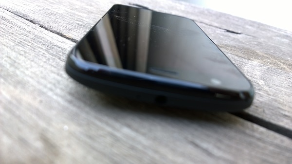
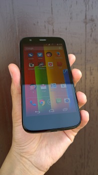
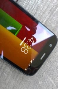
The Moto G (XT1033) has a subtle design. It’s, what I would call, simple yet elegant. As soon as you hold the device, you realise it’s a bit on the heavier size, which doesn’t appear to be the case from its height and width. Unfortunately, the back gets a lot of smudges and fingerprints very quickly. The front is dominated by the 4.5-inch screen – onscreen keys, mind you. The usual front-facing camera, speaker grill and sensors on its top, and primary mic and the microUSB port on the bottom.

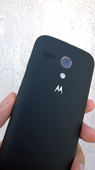
The right side panel hosts the Power/Lock button and Volume rockers – both protrude considerably but don’t feel fragile; while the other side is plain with no buttons or ports. The 3.5 mm headset jack, along with the secondary mic, sit on the phone’s top. Coming to the rear, you get the 5 MP camera with an LED flash, loudspeaker grill, and the Motorola logo dimpled on the rear cover. The device is a bit thick in the middle and does fit very nicely into your hand, thanks to its glass-plastic layer. The rear cover can be pulled off, revealing the battery cell, two SIM slots and the usual circuitry.

Screen

Coming to the phone’s screen, the 4.5-inch 720p IPS panel is definitely one of the best things about this Moto. You get a clear and bright screen with good viewing angles and it is probably the nicest screen out there for a phone that is priced this much.

Camera

This one isn’t so good. The 5 MP (AF) snapper on the Moto G is probably the camera you were expecting from a phone priced under Rs 15,000. It exists just to take a decent shot with great conditions, but performs badly, as expected, when thrown in day-to-day usage under various light conditions. You can click a photo by tapping anywhere on the screen, and can view existing photos or change settings by swiping from sides – similar to Nokia’s Lumia handsets. The camera is one area where Motorola seems to have cut corners keeping the cost factor in mind. Here are a few sample shots – http://imgur.com/a/3c4za

Call quality

The call quality on the Moto G is top notch. You aren’t going to face any unusual network reception issues here. Having said that, a few days after updating to Android 4.4.2, the unit started disconnecting to WiFi access points when no very near to the points. It’s a major and known bug, and a firmware update to fix this is coming pretty soon.

Sound

In-ear sound quality on the phone is more or less good. I wasn’t at all disappointed with the audio performance I got from this budget device, and found the default headphones to be good. The loudspeakers were also loud and clear, with a bit of distortion mostly on the two highest volume levels, and it’s hard to tell it apart from a high-end phone speaker.

With its 2,070 mAh battery, the Moto G, quite surprisingly, lasted me for a full day more often than not. Used for a lot of music, Email, Twitter, a few images and calls, the Moto G’s battery backup is as good as you would expect from such a device.

Software and performance

The Moto G, running on Android 4.4.2 (previously 4.3), is powered by Qualcomm’s Snapdragon 400 SoC (1.2 GHz quad-core processor, Adreno 305 GPU), along with 1 GB of RAM. This is another great thing about the device – its performance. The Moto G has probably the smoothest experience for a budget Android device. So much so, usually I would recommend a Windows Phone device when somebody has their budget under 15k, because you don’t associate a budget Android phone with snappy performance, but the Moto G does exactly the opposite. The phone runs smoothly, apps run and switch quite quickly, and the only time I saw some considerable performance issues was when I played a game like GT Racing 2. You could say that the performance department scores in favour of this device.

Motorola has made a few agile yet noticeable additions to the stock Android OS. The company hasn’t tried to change most things. There’s Assist to help you get around the phone for the first time, Motorola Migrate to help you transfer data to and from other Android and iOS devices, and a few other tiny touches like the Motorola camera app. Thanks to no heavy customising, we already have the Android 4.4.2 KitKat upgrade for the phone, and there’s nothing much wrong with the whole OS. If you are familiar with Android 4.4.2, you would feel at home using this device. There’s not too many changes, so it’s not very worthwhile to go deep into the design and UI part. 

The device comes in two storage variants – the 8 GB and 16 GB, and there’s no microSD card option, but you do get free 50 GB storage space on Google Drive for two years. Also, you don’t get any separate USB cable in the box, but that’s not really a problem since it uses the standard microUSB to USB cable (and also supports USB on the go).

Concluding this review, the Moto G gives what not any other device has done so far – a fun, non-frustrating experience to an Android user that doesn’t want to shell more than Rs 15,000. Things should only get better from here in terms of choice of phones in this price range. Snappy performance, good battery backup, average camera, decent build quality and best screen for a phone under 15k, Motorola has done a job well done, and it is not very surprising that the company decided to mark their Indian comeback with this handset, which has already become its best-selling device till now. If you’re looking for a smartphone in this price range, the Moto G (along with the usual Lumia 620 and Xperia L), is certainly the one to consider while deciding what phone to pick. 

Buy this phone on Flipkart for a discount.

Categories
Tech

Review: Samsung Galaxy Grand 2

A good screen, decent audio and camera come with Samsung’s latest release, but will the phone compete well with rivals?
by Manik Kakra

Samsung’s Galaxy Grand was a hit in the mid-rane segment. Many were attracted by the large-screen size and decent package it provided, but were left unsatisfied by the laggy performance and below average battery backup. With Grand 2, Samsung has made a few changes, so let’s see how good the Galaxy Grand 2 really is.
Hardware and design

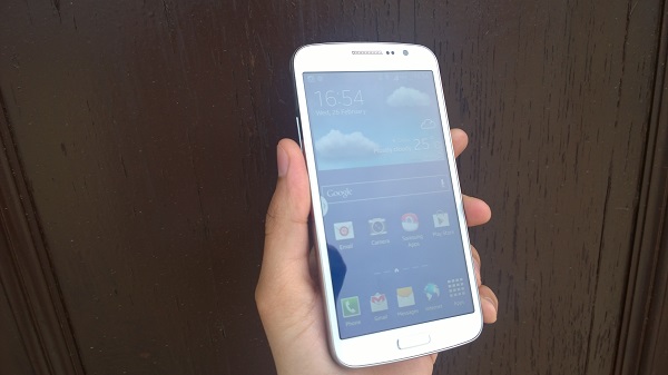
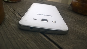
Samsung’s Galaxy Grand 2 (G7102) follows pretty much the same form factor and material like the Grand and S4. The square looks combined with average matte plastic material make the Grand 2’s build and design. Having slightly thinner bezels than its predecessor is certainly a welcome change.

On the front is a raised Centre (Home) Button with chrome-like ring around it, Back button on the right, and Menu/Option on the left. Above the 5.2-inch screen are the Duos branding, front-facing camera and the usual sensors.

Things get interesting on the back. Samsung has gone with the same faux-leather, seen on the Note 3, back cover on the Grand 2. It looks decent, but as soon as you hold the device and start checking it, you get a clear idea that this is plastic and not leather. With stitching surrounding the back’s boundaries, it does look nice. On the rear is the 8 Mp camera along with an LED flash, loudspeakers grill right next to them, and Samsung branding towards the middle.

On the sides, there are the Volume rockers on the left, and Power/Lock key on the other side. The sides have a silver line across them and the buttons follow the same layout. These buttons are raised enough to give you a good feedback on being pressed. Again, the material and finish of these buttons could have been better. On the top, you have the usual 3.5mm headset jack, while the bottom sports the microUSB port.

Pulling off the rear cover reveals the 2,600mAh battery cell, two SIM slots and the microSD card slot, apart from circuitry, other bits and pieces of the camera module.

Camera
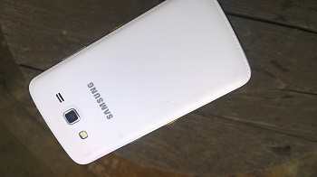
The Grand 2 boasts an 8 Mp camera along with an LED flash. The Camera app comes with a host of modes, settings and editing options, which are not difficult to use. Samsung has done a good job in the Camera UI department, making most of the settings accessible without too many taps. See a few sample images here.

The camera performs well. You get clear, decent colours, while low-light performance isn’t too impressive; the camera is more than capable of taking good shots in decent conditions.

Speakers

The speakers on the Grand 2 are pretty loud and audio is mostly clear. In-ear with the default headsets is clear, quite loud and doesn’t disappoint.

Screen

Coming to the 5.2-inch 1280×720 screen, it doesn’t let you down. The colours appear quite vivid, with a much higher resolution than the original Grand (and rightly so), and videos come out richer. The screen is definitely one thing that needed to be improved and Samsung seems to have done exactly that without over-sharpening the colours.

Call quality

As far as call quality is concerned, there’s nothing to complain about. I didn’t notice any unusual network reception, and was satisfied with the call and network reception of the phone.

During my usage, I got about 20 hours of backup from the phone battery on a single full charge. With sync on, lots of emails, Twitter, (brightness at 50 per cent) a few videos and calls, you would have to charge the device within a day, more often than not.

Software and performance

The Grand 2 runs on Android 4.3 Jelly Bean, along with Samsung’s TouchWiz UI on top. The overall look and feel of the whole UX very similar to what we have seen on the Note 3 and S4. You get five Home screens by default, and can customise them as and when you want – the usual Android manner.

Swiping top from the bottom of the screen opens up My Magazine, which Samsung’s style of Flipboard – giving you personalised content from your pre-selected online publications. Seen previously on the Note 10.1 2014 Edition, it is a good idea and helpful when you just want to glance through the entire day’s updates for a day.

You can access most of the settings right from the drop-down Menu along with your notifications. Lock screen, which, too, can be customized, gets unlocked by swiping in any direction (default way). App drawer, multi-app view and other nitty gritties remain the same that we have been used to seeing on Samsung’s Galaxy devices. You get around 5.5 GB of storage space (8 GB in total), and can expand storage via a microSD card.

This phone is a much better performer than the original Grand 2. After a few days of usage, you will realise there is a definite improvement in smoothness, resulting in better user experience. Having said that, we have Samsung’s own devices with better performance like the Note 3, but this comparison won’t be a fair one. TouchWiz does take its toll, but it certainly gives the user a few useful additions – Camera app, app folders, etc. – of stock Android. Google Now has been there for quite some time now and Samsung’s devices also come with the proprietary S Voice. It is basically a voice assistant that is far from being integrated into the OS and helpful than Google Now. I hardly ever used it, mainly because it recognised my voice less frequently and the overall experience was just average.

Concluding this review, the Grand 2, with its good screen, decent audio and camera, does bring a lot of things to the sub 23k phone range.  Performance isn’t really bad, but we could have had a much better material quality, especially now that Samsung admits slimy plastic isn’t always the way to go with its Galaxy range of devices. There are a few worthy devices that the phone competes with – Nexus 4, Lumia 820 – and it will be interesting to see if Samsung is able to continue its growth in this product range this year.
Categories
Tech

WordCamp Mumbai arrives this month

All WordPress bloggers and developers, beginners and experts can be part of two-day WordCamp event on March 15 and 16.
by The Editors | editor@themetrognome.in

This is one event that users and developers of WordPress.com should not miss – WordCamp Mumbai 2014 comes to the city on March 15 and 16, 2014, and all users are invited.

The event will take place at Manik Sabhagriha, Bandra Reclamation. For event details and list of speakers, see here.

As per the organisers, “[The event] promises a lot of learning and interaction between a vibrant WordPress community of bloggers and developers.” Also, the event is a ‘Pay what you want’ one, where the attendee decides the price of the ticket you want to buy. However, the minimum amount payable is still Rs 300.

(Picture courtesy WordCamp Mumbai on Facebook)

Exit mobile version