Categories
Tech

Samsung launches Galaxy Alpha

Priced at Rs 39,990, the new smartphone is said to the forerunner for many more devices from the Samsung stable.
by Manik Kakra | @Manik_K on Twitter

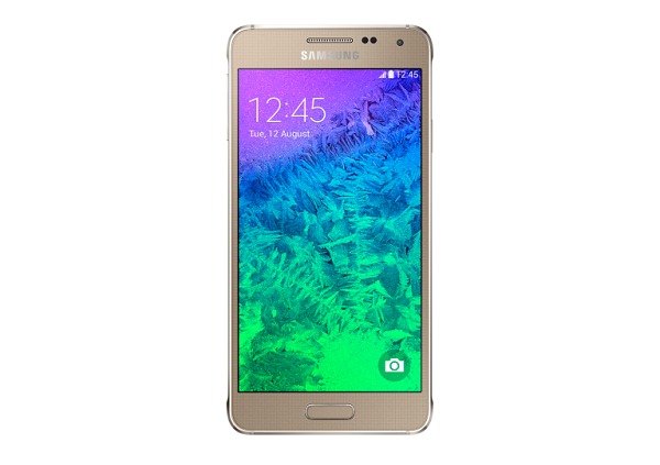
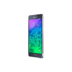
Samsung recently launched its new Android 4.4.4 smartphone in India, the Galaxy Alpha. The Galaxy Alpha, touted by the company as the beginning to many more exciting devices from them in the future, sports metallic sides and a polycarbonate back cover. Samsung is quite vocal about the phone being stylish and premium.

Galaxy AlphaWeighing 115 grams and just 6.7 mm thick, this new phone sports a 4.7-inch (1280 x 720) Super AMOLED screen, and is powered by Samsung’s own Exynos SoC (1.8 GHz quad-core processor + 1.3 GHz quad-core processor) coupled with 2 GB of RAM. Loaded with 32 GB of on-board storage, there’s no storage expansion option. On the back, there’s a 12 MP (CMOS) (AF) camera (with an LED flash) that can shoot Ultra HD videos while the front has a 2.1 MP (CMOS) camera.

The Galaxy Alpha is equipped with a 1,860 battery unit, and is compatible with the Gear line of wearables. Other features include Bluetooth 4.0, WiFi, NFC, 4G LTE connectivity, GPS, and FM Radio.

It will go on sale from next week in charcoal black, dazzling white and frosted gold for Rs 39,990.

Categories
Tech

Sony launches Xperia Z3 and Xperia Z3 Compact in India

The phones are priced at Rs 51,990 and Rs 44,990 respectively. We take a quick look at the specs on offer.
by Manik Kakra | @Manik_K

Continuing with its six-month launch cycle, Sony yesterday released its new flagship and its compact version – the Xperia Z3 and Xperia Z3 Compact in India.

These new Sony devices are IP55/ IP68 certified, meaning they’re water-proof and dust-resistant. Both are powered by Qualcomm’s Snapdragon 801 chipset (2.5 GHz quad-core Krait 400 processor, Adreno 330 GPU), along with 3 GB of RAM in the Z3 and 2 GB in the Z3 Compact.

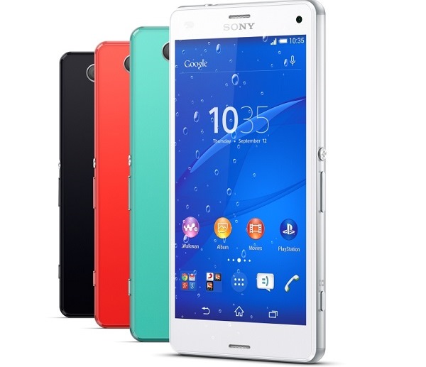
Measuring 127 x 64.9 x 8.6 mm, the Z3 compact features a 4.6-inch 1280 x 720 LCD touchscreen and weighs about 130 grams. On the hand, the Z3 measures 146 x 72 x 7.3 mm, featuring a 5.2-inch 1920.1080 full HD screen and weighing around 150 grams.

Z3_1On the back, they sport a 20.7 MP (EXMOR RS) camera with an ISO count of up to 12,800; while the front has a 2.2 MP camera. Sony has also updated its camera app, bringing a few more shot sets like 3D effects and sharing your other Xperia devices via WiFi to shoot videos. On the audio side of things, the phones support FLAC files natively and are loaded with 24KHz/192 sound capabilities.

Running on Android 4.4.4, the phone has Sony’s Xperia UI on top. Buyers get three months of free streaming and download options from Sony’s JIVE app.

Connectivity-wise, there is Bluetooth 4.0, WiFi, NFC, GPS, 4G LTE, and FM Radio.

While the Z3 is equipped with a 3,100 mAh battery unit, the Z3 Compact has a 2,600 mAh battery unit.

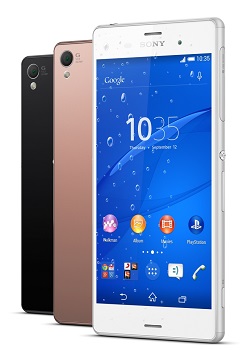
The Z3 is comes in copper, white and black colour options, and the Z3 Compact in green, orange, white and black. Both these phones are available now, with the Z3’s MRP being Rs 51,990, and the Z3 Compact’s Rs 44,990.

Categories
Tech

Jolla launches in India

Finnish company’s smartphone priced at Rs 16,499 has a great OS, but will need more features to make a difference.
by Manik Kakra | @Manik_K on Twitter

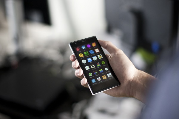
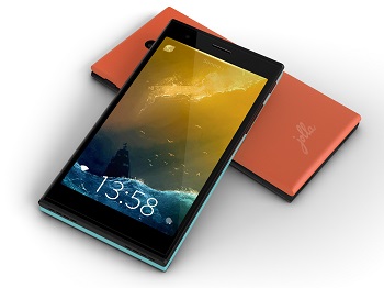
Finnish handset maker, Jolla, has officially stepped into the Indian market. The company unveiled its Jolla smartphone, which is available exclusively on Snapdeal. The phone, which has been out and released in several countries months back, is the first smartphone that runs on Sailfish OS. The OS is based on MeeGo (as well as Mer Project and Nemo Mobile), which was Nokia’s own project a few years back and is now taken ahead by some of Nokia’s ex-employees.

Jolla_Jolla (pronounced ‘Yolla’) sports a 4.5-inch (960 x 540) screen, with the option to change the rear cover as per your choice from a range of colours made available by the company. Under the hood, there is a Snapdragon 400 SoC (1.4 GHz dual-core processor, Adreno 305 GPU), along with 1 GB of RAM.

The phone is powered by a 2,100 mAh battery unit and comes with 16 GB of internal storage, which is expandable. On the back, there is an 8 MP (AF) camera (with an LED flash); while the front has a 2 MP camera.

Connectivity-wise, there is Bluetooth 4.0, microUSB 2.0, 4G LTE (limited support), WiFi b/g/n, and GPS.

The phone has been priced at Rs 16,499, and is available from Snapdeal. The first 90 buyers will also get a special VIP box with the phone.

With so many affordable, value-for-money handsets available in the market today, it’s going to be a tough road ahead for Jolla. The OS appears refreshingly different from what we have on pretty much every smartphone out there – Android, iOS and Windows Phone – but would require a lot more to get some going into the Indian market.

Categories
Tech

Review: Motorola Moto G (2nd Generation)

What’s new and what isn’t with the second generation Moto G? We do a spot check and come away impressed.
by Manik Kakra | @Manik_K on Twitter

Ever since Motorola has come back into the Indian market, the company’s motto has been to provide a richer Android experience to devices that are priced well below the flagships, something that not many have been able to achieve. The original Moto G was quite great device for its price and it did (still doing) really well in the market. With the new Moto G, Motrola has tried to keep things rather simpler – a refreshed model without too many changes. Does it live up to its predecessor’s level? Let’s try and find out.

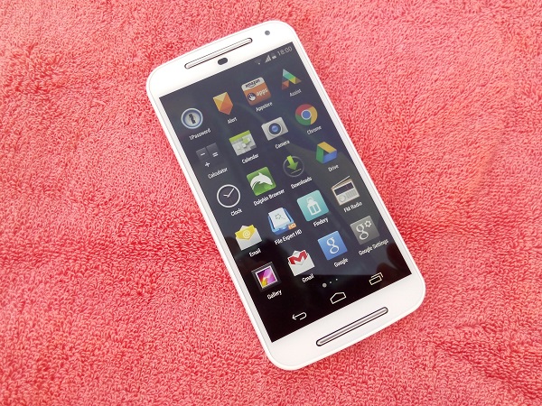
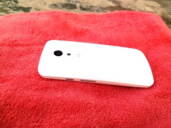
The looks. Motorola’s new Moto G (XT1068) follows a different design than the original one, and something that, at least from the front, looks closer to the Moto E. On the white model, the (two silver strips) front-facing speakers (stereo) stand out surrounding the 5-inch 1280 x 720 LCD IPS touchscreen. While the front panel has Gorilla Glass on top, the rear is made up of soft matte plastic material with a slight curve across it.

The phone, at about 150 grams, feels hefty and fits pretty well in your hand. One half of the sides is matte (from the back) and the other is gloss (front part), giving you a solid grip. Other components on the front include the 2 MP front-facing camera, LED notification light, and sensors. The back has the ‘M’ logo placed in sort of a dimple shell, new 8 MP camera with an LED flash.
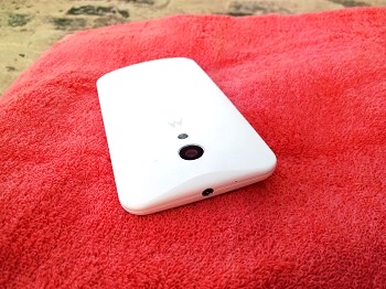
The top houses the 3.5mm headset jack and secondary mic; while the bottom gets the microUSB port. The left side panel is absolutely plain; and the right one houses the volume rockers and Power/Lock key. These physical keys are required to be pressed hard and could have been given a better finish. Just to add, the screen is, as usual, prone to smudges and fingerprints, while the matte back isn’t.

The phone is equipped with a larger 5-inch HD screen, and the panel seems to be a different one from the original Moto G. It is bright, slightly better to operate under direct sunlight, has decent viewing angles and colours also appear sharp. If you’re used to a full HD panel, you might notice pixels on the screen, but other than that, there’s not much to complaint about it.

This dual-SIM handset comes loaded with Bluetooth 4.0, WiFi b/g/n, 3G connectivity, and GPS. As far as connectivity is concerned, the phone performs well. There are no shortcomings regarding network reception, GPS locking-on or Bluetooth use.

The phone’s call quality is on par with flagships and the volume level is slightly higher than the original Moto G, if I remember correctly. Coming to the in-ear sound, the default headsets are pretty decent, but they are not comfortable to wear (depending on your size). They keep coming off when used during commuting and make for a rather sub-par experience. On the other hand, the loud speakers on the Moto G are much improved. The front-facing stereo speakers are loud and clear, though not as punchy as you would like them for your videos and games, but they are noticeably better than many handsets in the mid-range.

Camera. The camera seems much improved from the one on the original Moto G. It can not only take more detailed shots but also less grainy. You can view a few images here: http://imgur.com/a/ymXMP

As you can see, images are more detailed, less noisy and colours appear brighter. The phone’s native camera app, though, is still not very impressive. Though low-light performance also seems to score better, there is still a lot of scope of improvement in this aspect. The focus mechanism needs work. There are just a few basic settings to choose from and you might want to try third-party camera apps.

Battery. The new Moto G is equipped with a 2,070 mAh battery unit. The phone’s battery life is quite good. More often than not, it lasted me a day with around 10 per cent still in the tank. The usage mainly included almost all WiFi for Emails, Twitter, a few videos on the YouTube app, 5 to 10 minutes of calling and half an hour of in-ear music. If you are okay with the Power-saving mode, you can stretch the battery life further.

Performance and software. The Moto G (2nd Generation) is powered by Qualcomm’s snapdragon 400 MSM8266 SoC (1.2 GHz quad-core processor, Adreno 305 GPU), along with 1 GB of RAM. The phone runs on near-stock Android 4.4.4 with a few little additions done by Motorola. Motorola has included its usual set of apps and services like Assist, Help, Migrate and Alert. The phone feels smooth to operate and doesn’t stutter while browsing the Web, playing games or just navigating through the OS.
One thing worth mentioning is that going to and from one app to another, you will see that apps take a bit more time to load than on high-end phones. This is mainly due to Motorola not upgrading the RAM size. Otherwise, this is a capable smartphone that doesn’t often lag or show signs of freezing in the OS. If you have used a Nexus device in the last two years, or one of Motorola’s recent devices, you will feel at home with the new Moto G. The whole look and feel is that of stock Android 4.4.4, and the next major upgrade is in the pipeline within the first three months of Google releasing it. For storage purposes, you get over 12 GB of space and also the option to use a microSD card of up to 32 GB size.

Wrapping up, the new Moto G can be called as a slight refresh to the original one. With Motorola keeping screen resolution, RAM, SoC and battery unit the same, there mainly only a couple of big changes made. But it is not to say they’re completely wrong in doing so. With better camera, good battery life and screen, and decent design, the new Moto G is one of the best performers in this segment. If you already own a Moto G, then you’d do better not to buy this, but if you’re looking for an Android smartphone within Rs 15,000, you can surely check out Motorola’s newest mid-range offering.
Categories
Tech

Google finally unveils Android One

Yesterday, three phones were launched to flag off Android One, from Micromax, Karbonn and Spice. More tie-ups are to follow.
by Manik Kakra | @Manik_K on Twitter

Google unveiled its long-talked about project, Android One, in India on Monday, September 14, 2014. The project is Google’s take on the low-end devices that do not usually get OS updates or provide a good, consistent experience. But more on that later.

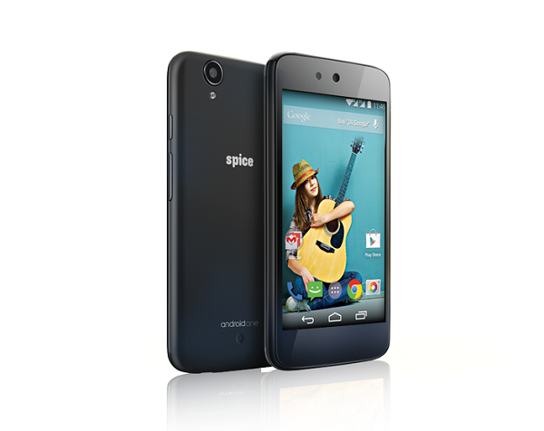
First off, these phones were launched to flag off Android One – Micromax A1, Karbonn Sparkle V, and Spice Dreams Uno.

Yep, the first three OEMs to join Android One are Indian’s Micromax, Karbonn, and Spice. All these phones have the same internal hardware and run on the latest Android 4.4.4 OS (near stock Android). The differences between them arise from the colours available, material used and looks.

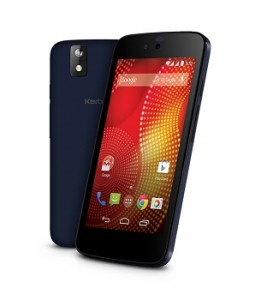
Karbonn-Sparkle-VThe phones sport a 4.5-inch 854 x 480 touchscreen, and weigh around 140 grams on an average. Under the hood, there is a MediaTek 6582 SoC (1.3 GHz quad-core processor, Mali 400MP2 GPU) coupled with 1 GB of RAM. On the back, there is a 5 MP camera (with an LED flash), which can record 1080p videos at 30 FPS; while the front gets a 2 MP one. These dual-SIM phones come with 4 GB of on-board storage space expandable up to 32 GB (you get additional 10 GB online storage with the Spice phone); and carry a 1,700 mAh battery unit.

Connectivity-wise, there is Bluetooth, microUSB 2.0, 3.5 mm headset jack, FM Radio and 3G support. You can buy any of these phones for Rs 6,399 from online stores, depending on which handset you want, and later they will be available in retail stores as well.

Talking about Android One, Sundar Pichai, Senior Vice President, Android, Chrome and Apps, was clear that they want to provide quicker OS updates and a better user experience for devices priced around $100. Google is joining hands with more manufacturers like HTC, Lenovo, Xolo, to name a few, as well as Qualcomm on the silicon side. The project will soon be launched in Sri Lanka, Indonesia, Pakistan, and Philippines.

Airtel users will get 200 MB of free data bundle for the first six months for their app updates and OS updates. It is not clear whether this data bundle also includes data surfing and other needs. You can order the Spice Dream Uno here, Micromax A1 here and Karbonn Sparkle V here.

Categories
Tech

Review: Gionee Elife S5.5

We study the world’s slimmest smartphone, its overall performance and how well it stacks up against its competition. Hint: not too well.
by Manik Kakra | @Manik_K on Twitter

Gionee launched the Elife S5.5, the slimmest smartphone, about five months back. A lot has been said and written on the device since then. Here’s my review of the phone.

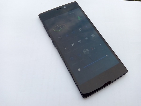
During the five months of its launch, there have obviously been several smartphone launches in India, but Gionee’s ‘slimmest smartphone’ title remains intact with it. The Elife S5.5 is just 5.5mm thick and is quite a looker. With glass on the back and front panel, this Gionee phone doesn’t follow ‘run of the mill’ material and design.

The first thing you will notice is how light and slim it is, and how well the glass has been put along on the back. Though both the front and back are prone to dust and smudges, there’s a slight oval shape with curves on the top and bottom of the phone’s body and edges, which are matte. The front also houses the 5 MP front-facing camera, receiving speaker grill, three capacitive buttons – Menu, Home, and Back – on the screen’s bottom.

The left side panel has the volume rockers and Power/Lock key, and the buttons don’t really gel well with the body. Plus, you have to press them a little firmly in order to operate. The right side panel only has the micro SIM card slot. Oddly enough, the 3.5mm headset jack has been placed at the bottom; while the microUSB port is on the top.

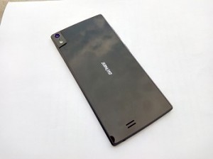
Apart from aluminum edges, one interesting thing the company has done on the sides is this slanted sides that join the sides with the rear. This should probably help you grip the phone better. Coming to the back, the 13 MP camera, along with the LED flash and secondary mic, are tucked on the left upper corner and the Gionee logo is in the middle, while the speaker grill is near the bottom. The overall look and feel of the phone is very nice and you won’t feel like there’s a loose part anywhere on the body.

The Elife S5.5 has a 5-inch 1920 x 1080 full HD AMOLED screen, which does its job well. The colours look vivid, videos look pretty decent and viewing angles are also not really bad. Though the screen doesn’t impress when used under the sun, it is more than capable for you to watch high resolution videos, or play games.

Coming to the camera, the phone is equipped with a 13 MP snapper. Gionee has done a good job with the camera. You can take a lot of good, sharp images with this phone. It tends to struggle a bit in low-light conditions and can give noisy images when used indoors. Having said that, this camera doesn’t disappoint and is capable of taking really nice photos. Here are a few sample images.

The phone’s audio quality is its weak point. The sound quality, whether loudspeaker or in-ear, is not much to appreciate. The volume misses the required ‘punch’ and watching videos on it is not a good experience, especially with how much it can distort at times.

As far as connectivity is concerned, the smartphone packs 3G connectivity, Bluetooth 4.0, WiFi a/b/g/n, and microUSB (supports USB on-the-go). Connectivity options work just fine and signal reception is also okay.

Coming to the phone’s battery life, it paints a rather sad picture. Packing in a 2,300 mAh battery unit, the phone usually gave about 16 hours on a single charge. There surely needs to be a better hardware and software combination in place so as to give improved battery life.

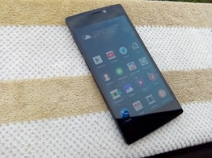
Talking about the phone’s performance, the smartphone is equipped with the MediaTek MT6592 SoC (1.7 GHz octa-core processor, Mali 450 GPU) and 2 GB of RAM. The phone runs on Android 4.4.2 (recently updated) with Gionee’s Amigo 2.0 UI on top. The software follows a similar pattern we have seen on a few other OEM skins. There’s no separate app launcher and all your apps’s icons are placed on various Home screens. You can lock the screen by swiping the clock downwards or by pressing the lock button. You can unlock the screen either from the button or by double-tapping the screen.

Gionee has made a few changes with its Amigo UI. The default music player, notification bar and icons look much better and go well with the overall look and feel of the OS. Having said that, the Amigo UI still has a lot to catch up when it comes to performance and fixing bugs. You will be disappointed to note that the phone isn’t very smooth for day-to-day usage and there are a few bugs, like the music player exits or lock screen stops to respond, that need to be fixed. With the likes of the Moto X and Mi 3 giving this phone a run for its money, it will lag behind given how slow it performs at times and how less responsive the whole software feels.

All in all, the Gionee Elife s5.5 again shows that Gionee is rather capable of producing great hardware and that they need to really pull their socks up for the software part. The phone has a lot going for it – screen, camera, design appeal, but, on the other hand, its software doesn’t give a very satisfying experience. Available for around Rs 20,000 (includes a flip cover, two screen guards), the device has a hard battle up its sleeves considering how the Indian smartphone segment is shaping up lately.

Exit mobile version