Categories
Tech

Review: Samsung Galaxy Note 4

Samsung’s newest smartphone has everything you need and much more – and it’s larger, with a smarter S Pen, too.
by Manik Kakra | @Manik_K on Twitter

Just about every smartphone manufacturer is coming out with large phones. And why not, people want to consume more content, watch videos, see more high quality images, and more. It won’t be wrong to say that if there’s one company who started this trend and is leading it, it’s Samsung. The Korean giant’s Note series is one of the most popular smartphone names, and they’ve just come out with the Galaxy Note 4 priced at Rs 55,000.

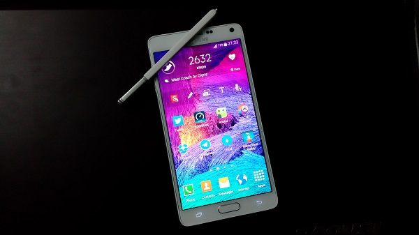
The looks. Samsung’s Galaxy Note 4 (SM-N910G) is (after the Galaxy Alpha) is what the company’s design will be for its near future. The phone comes with a different chassis that you wouldn’t find in any of the previous Note handsets. With dual chamfered edges (squared at four angles) and polycarbonate rear cover with textured surface, the phone feels very different and better from the Note 3 or even the Galaxy S5.
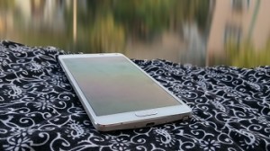
Of course, the device is really large (which is a given for a Note smartphone), but it is nice and not too uncomfortable. The front, with the 5.7-inch Super AMOLED, also sports sensors on top, 3.7 MP front camera, ear speaker grill in the middle next to the Samsung logo, and the LED notification light on the other side.

The screen’s bottom has the physical Home button with Recent apps key on its right and Back key on its left (no Menu key). At the bottom, apart from the noticeable curved back cover, you see two mics, microUSB 2.0 and the S-Pen slot that embeds in the rear neatly. The top has the 3.5 mm headset jack, another mic, and the Infrared port.

On the back, the textured surface houses the 16 MP camera with LED flash and Heart rate monitor, Samsung logo, 4G sign and loudspeaker grill (going from top to bottom). There are volume rockers on the left; and the Power/ Lock key on the other side, finished similar to the Galaxy Alpha. The Note 4 is a large device, and Samsung has done most things right to get the design correct including thin bezels and durability, and it’s a good thing if Samsung follows up on this design line for its upcoming flagships.

The Note 4 is a lot about that 5.7-inch Super AMOLED that has a curved Gorilla Glass 3 on its top. The glass on top gels very well with the phone’s body to give you a smoother experience while scrolling on the screen. While there’s some difference between the body and the glass at one side of our review unit, which might welcome some dust at prolonged usage, it isn’t much of an issue and probably even sorted with current retail units.

The screen. This is Samsung’s AMOLED at its best. With a 2560 x 1440 high resolution screen, watching videos is a great experience. What makes it better is reading text, where even finer text would appear very nice and a joy to read. The colours look vibrant, sharp and different from an LCD, which is expected, and the deep black levels are very high. Using the screen under direct sunlight is good too, as it’s readable without having to crank the brightness level to maximum.

Camera. Another interesting feature in the Note series has been Samsung’s camera, which is often the best that the company offers in its line-up. The phone boasts a 16 MP (AF) camera with an LED flash, which can reconrd 2160p at 30 FPS videos, or even 720p videos at 120 FPS. For images also, there are various resolution settings you can choose from. Here are a few sample images.

The camera on the Note 4 can take good, detailed shots. Thanks to the OIS capabilities, its low-light performance is not bad (but it can be dodgy). The camera app is smooth, has plenty of options, and quick to change and select modes from. The selective focus, HDR, etc. work very well, better than on the S5. For those who find it uncomfortable to use the Note 4 to take photos, they have the option to try switching to taking shots by pressing the volume buttons. You could say that the Note 4’s camera is one of the best to come out this year and every kind of user will find something useful in there.
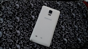
Battery life. Powering up all those bells and whistles is the 3,220 mAh battery unit that is accessible by removing the back cover (and also reveals the microSD card slot and micro SIM slot). More often that not, battery life on the Note phones is said to be among the top few smartphones, but the story is a little less sunny with the Note 4. More often than not, the Note 4 just about lasted me a day, which isn’t bad, but you expect a Note phone to last you a little longer than that. With brightness level at 30 per cent, lots of Emails, S Health, Twitter, half an hour of gaming and music playback, you should be fine for about a day long usage. The phone comes with a higher-capacity for charging the device quicker. The Note 4 gets charged from zero to 50 per cent in half an hour, and fully charged from zero in about 90 minutes, which is great.

Connectivity. The Note 4 has plenty of options and all of which I tried worked just as they should. The network reception on the Note 4 is as good as you need. In-ear call quality is top-notch, too.

Audio. Audio quality of the phone with the loudspeaker seated on the back is pretty good. It is not bad at all for games and videos, but it would have been certainly better had Samsung not gone with mono speakers and also placed them at the front.

Software and features. The Note 4 boasts a Snapdragon 805 SoC (2.7 GHz quad-core processor, Adreno 420 GPU), along with a whopping 3 GB of RAM. Specifications-wise, you need not look elsewhere. The phone runs on Android 4.4.4 with TouchWiz on top.

One of the USPs of the Note series has been its S-Pen. The Note 4’s S-Pen is actually much improved and has a few handy features to work with. As soon as you pull out the S-Pen, after a brief vibration, you get four options in a pop-up. From here, you can choose to make a memo by writing with the S-Pen, take a screenshot and edit it, or take a clipping of what’s currently on your screen and share it, or share an image from one app and paste into another.

The Note 4 also has Samsung’s popular multi-window feature that lets you access and check on more than one app at once. The Multi-Window mode can be enabled by long-pressing the Back button. You can make an app window smaller by swiping from one of the top corners. Many pre-loaded apps like Gallery, Chrome, S Note, Twitter for Android support this functionality and it actually works better than ever. The whole experience of running two apps on your screen at once offers much less stuttering than before.

Performance. The phone is smooth to watch videos, navigate through Home screens as it should be, but it lags a little in Settings. It is smoother than the S5, in my opinion, but with multi window and Gallery opened (just an example), the phone starts to slow. For the most part, the experience is quite smooth and almost lag-free. Samsung has also done a few changes to its software’s look; Settings now shows you most used options at the top followed by the usual list order. You can now lock the screen while watching a video in order to not have any screen operations by mistake by just tapping the Power key within the native Video app.

As far as Home screens and Menu launcher are concerned, the look and feel is the same. The functioning is no different, and I would still say that Samsung could really do with a step up on their icons and font in use. The 32 GB variant has about 24 GB of storage space for the user.

Concluding our review, the Galaxy Note 4 is surely one of the best smartphones out there. It has an excellent screen, a great camera, decent battery life, and improved design and S Pen functionality, so if you are looking for a large screen device and have the required budget, you should surely take Samsung’s latest Note in consideration.
Categories
Tech

This just in: Celkon Millennia Epic Q550

The new Android smartphone comes only in a black variant for now and will have a Windows version in two weeks.
by Manik Kakra | @Manik_K on Twitter

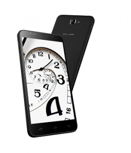
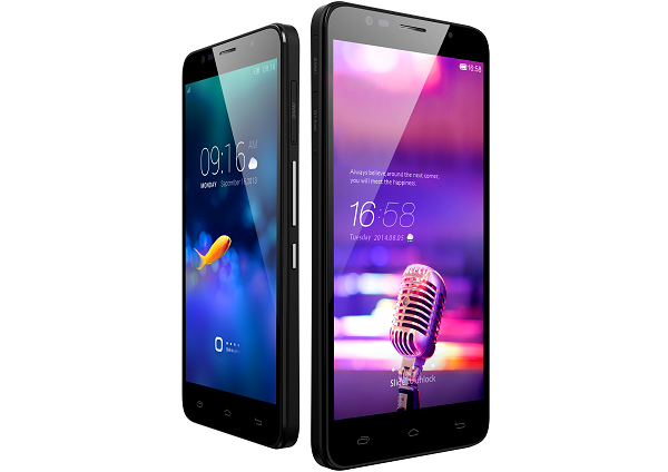
Celkon has launched its new Android 4.4.2 KitKat smartphone in India called the Millenia Epic Q550. The phone sports a 5.5-inch (1280 x 720) screen, is 8 mm thick and weighs about 143 grams.

Q550 Under the hood, there is MediaTek’s MTK 6582 (1.3 GHz quad-core processor) along with 1 GB of RAM. For connectivity options, there’s Bluetooth, microUSB (supports USB On=The-Go), WiFi, GPS, FM Radio and 3G.

On the back, there’s an 8 MP (AF) camera that can record HD videos; while the front has a 2 MP camera. This dual-SIM phone comes loaded with 16 GB of internal storage, which is expandable up to 64 GB via a microSD card. The Q550 is powered by a 3,500 mAh battery unit.

Commenting on the launch, Y Guru, Chairman and Managing Director – Celkon Mobiles, said, “At Celkon, we have always believed in upping the ante, each time we launch an offering. With the new Millennia Epic Q550, we have raised the bar one more time. At just 143 gm weight and 8 mm thick, we have been able to pack  a powerful battery for longer life in a uni-body design at an astounding price tag. We aim to become one of the largest in the country and with many such exciting offerings lined up, we are sure to achieve significant growth this fiscal.”

The company is also planning to launch a Windows Phone device in a couple of weeks, and an Android One device early next year. The phone comes in only black colour, and will be available from retail stores as well as online channels for Rs 10,499.

Categories
Tech

Review: Sony Xperia Z3

We check out the new smartphone from the feted Sony Xperia series, the Xperia Z3, and come away very much impressed.
by Manik Kakra | @Manik_K on Twitter

Sony’s Xperia Z series of smartphones is known for its good design and decent performance. The company made several improvements going from the original Z to the Z2, and it is expected to do the same with the Z3. Its financial health is far from being in good shape as of the last 18 months or so, and a lot rides on this device (along with a range of other phones) to improve that state of affairs. So, does the Z3 live up to expectations?

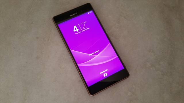
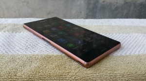
Sony’s Xperia Z3 (D6553) is the company’s latest and best offering. The smartphone follows a similar angular design as its two predecessors, but you will be wrong to say there aren’t any changes made. With rubberised angular edges, slightly rounded (yet flatter than the Z2) sides and overall slim profile, the phone is comfortable for those who are already used to carrying large smartphones. The Z3 also has slimmer bezels than the Z2, meaning more body estate for the screen and less in overall length.

The looks. The front, dominated by the 5.2-inch full HD LCD, has two speaker grills on the screen’s top and bottom, with the Sony logo, sensors and the 2.2 MP front-facing camera and LED light. Coming to the right, you have the microSD card slot and nano SIM card slot housed under a single flap, which still feels flimsy but is slightly better to operate than the Z2’s, and the Power/ Lock key nearer the middle part, Volume keys, which are smooth to touch and protruding just enough to give you good feedback when pressed gently. The dedicated camera key is located just where your right hand (index finger) would be if holding the phone in landscape orientation, with the on-screen navigation keys on your right.

The left side panel locates the microUSB port (under a similar protective flap), magnetic pogo ports for charging the phone using a Sony magnetic dock or for attaching your PS4’s DUALSHOCK Controller to play games. Further down, there is an eyelet for those who still like to carry a thread, a locket, a small cord etc. around their phones these days.

Coming to the back, there’s the 20.7 MP camera on the top left with the LED flash right next to it, NFC and Sony logo toward the middle and the Xperia logo towards the bottom. The whole back panel has got glass on top, meaning fewer scratches, but it’s prone to smudges and fingerprints just like the front. The phone is by no means a compact device, and it probably isn’t meant to be, but there’re a few neat little changes that make it just a bit more comfortable to grip and carry around without losing the Z3’s premium feel and design, and our copper-brown variant stood out just a little more.

Display and screen. The phone boasts of a 5.2-inch TRILUMINOUS LCD. Sony’s Z3 comes with two additional display options – X-Display and Super Vivid mode. With the default mode (third one), the screen is bright, has decent viewing angles and gives nice rich colours for most part. The other two modes aren’t really worth it, especially for watching videos where they just over-sharpen characters and the picture loses out a lot. It has a little better visibility than the Z2, but you will have to really crank up the brightness level to read comfortably. The Z3 has a good screen, but it is still not in the league of the One (M8) and the S5, which, in my opinion, are the best 1080p panels for Android phones today.

Having said, it’s certainly not a deal-breaker and most users should be fine with it for images, Web browsing and even watching videos.

Camera. The Z3 comes with the same 20.7 MP (BSI sensor) camera (f/2.3) we saw on the Z2. Here are a few sample images

The Z3 supports ISO level of up to 12,800, which is higher than that of any other phone today. Users who are comfortable with trying various settings should find it helpful for low-light conditions. The camera app has a lot of editing modes like Background Defocus, AR Effects, HDR, as well as settings like Exposure, ISO, and resolution. Unfortunately, the camera story is similar to the Z2’s which wasn’t very impressive. Images come out quite detailed in good light conditions, but noise seems to be a downside when shooting with the Z3. It performs just okay in low-light conditions. You may find taking photos in 8 MP mode better than any other, and most users will find the overall quality to be just fine. For those interested, the phone can also take full HD videos at 60 FPS and 4K videos.

Connectivity. The Z3’s GPS, 3G, FM radio work fine, though its WiFi does take 1-2 seconds more to get switched on and connect to a known access point than other phones I’ve tried recently. Call quality on the phone is top-notch with no network reception issues or call drops in between during my usage. I still haven’t tried 4G LTE on a device as there’s no network operator offering such a service in Delhi as of now.

Audio quality. In-ear call is loud and clear and so is your voice for the person on the other side. When it comes to audio quality, the Z3 performs well. The front-facing stereo speakers are no match for the One M8’s, they are still not bad and usable for videos and games. The phone supports native FLAC files support, but I couldn’t check how the bundled headsets perform with it as Sony didn’t send us a pair of those.

Battery. It will be safe to say, the Xperia Z3’s most compelling offering is its battery life. More often than not, the phone lasted me more than day with battery level still around the 15 per cent mark. During my usage, I didn’t have to charge it from zero to full more than once a day except for once when the phone was used intensely for watching videos throughout the day. If on moderate usage, the Z3’s 3,100 mAh battery unit may even give you close to one and a half day of usage. And of course, you can stretch it if you use the built-in STAMINA and Ultra STAMINA modes by sacrificing on the phone’s features.

Software and performance. The Xperia Z3 runs on Android 4.4.4 with Sony’s own Xperia UI on top. The Xperia UI is a known entity on Android space and Sony hasn’t much to what it was on the Z2. Sony could have toned down the number of pre-loaded apps and could have made its own services like What’s New clear of the Google Now swipe-up gesture, but they haven’t.

Under the hood, there is a Snapdragon 801 SoC (2.46 GHz quad-core Krait 400 processor, Adreno 330 GPU) coupled with 3 GB of RAM. There’s about 11 GB of available storage space and you can increase it with a microSD card.

It won’t be wrong to say that this is Sony’s best performing Android phone. The Z3 is smooth to operate, doesn’t stutter when switching from one app to another, can handle full HD videos (may miss on audio sync depending on the codec used) and can handle intensive games without dropping many frames. If you have used any of the last two Xperia Z devices, you will feel at home with the Z3’s software. With similar Home screen setup, icons, Menu launcher behaviour and settings, Notification bar and quick toggles, Lockscreen, Sony’s usual set of widgets and Settings, the Z3 has a familiar monochromatic OS that one often associates with Sony’s Android flagships.

The only downside that Sony really needs to cater here is that this phone requires to be attached to a PC to download and install an OS update. It’s not acceptable that a technology company like Sony can’t provide Over-The-Air updates in this day and age. Having said that, the software and performance part is more than satisfactory, and the whole Xperia package on the Z3 remains one of the best when it comes to Android.

Wrapping our review, the Z3 is one of Sony’s best ever devices. With great battery life, good screen, improved design, decent camera and IP68 rating meaning a water-resistant and dust-proof phone, the Z3 is indeed a compelling offering, and if you’re looking for a high-end smartphone, you should definitely check the Z3 out.


Categories
Tech

Review: Touchtalent app

This is an app that allows you to showcase your art and connect with, hire other users for professional purposes.
by Manik Kakra | @Manik_K on Twitter

There are quite a few smartphone apps that allow you to share photos, rate them and comment over them, but there are hardly any apps that allow you to actually showcase your creative side and earn from it. Touchtalent is one such app. To put it in a nutshell, Touchtalent is a Web community where people showcase their art. As a user, you can follow many other people that you feel have some worthy content, if or you want to connect with for working alongside.

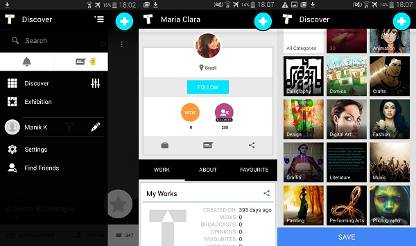
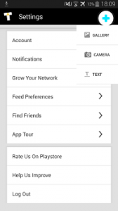
Touchtalent appTo start with, you can either use your Facebook or Google+ Account, or choose to sign up with your Email ID. From here, you can then upload your photos, graphical art, design, follow others and even message them right there. Plus, there’s an option to hire a person, but I couldn’t really check that, but it probably is there if you want to partner with another person regarding some project that you feel they are good at (looking at their collection).

The app (I tried it on Samsung’s Galaxy Alpha, running on Android 4.4) is available for Android and iOS. It works smoothly and looks just as an app that revolves around art should. The App’s UI is simple and user-friendly. The first time you try it, you won’t be confused. As soon as you join in, you’re provided with a link to see other Touchtalent users from your country.  The left pane gives you options like Discover (to see popular users), Exhibition (for special occasions), Settings, your Profile, and the option to add your Social Profile. You can upload a photo from your phone’s Gallery or take a photo from the camera right from the app. Your feeds show you collections of people you will follow, and from there you can visit a user’s Touchtalent Profile, use a picture as your wallpaper, Star it, or share it to another app. Every time a person view your Profile, or follows you or likes it, you get a notification, which you can opt out from the app’s settings if you like.

To wrap it up, Touchtalent is a worthy place to check and explore if you want to showcase your art. The community seems active and something that most users will feel like interacting with.

Categories
Tech

Lenovo launches Vibe X2

Launched at a price of Rs 19,999, the new ‘three layered’ Android smartphone goes on sale on Flipkart today onward.
by Manik Kakra | @Manik_K on Twitter

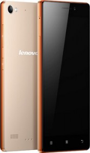
Lenovo recently launched its brand new mid-range Android smartphone called the Vibe X2. The X2, part of the Vibe series, boasts a 5-inch full HD touchscreen.

Vibe X2_The USP of the phone is its ‘three-layered’ body that consists of three distinct colours to form the phone’s body, which is about 7.3mm thick and weighs 120 grams. Under the hood, there’s a MediaTek MT 6595 SoC (1.7 GHz quad-core + 2 GHz quad-core, Series6 PowerVRGPU) along with 2 GB of RAM. The new Vibe X2 is powered by a 2,300 mAh battery unit, and the company also unveiled a battery accessory, priced at Rs 1,999, (termed it as the X2’s fourth layer) to attach with the device that makes the total capacity 4,600 mAh.

On the back, the phone features a 13 MP (AF) camera; while the front has a 5 MP camera.  There’s 32 GB of on-board storage. The device runs on Android 4.4.2 with Lenovo’s own UI on top. The company says it will update the X2 and Z2 straight to Android 5.0 next year without giving them Android 4.4.4 update in between. Connectivity-wise, there’s 4G (LTE), 3G, Bluetooth 4.0, microUSB 2.0, FM Radio, NFC, WiFi b/g/n/ac, and GPS.

The phone will go on sale exclusively on Flipkart starting today, November 10, at a price of Rs 19,999.

Categories
Tech

Review: Samsung Galaxy Alpha

Samsung has upgraded its design and done away with some irritating features, but little else has changed for their newest phone.
by Manik Kakra | @Manik_K on Twitter

If there’s anything in the Android space that’s withstood lots of tests, it has been Samsung’s Galaxy S and Note series. The two series have done exceptionally well in various markets, but now Samsung is thinking differently, and working to improve their phone design and looks. In the last three years or so, the company has been lauded for great phone features and offerings, but it has also been criticised for not thinking over its design and material choices. This is where the Samsung Galaxy Alpha comes in.

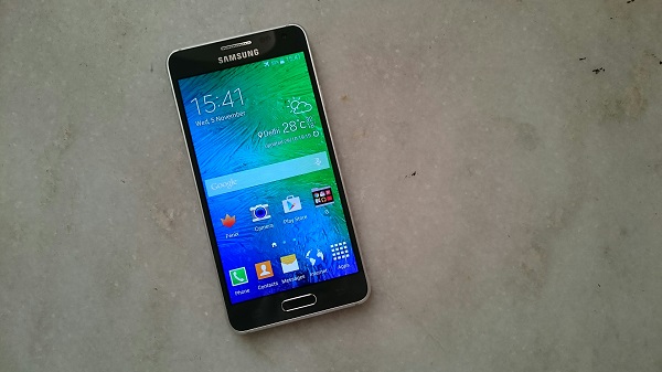
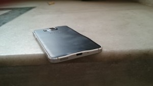
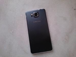
The looks. Samsung’s Galaxy Alpha (SM-G850Y) has a dual chamfered aluminium frame with slightly narrowed edges –a big change in a Samsung smartphone. Samsung has gone with chrome edges quite a few times, but these looked like fake metal and didn’t last long. But as soon as you pick this phone, you will notice how nice the phone feels and how comfortable it is to grip. With its 4.7-inch 720p screen with decent-sized bezels, lightweight profile (115 g), the phone feels compact and is surely not a bulky handset by today’s standard.

The front, other than the screen, sports the speaker grill, Samsung logo, front-facing camera and sensors at the top; and three navigation keys – Menu, Home (physical), Back – at the bottom. The left side panel locates volume rockers (single body that sort of flats towards the middle part); while the right side panel carries the Power/Lock key. Again, if you look at these physical keys, you realise the company has chosen materials thoughtfully. Though it would have been better had these buttons been required to press a little less firmly, they look nice and give just right feedback on pressing.

Coming to the back, you see the main camera with the LED flash and heart rate monitor embedded inside, and the Samsung logo and loudspeakers towards the bottom. The back panel is made of a thin plastic sheet, which is probably the only design flaw that could have been handled better. The back sports a patterned design, a bit different from the Note 3 and definitely better to look at on first glance. The 3.5mm headset jack and secondary mic are placed right at the top (where you can also see two plastic cut-outs for antenna purpose); and the microUSB 2.0 has been neatly placed at the bottom

Screen. The 4.7-inch (1280 x 720) Super AMOLED screen is far from being one of the best out there. The S5 has a full HD Super AMOLED, but the Alpha has an HD screen that does a good job for viewing videos, playing games and when used under direct sunlight. The black levels are deep, colours look vibrant and quite saturated (red and green), which you expect from a Samsung AMOLED. But it doesn’t quite show accurate colours. The screen has good viewing angles, and its flaws are not deal breakers.

Audio. The loudspeaker at the bottom is actually fairly loud and mostly clear. If you are okay with its placement and don’t find yourself putting your hand on it unknowingly and muffling sound, it performs well for videos as well as games. In-ear audio quality with the bundled headsets is also decent. It does its job well, giving clear audio for most basic use and handling beats and treble quite well as a default smartphone headset would.

Camera. The phone sports a 12 MP camera (f/2.2) at the back with an LED flash. The native camera app is exactly what we have on the S5 that is simple and smooth to use. Here are a few sample images

As you can see, the phone can take sharp and quite detailed photos. It performs pretty well in good light conditions, but struggles in low light. The camera takes a little with noticeable contrast while to focus in low light (with stabilisation) and clearly isn’t that good in that department. With default settings, though, you can take pretty good shots. There are plenty of modes to choose from, like HDR, Panorama, Selective Focus, which works as well as the S5.The camera can also take ultra HD videos, which can also be edited later.

Battery. The phone houses a 1,860 mAh battery unit. It is not too large by any modern smartphone standard, and it shows in the battery life. I found the phone struggling to go beyond 20 hours of usage. Having said that, with moderate usage, it can give you nearly a day’s use. With a little high brightness level and playing a couple of games, checking Twitter, and Emails, you will find yourself having to charge the phone more than once every 24 hours. With that thin profile, seems like battery life took quite a toll on itself. Connectivity-wise, the phone doesn’t give any troubles. Bluetooth, GPS lock-in, NFC, WiFi perform just as you would expect from a smartphone.

Software and performance. The Indian Galaxy Alpha variant has Samsung’s Exynos 5430 (1.8 GHz quad-core processor + 1.3 GHz quad-core processor and Mali-T628 GPU) coupled with 2 GB of RAM. The phone runs on Android 4.4.4 with TouchWiz UI on top. This is a 32 GB model with around 25.8 GB of usable storage space. Talking about the phone’s software and performance, it is similar to what we saw on the Galaxy S5. The phone can handle heavy webpages, games, closing and resuming apps just fine. But you will find the UI stuttering a little every now and then. One out of five times on pressing the Power/ Lock key to unlock the device, you will see the screen doesn’t light up for three to four seconds while two navigation keys illuminate immediately – a bug. Also, on pressing the Recent apps key, there’s some delay when the recent apps line-up and you can press the app of your choice. It would have been nicer had Samsung done a few subtle changes with its TouchWiz, maybe marking the start of better iconography, fonts and toning down on how heavy TouchWiz feels at times.

The Galaxy Alpha is more about Samsung’s change in design for its upcoming devices and less about this device itself. The phone clearly performs better in the design department compared to other Samsung phones during the last two to three years. With a decent screen, good camera, average battery life, it’s a bit hard to suggest this phone over the S5, but for those looking for a Samsung phone that doesn’t feel tacky and is comfortable to hold, this might be a good option.

Exit mobile version