Categories
Tech

Review: Nokia Lumia 830

The last Windows phone with the Nokia branding, the Lumia 830 is a solid buy at a Rs 24,000 price.
by Manik Kakra | @Manik_K on Twitter

The Lumia series has been gradually establishing itself in the low and mid-range segments, maybe a bit too slowly, but it is getting there. With the Lumia 5, 6 and 7 series, Nokia provided decent handsets, and now it has upgraded its old Lumia 820 to take on the likes of the Nexus 5 in the Rs 30k price range. So, let’s see if the Lumia 830 lives up to its name or not.

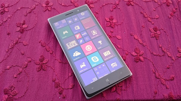
The looks. Nokia’s Lumia 830 follows a slightly different fabula design with a solid feel. The first thing you’ll notice is its metal frame around the body. On the front, apart from the 5-inch HD screen with Gorilla Glass 3 on top, are the capacitive touch keys – Back, Windows (and the primary mic below it), and Search, which don’t glow on being used, front-facing camera, sensors and speaker grill.
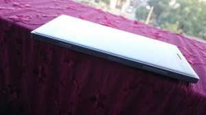
The right side panel houses the Power/Lock key as well as volume rockers and dedicated camera key, all three of these physical keys are made out of aluminium but aren’t very dependable for tactile feedback, while the left side panel is plain without any buttons or port. The microUSB port and 3.5 mm headset jack are located at the top and the bottom is plain.

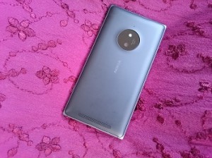
At the back is the familiar polycarbonate cover that has a fairly large 10 MP camera sensor (reminds you of the Lumia 1020), the Nokia logo imprinted in the middle, and the loudspeaker grill near the bottom. You can remove this rear cover from the bottom to reveal the nano SIM card slot, battery unit and microSD card slot. The design and look part of the device scores well for me. Despite having a metallic frame and angular four edges, I liked its grip and didn’t have problems carrying it around.

Screen. The Lumia 830 boasts a 5-inch (1280 x 720) LCD screen powered by Nokia’s popular ClearBlack technology. The screen, as you would expect, has good deep black levels and is not a pain to use under sunlight. It has vibrant colours and videos appear quite sharp on it. The screen isn’t full HD, but it does the job fairly well, especially for how the Windows Phone OS has been designed.

Camera. Nokia has touted the Lumia 830 as a flagship camera device that isn’t priced as a high-end one. The phone boasts a 10 MP PureView camera (Carl Zeiss optics) with an LED flash and also features OIS. Here are a few sample images.

The camera can take a lot of good photos. Most of the time, photos come out sharp and detailed. There are a plenty of options to choose from while taking a photo – ISO, exposure, shutter speed, etc. You could say the low-light performance isn’t the best, but overall this camera is a really good performer. Other than the default camera app, there are three camera apps. The default app seems much quicker to capture shots than what I saw on earlier Lumia devices. Other camera apps include Nokia Camera, Lumia Selife and Lumia Refocus, most of which are mainly useful for post-shot use.

Audio. The device has solid audio quality – whether it is in-ear or through loudspeaker. The loudspeaker, though could have been placed better, is more than capable to produce good audio when playing games or a track. In-ear sound is top-notch, plus, there’s nothing to complain about network reception throughout our usage. Call quality seemed fine with no unusual call drops.

Battery. Equipped with a 2,200 mAh battery unit, the phone gave about a day’s use on a single charge. Even when used with 3G and not much of WiFi (with low screen brightness) for Outlook, Twitter, music and general calls and messages, it lasted about 23 hours. You can switch on the in-built battery saver mode if you need some more juice out of the phone. It charges from zero to full in about two and a half hours. Being able to charge wirelessly with a compatible rear plate is also an option.
Software and performance. Under the hood, this Windows Phone OS 8.1 Update 1 (with Denim Update) has Qualcomm’s Snapdragon 400 SoC (1l2 GHz quad-core processor, Adreno 305 GPU) with 1 GB of RAM. There’s also SensorCore in place, but I had Motion Data off during my usage.

The Lumia 830 performs and feels as smooth and fluid that you generally associate with the WP OS. Glance Screen is something I really like. Many previous Symbian users might remember having time, call and message notifications show right on the screen even when it is off, giving you useful information without taking a toll on battery life. You can double-tap to wake the entire screen and it works well.

The phone handles games and regular OS tasks quite well. Having said that, when it comes to the OS experience, Windows phones still have a lot of work to do besides having a clean and neat look. Every now and then, you still get to see the loading or resuming screen on pressing the back button, or going from one app to another even though you aren’t doing very intensive work on the phone.

There are a few noticeable improvements done by Microsoft (and Nokia). Live Tiles on the main Start screen are actually live – giving you a bit of current information without having to open the relevant app and refresh it. You can now make folders on the Start screen, apply wallpapers that follow your screen and tile patterns and also have the option to have different volume levels selected for your media and calls. The pull-down notification bar also gives you toggle buttons for WiFi, Location, and more, but for some reason, there’s still no data toggle button, which means you have to go into Settings and switch it on or off from there. Apparently, it is coming in the next update.

When it comes to apps and services, Windows Phone isn’t a half-baked OS any more. Most of your popular apps and services run on the OS, while a few of them only have third-party options. With Nokia’s HERE Maps, Outlook, OneDrive, good Twitter and Reddit apps, I didn’t have too many problems in this regard, but there’s surely something missing if you’re dependant on Gmail. The user gets about 14 GB of internal storage space, which can be expanded using a microSD card apart from 15 GB of free storage he/she gets from Microsoft’s OneDrive service. In my opinion, the OS has still a lot to cover and add (including a couple of points mentioned above), but seems to be doing so, but probably at a rate that could hinder its position in the smartphone market.

Concluding our review, the last Windows Phone with the Nokia branding, the Lumia 830, seems like a solid device. It has a great camera, good battery life, decent screen, high quality audio and premium design for this price, and an improved OS. With a price tag of about Rs 24,000, if you’re looking to try your first Windows Phone device, the Lumia 830 feels like a really worthy option for now.
Categories
Tech

Review: MAPS.ME app

Maps are important on our devices these days – and this app is fairly decent, though some points require work.
by Manik Kakra | @Manik_K on Twitter

A map is one of the first things we install on a new device – it is essential to one’s commute, planning and organising according to expected traffic jams. Thanks to popular options like Google Maps and Nokia’s HERE Maps, many smartphone users today find it convenient to reach a destination without having to ask around on the way.

ProMAPS.ME is another kid on the block that aims to make your mapping experience more convenient and affordable. The developer team seems quite proud of its offline capabilities, data points, etc. While we already have offline maps features on HERE and Google Maps, it is good to see more and more developers realising how handy this can be, especially when you aren’t in an area with a solid network reception quality, or are running low on data balance.

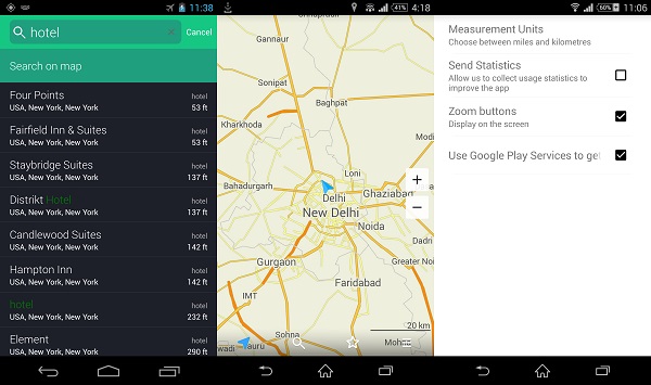
The service uses OpenStreetMap in the backend for the entire data. The app’s whole UI look and feel is nice and not shabby to use. Settings and other options are simple to reach and select without having to try too hard when using it for the first time. You can search a destination’s route, a place of interest like a food joint, hotel, and many more. If needed, you can also add a place to your bookmarks, which you can later access or check by just tapping on star on the app’s main screen.

When downloading any country’s full offline map, you get options to either download its map or a map with a driving route in place (which makes more sense for most people). As far as searching for places and locations is concerned, the app does a good job. It was able to give a list of places and points pretty much every time I searched. However, when it came to live route directions and traffic condition, MAPS.ME lacks quite a lot, at least for Delhi (where I reviewed it). The routing experience and navigation could be improved and the developers should consider adding more useful information and options on screen while the user is in between.

Plus, there’s still not enough data in place, it seems; there’s no option to check commute to even a popular place via public transport, which I found the most disappointing thing about the service. But because they are new and still cementing their place in the app market, I am hopeful that these few niggles will soon be dealt with.

If you are looking out for a maps app and haven’t given Google Maps or HERE Maps a try, MAPS.ME seems like a decent option, but only if its constrained data and options aren’t troublesome for you. Hopefully, the app will be updated regularly with some work behind the curtain as well.

MAPS.ME is a free app (it was a paid one previously), and is available for Android, iOS and BlackBerry OS 10.

Categories
Tech

Review: Xiaomi’s Redmi Note

With the new Redmi Note, Xiaomi sets its eyes on large-screen phone buyers, with a modest under-Rs 10,000 price tag.
by Manik Kakra | @Manik_K on Twitter

Xiaomi’s entrance into the Indian market was quite a news story. While the company didn’t sell as many units to set the market on fire lots of users, especially who were active over online portals, heard and talked about them. If you remember, we were quite impressed by the Mi 3, which performed really well despite in most departments despite priced under Rs 15,000. And with the Redmi Note, Xiaomi has set its eyes over large-screen buyers with a price tag of under Rs 10,000.

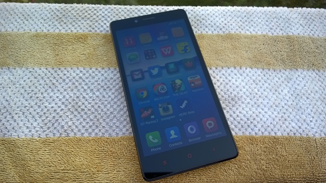
Looks and design. Xiaomi’s Redmi Note (HM Note 1W) follows the large-screen-that-isn’t-high-end trend. Weighing almost 200 grams and not being a thin device, the front has a 5.5-inch HD screen with Corning Gorilla Glass 3 on top. Three capacitive buttons – Options, Menu, and Back – below it, which glow in Red but aren’t very bright. Above the screen are the front-facing camera, speaker grill and sensors along with a tiny LED notification light.

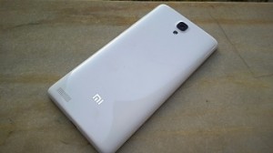
The back has a glossy thin plastic cover, removing which reveals two SIM card slots, microSD card slot and the removable battery unit that also stretches to the sides. The back houses the 13 MP camera with the LED flash next to it, loudspeaker towards the bottom and the Mi logo in silver. No doubt had the back been a little less slippery, or with a better finish, one would have found gripping the device more comfortable.

While the sides are plain, the right side has the Volume rocker and Power/ Lock key. These keys are not very premium to look at, but they are tactile to press. At the bottom is the primary mic and microUSB 2.0. On the top, you have the 3.5 mm headset jack and secondary mic. You could say the phone looks nothing extraordinary, and we would have liked the phone to be less bulky.

Screen. Its 5.5-inch (1280 x 720) screen is just about okay when it comes to resolution for phones in this price range. Images and webpages look quite sharp on the screen, though videos tend to appear a little washed out. The screen has decent viewing angles and can brighten when needed under various conditions. Games that support the given resolution, on the other hand, look just as nice as you expect.

Camera. The Redmi Note sports a 13 MP camera with an LED flash. Here are a few sample images.

The camera is no match for even a mid-range phone and just as good as most phones priced under Rs. 10,000. It takes sharp images under favourable conditions, but don’t expect a lot. Photos in low-light, as you’d expect, are not at all worthy and you should avoid using this phone when it isn’t bright with your subject being still.

Audio. Both in-ear and loudspeaker perform decently. You don’t get any headset in the box, so you would have to get one yourself. Using a basic pair of earphones with the phone, expect a decent quality, quite loud but not too great. The loudspeaker on the back is also just okay and just about does its job while watching videos.

Battery. The device is equipped with a 3,200 mAh battery unit and it is the best thing about this device. You get more than a day of juice even with a bit of heavy usage. Having always sync on, watching videos for about half an hour, checking Twitter, playing a game like GT Racing 2 for half an hour, the phone’s battery life stretches over a day, and with moderate usage, it should go even further. Being a large device, this is definitely a plus point.

Software and performance. The device runs on Android 4.2.2 coupled with MiUi. Under the hood, there is MediaTek’s MT6592 SoC (1.7 GHz octa-core processor, Mali 450 MP GPU) along with 2 GB of RAM. The user gets about 5.8 Gb of available storage out of the box. All the apps are on your Home screen as there’s no separate app launcher. You can make folders, change widgets on it and uninstall an app right from a Home screen.

MiUi is one of the active ROMs in the Android community and there are a lot of tweaks and mods available for it, if you want to try. It has been designed well with most things, like the Notification center, toggle buttons, icons, which go well with the OS’s overall look and feel. Long-pressing the Options key gives a horizontal list of recent apps from where you can remove it; lock it apart from opening it. Or you can also remove each of those apps from the recent list and memory. Lock screen is simple yet useful: with a simple swipe-down gesture from a particular point to unlock it, or swipe it in other sides to directly open Messaging, Camera or Call Log.

The general performance of the phone leaves a lot to be bit desired. Initially, it seemed smooth to scroll, open apps and watch videos, but within two days of use, I saw quite a few issues. Many times when you come back to Home from an app, the launcher reloads; or if you go back to an app, it goes blank (works fine on other phones), which is a little surprising considering there’s 2 GB of Ram in place. Plus, the phone is running on Android 4.2.2 that was released two years back and there’s no word on when it will be updated to Android 4.4 (leave aside 5.0). Scrolling between Home screens, Settings, Dialler is mostly fine but you see signs of lag every now and then. Having said that, the phone handles games and HD videos without any troubles, this is one area that isn’t going to disappoint you. To sum its overall performance, it is not really bad, but it’s certainly not on par when you have used something like the Moto G (1st Generation) that is its competitor.

Concluding our review, the Redmi Note is a decent start from the company to kick off its ‘phablet’ plans. With a good screen, great battery life, decent camera and sub-par performance, anybody coming from a Mi 3 won’t be very happy, but for those looking for a large-screen phone under Rs. 10,000, this could become a device to consider only if the company releases OS updates for it that includes a lot of performance improvement.

Categories
Tech

Review: Lenovo Vibe X2

It is almost love at first touch with the Lenovo Vibe X2, which scores with its design and software performance.
by Manik Kakra | @Manik_K on Twitter

Lenovo has been a dark horse in the smartphone race; the company has steadily been leaving its mark in various smartphone markets. Now, it seems to be focussing on the mid-range segment of smartphones, with the Vibe X2.

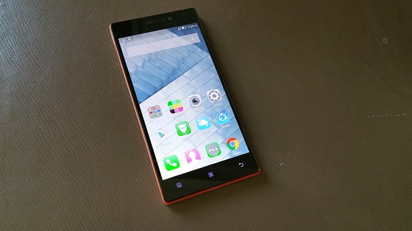
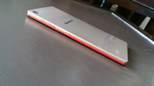
The looks. Vibe X2 (X2-AP) has quite a unique design language. With three layers (all different and bright orange, peach and light bronze) besides the screen, the manufacturer gets credit for the first look. Further, you can attach a couple of accessories like an external battery unit or speaker making it the fourth layer minus a shabby look. There’s a lot of Magnesium in use here, the phone weighs about 120 grams and is 7.3mm thick, which makes it comfortable to carry around.

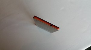
Around the sides (with the three stripes running), you have the dual SIM tray (houses a nano SIM and micro SIM) placed underneath the left side panel, and the volume rocker and Power/ Lock key on the other side. I would have liked these physical keys to be a bit more tactile and less flushed to the body surface as you will often find them inconvenient to spot and press without having to look at them. The microUSB port and primary mic sit at the bottom, and the 3.5 mm headset jack is at the top.

On the front, there’s the 5-inch full HD panel, along with the 5 MP front-facing camera, sensors, speaker grill, and a tiny LED notification light on its top; while there are three capacitive buttons – Option (Menu), Home and Back button placed below the screen, which are not very dim. The rear seems usual – Camera and LED flash on the right corner, then the secondary mic, Lenovo logo in the middle, and loudspeakers towards the bottom.

Display. The phone boasts a 5-inch (1920 x 1080) LCD touchscreen. The display of the phone is sharp, quite bright and decent for using under sunlight. The colour reproduction, though, does not pop as a high-end device, but it’s not bad. Viewing angles are also on par with most full HD panels, and videos and high resolution images appear pretty nice on the screen.

Camera. The Vibe X2 sports a 13 MP (AF) camera along with an LED flash. Here are a few sample images.

The phone’s camera isn’t its best feature. More often than not, pictures turn out to be just okay. Colours sometimes appear washed out, and only decent when the camera is able to focus well, which is another place where it struggles. Low-light shots aren’t much to talk about. With decent conditions, you can get a few detailed shots, but don’t expect more. You are better to try taking shots in the HDR mode than normal as it turned to be more than useful on several occasions. The 5 MP front-facing camera is not bad for making video calls or taking a selfie. The camera app, in contrast to the rear camera, is smooth and simple to work around.

Battery. With a 2,230 mAh battery unit inside, you will have to charge it up in about 15 to 16 hours. With brightness level at 20 per cent, and always on WiFi, the phone’s battery is not a great performer. Also, the Vibe X2 doesn’t support fast charging.

Audio. Audio on the phone is also not that great. Though loudspeakers are on par with most smartphones when it comes to videos and games, in-ear sound quality is average. Using the bundled headset with another phone gives you a noticeably better sound, meaning the Vibe X2 (with the bundled headset) isn’t much of a standout.

Software and performance. The device is equipped with MediaTek’s MTK 6595 SoC (1.7 GHz quad-core and 2 GHz quad-core processor, PowerVR GPU) along with 2 GB of RAM. It runs on Android 4.4.2 with Lenovo’s Vibe UI in use.

If you have used another Lenovo phone from last year, you are going to notice and mostly like what changes the company has done to its software. There’s no separate app launcher like before and all your app shortcuts appear on Home screens, but the whole look, icons, arrangement of UI elements is much better. The phone is fluid to open apps, reboot, responsive to play games on, and hardly ever stuttered during my entire usage.

The notification center and Settings have also been given a facelift. You can edit which toggle buttons appear above the notification bar, and also take a screenshot. Lockscreen now allows you to directly jump into Call Log, messages or open the Camera app. Status Bar changes its colour depending upon the app you are currently on. It is white by default, but, for instance, if you move to Settings (which has a White background), the status bar and icons turn black.

You can also double tap to wake the screen, which works well. Long-pressing the Options key brings up recent key (in iOS manner), and long-pressing the Home key pops Google Now up (by default). The user gets about 26 GB of accessible storage space. All in all, one can sum up the software and performance experience by saying Lenovo has done a lot of good work in improving its software and making the phone a stellar performer.

To sum up, the Lenovo Vibe X2 seems to be a great value for money purchase about Rs 20,000. With a good screen, great performance, average battery life, if you aren’t too concerned about the camera performance, this smartphone surely comes as a great option for this price.

Categories
Tech

Celkon and ZTE launch two new phones

Celkon’s first Windows phone, a low range device, comes to India; while ZTE’s mid range phone is named the Grand SII.
by Manik Kakra | @Manik_K on Twitter

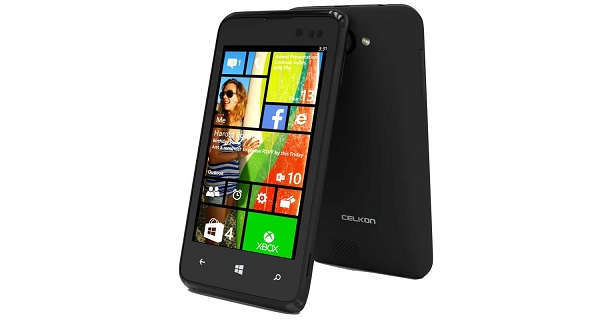
As announced by the company a few days back, Celkon has launched its first Windows Phone device in India two days ago. The phone is named WIN400, and caters to the low-end smartphone segment.

The WIN400 (in image above) features a 4-inch (800 x 480) screen and runs on Windows Phone 8.1. Under the hood, there is a Snapdragon 200 chipset (1.2 GHz quad-core processor, Adreno 203 GPU) along with 512 MB of RAM. On the back, there is a 5 MP (AF) camera (with an LED flash), while the front has a 1.3 MP camera. The phone comes loaded 1,500 mAh battery unit and with 4 GB of internal storage, which can be expanded up to 32 GB using a microSD card. Connectivity-wise, there’s 3G, Bluetooth 4.0, WiFi, GPS, and microUSB 2.0. The phone comes in black, and is available for Rs 4,979.

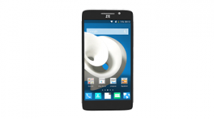
ZTEZTE also launched its new mid-range smartphone, the Grand SII (in pic on left). The device runs on Android 4.2 with Mi Flavor UI on top. It’s powered by Qualcomm’s Snapdragon 800 chipset coupled with 2 GB of RAM. The Grand SII features a 5.5-inch (1920×1080) screen and is equipped with a 2,500 mAh battery unit. There’s 16 GB of internal storage, which is expandable. The rear sports a 13 MP camera, and the front has a 5 MP camera.

It also boasts 3G and 4G LTE connectivity options along with Bluetooth, WiFi, GPS, microUSB 2.0, and FM Radio. The phone comes in only silver-black colour, and is available exclusively from Amazon at Rs 13,999.

Categories
Tech

This just in: Microsoft Lumia 535

Launched in India at a price of Rs 9,199, this smartphone is Microsoft’s first Windows handset under its own brand.
by Manik Kakra | @Manik_K on Twitter

Microsoft’s first Windows Phone handset under its own brand, the new Lumia 535, has been launched in India two days ago. The phone marks the beginning of Microsoft phones in the Indian market, while the low-end feature phones will continue to be under the name Nokia.

Running on Windows Phone 8.1 (with Lumia Denim Update), the Lumia 535 features a 5-inch (540 x 960) screen with Gorilla Glass 3 on top, and comes loaded with many Microsoft apps and services like Offices, OneNote, OneDrive, Xbox app, and more. Under the hood, there is a Snapdragon 200 SoC (1.2 GHz quad-core processor, Adreno 302 GPU), along with 1 GB of RAM.

On the back, there is a 5 MP (AF) camera (with an LED flash), while the front has a 5 MP wide-lens camera. There’s 8 GB of on-board storage, which can be expandable up to 128 GB, plus, 15 GB of free OneDrive storage space.

This dual SIM handset sports Bluetooth 4.0, GPS, microUSB 2.0, WiFi, 3G connectivity, and 3.5 mm headset jack. Weighing about 146 grams, the phone packs a 1,905 mAh battery unit.

The Lumia 535 goes on sale later this week at Rs 9,199, and comes in bright green, bright orange, white and black colour options. The user will also get free 500 MB of 3G data from Vodafone for the first two months, 2 months of BoxTV subscription, free recharge from PayTM worth 600 bucks, and free EBooks from Flipkart worth Rs 1,500.

Exit mobile version