Categories
Tech

Apple iPad Air and mini Retina launching in India this week

December 7 will see the launch of two new iPads in India. Know the specs you can expect from both.
by Manik Kakra

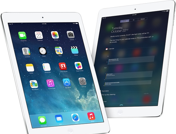
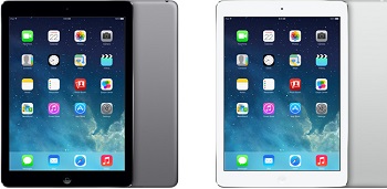
The new iPads – iPad Air (in pic above) and iPad mini with Retina Display – are going to launch in India on the December 7. As per one of Apple’s retail partners in India, Ingram Micro, the iPad Air’s price will start from Rs 35,900 for the base model (16 GB WiFi), and the iPad mini Retina will start from Rs 28,900 for its basic model.

While the iPad Air may cost up to Rs 67,000 for its 128 GB WiFi + cellular model, the iPad mini Retina is expected to notch around Rs 60,000.

Apple’s iPad mini (original) will is still available for its starting price of Rs 21,900, and the iPad 2 for Rs 28,900. Previously, Apple launched the iPhone 5C and iPhone 5S in India, but this time there doesn’t seem to be too much of a difference between the official prices in the US and India.

Both the tablets, available in space grey and white-silver colour options, will hit the shelves on December 7, and the announcement could come as late as Friday.

These are the hardware specification of these iOS 7 devices:

iPad mini_RetinaiPad mini Retina (in pic on left) Display:

7.9-inch Retina Display (326ppi)

Dual Channel, WiFi a/b/g/n; Bluetooth 4.0

1.2 MP front-facing camera; 5 MP rear camera

A7 chip (64-bit) along with M7 co-processor for motion


iPad Air:

9.7-inch Retina Display (264ppi)

Dual Channel WiFi a/b/g/n; Bluetooth 4.0

1.2 MP front-facing camera; 5 MP rear camera

A7 chip (64-bit) along with M7 co-processor for motion

Categories
Tech

HTC’s One Max comes to India

HTC’s newest phone is priced at Rs 56,490; the phone’s high price could be accounted for by fluctuating rupee-dollar rates.
by Manik Kakra

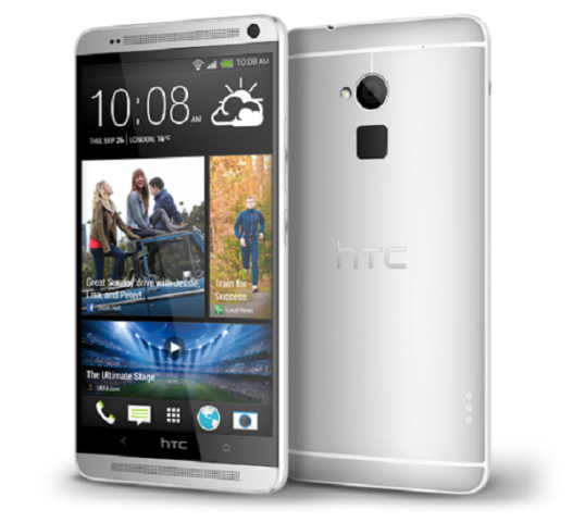
HTC has just officially launched its One Max in India. This phone boasts a 5.9-inch 1080p LCD 3 touchscreen, and is touted as the One’s big brother. Under the hood, there is Snapragon 600 (.17 GHz quad-core Krait 300) SoC, along with 2 GB of RAM. On the back, there is a 4 MP ‘Ultrapixel’ camera as well as a fingerprint scanner mainly for unlocking the screen and launching three apps with a finger swipe (three fingers pre-assigned by the user). The front side sports a 2.1 MP wide-angle camera and dual speakers. It runs on Android 4.3 Jelly Bean with HTC’s Sense 5.5 UI on top.

Weighing 217g, the One Max features Bluetooth 4.0, WiFi a/b/g/n/ac, NFC, a microUSB 2.0 port and 3.5 mm headset jack. The phone is powered by 3,300 mAh battery, and is available in 16 GB and 32 GB storage options, expandable up to 64 GB via microSD card.

First showcased back in October, HTC has priced the phone at a whopping (MRP) Rs. 61,490, and it’s now available in the market for Rs. 56,490. Users also get 50 GB of free Google Drive storage space for two years. The company also unveiled the official Power Flip Case accessory for the One Max, which aims to provide 1,200 mAh of juice while providing for protection to the device as a shell.

It is evident that the rupee-dollar exchange rate has really made phones prices rocket in the last couple of months or so, and it’s hurting. It’s hard to imagine people going for this phone for over Rs. 55K, maybe once the price goes under the 50k mark, it may well attract a lot of user looking for a large-screen phone.

Categories
Tech

Review: Sony Xperia Z1

What does the Xperia Z1 have that the earlier Xperia Z doesn’t? We do some checking and look for answers.
by Manik Kakra

Sony has been trying to get its phone division better converged with its music and camera divisions in order to get ahead in the smartphone battle. Its Xperia Z left a bitter taste in some people’s mouths, and the company aims to find its mojo back with the Xperia Z1. So, let’s check out this new Android smartphone from Sony.

Hardware and design

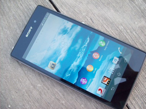
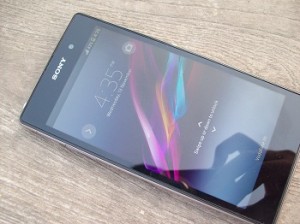
Sony Xperia Z1Sony’s Xperia Z1 (C6902) follows the same rectangular slap design that we have seen with the Xperia Z, and ZR. Handling one for the first time, you may realise that it’s a bit bigger than the Z, but isn’t different from it when it comes to looks.

The phone sports a 5-inch full HD screen, which also carries the three onscreen keys. On top are placed the usual speakers with LED fitted underneath the grills inside. Just below the screen, even though there is nothing placed, the bezel space is noticeable and pretty big for a space having no real estate.

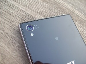
On the left sidepanel, you have the microUSB port, memory card slot and two-pin charging points for charging using a dock. On the right side, there’s the SIM slot and the familiar circular metallic Power button – looks nice to me – and plastic volume rockers. All these slots are flapped and, though the Z1 is water-proof, these flaps, which seem quite fragile, have to be put on Sony Xperia Z1when you are trying some water adventures while carrying the device. On the back sits the 20.7 MP camera with an LED flash. The back is made up of thick plastic material with coating, which fits quite well in the hand, but both front and back are dust and fingerprint magnets. It becomes a bit frustrating seeing dust all over the screen after pulling the phone out from your pocket.

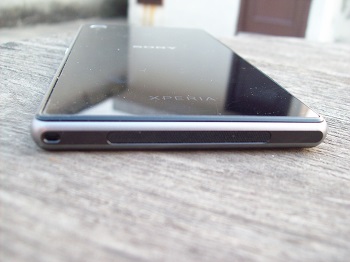
The top gets the 3.5mm headset jack. The loudspeakers, like the iPhone 5’s, are at the bottom. Round edges, aluminium-mixed front.

Screen

Talking about the phone’s 5-inch 1080p screen, Sony’s Z was mainly looked down for its ordinary screen quality, but did the Z1 come out winning? The Z1’s seemed much better to me than the Z. Colours look nowhere as washed out as on the Z, and it is crisp. But when you use it after seeing the LG G2 or even the HTC One, it does rank below those two. Sony mentions the use of BRAVIS Engine for the display, but while there is certainly a lot of improvement from what it was like on the Z, there is still some work needed when it comes to viewing angles and contrast.

Sony Xperia Z1Camera

The Xperia Z1 boasts a 20.7 MP f/2.0 (mainly 20) MP camera with BIONZ image processor. The trick here is that the camera does oversampling, giving out 8 MP images. I tried the camera a bit, and was pretty satisfied with it. Sony’s camera UI is neat, straightforward and doesn’t require too many adjustments for every shot. On the down side, I did notice some over-processing from the software. You take a shot expecting something, but the result you view later seems a bit different, usually sharper than how it should have been. The camera performed well in decent conditions, but there’s definitely a lot of noise once you try it in a dark room or under such difficult conditions. See sample shots here.

Audio

Let’s now talk a bit about the audio quality. It’s Sony, so you expect a good audio experience, and that’s exactly the case here. In-ear sound is clear, quite loud and you shouldn’t be hesitating to use your favourite headphones with the phone. Loudspeakers are also loud and usually don’t distort when played on high volume. I was quite happy with their performance while gaming, barring muffling them with my hand while holding the phone when in landscape mode. Also, Sony’s music player is really nice. It has got some beautiful colours for backgrounds and works smoothly, too.

The call quality on the Xperia Z1 is top notch, and there’s no network reception issues any time during my usage.

Software and peformance

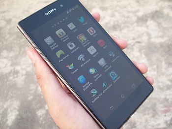
The Xperia runs on Android 4.2.2 with Sony’s UXT UI on top. Overall, there are hardly changes here from we have seen and used on the Xperia Z. Under the hood, there is a quad-core Sony Xperia Z12.2 GHz (Krait 400) Snapdragon 800 SoC, along with 2 GB of RAM. The whole look and feel is identical. The phone hardly ever lagged during my usage, and was mostly smooth, responsive and didn’t do any random reboots on its own. You can play full HD videos, go back and forth, and won’t notice any major performance issues. Having five home screens by default, four icons – Sony LIV, Mucis, Messaging and phone in dock, and below sit the on-screen buttons –Back, Home and Multi App View.

Thanks to the placement of on-screen buttons, you lose some screen estate to them in most of the apps you will use. The UXT UI gives you similar app launcher as other OEMs do. Here, you also get a different screen, when swiped from left, to uninstall apps, go to the Play Store, Sony’s app store, and arrange apps in various orders.

I usually got around 21 hours of battery life from, the phone’s 3,000 mAh battery, on a single charge – auto sync on, half an hour of gaming, some music and lots of Twitter and Web surfing.

Sony also provides users with music downloading and streaming service – SonyJive. You et free downloading and streaming for first six months. Don’t get excited. The app is very sluggish, full of bugs, the service has average collection and you get DRM protected content. Yup, it is really bad. I would rather have no such service than having one which may give such an awful experience – definitely the worst part of the whole device.  LIV is a service that allows you to stream content from various Sony channels, without any extra cost. There is also Big Flix app from which you can stream Bollywood movies – pretty decent collection this time. And you also get six movies free (can only be watched on the device itself) six movies from Priviledge, just wish they had given HD qulaity, too.

Summing up

The Xperia Z1 is definitely Sony’s best offering right now. Great performance, coupled with decent camera and looks, the phone does seem a good choice. There is no doubt Sony still needs some work on the display side, and maybe just put (or leave it out completely) a better music streaming service for Indian users. All in all, the phone shows that the company might well be on the right path.

Categories
Tech

Just in: Nexus 5, Nexus 7 (2013) available on Indian Play Store

Our tech writer previews and reviews the specs on the new Nexus phones – the Nexus 5 and the Nexus 7.
by Manik Kakra

Here they are, folks. The Nexus 5 and Nexus 7 (2013) are now officially available in India.

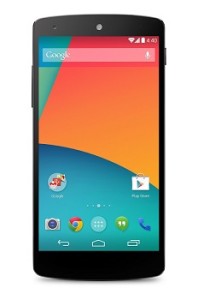
Nexus 5Announced about three weeks back, the Nexus 5 (in pic on left) marks the launch of Android’s latest version – 4.4 (KitKat). The phone is powered by Qualcomm’s Snapdragon 800 chipset, along with 2 GB of RAM. On the back, it sports an 8 MP (AF) camera (plus LED flash) with optical image stabilisation feature; while the front has a 1.3 MP camera.

Boasting a 4.95-inch full HD screen, the Nexus 5 comes in black and white colour options – with 16 GB and 32 GB variant. Other features include Bluetooth 4.0, WiFi a/b/g/n/ac, microUSB (+ Slim port), and LTE (may not support Indian telecom bands). While the 16 GB variant is priced at Rs 28,999, the 32 GB is available for Rs 32,999. The Play Store also lists the official Nexus 5 bumper for Rs 2,999.

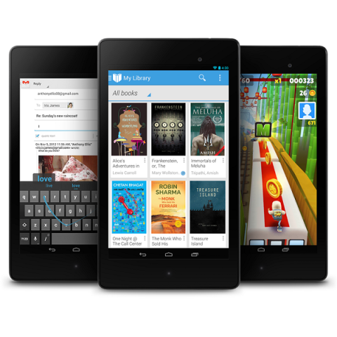
Coming to the Nexus 7 (2013, see main image above), the tablet features a 7-inch full HD screen, and comes in 16 GB and 32 GB storage variants. On the back, there is a 5 MP (AF) camera; and the front has a 1.2 MP camera. Under the hood, there is a Snapdragon S4 Pro SoC, along with 2 GB of RAM. This Android 4.3 (4.4 is out) features WiFi a/b/g/n, Bluetooth 4.0, NFC, LTE (depends on the model), and microUSB (+ Slim port). The Nexus 7 starts from Rs 20,999 for the 16 GB WiFi-only model, and goes up to Rs 27,999 for the 32 GB WiFi + Cellular (LTE) model.

Categories
Tech

Review: The LG G2

Our tech writer has the goods on LG’s newest smartphone offering, and what’s good and not so great about it.
by Manik Kakra

There is a smartphone race going in the market today, which mainly involves a race for specifications and who’s the first to catch the bus. This has been going on awhile. LG has been in the front seat for a bit, but the race is now getting more or less about who capitalises better on their top spot, and whether they provide updates, decent prices, have any standout usable feature or not. LG’s G2 is the company’s flagship device and is an interesting addition to the Android space. This is our review of the phone.
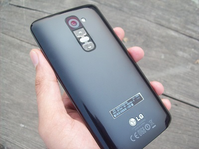
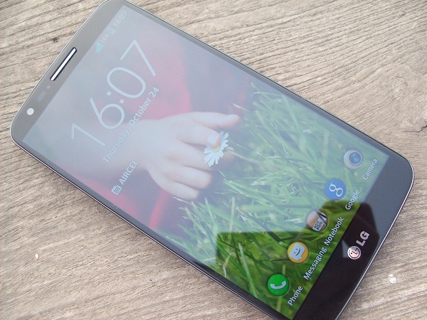
LG G2 (2)Hardware: The LG G2 is quite a beast when it comes to hardware. Under the hood, there is a 2.3 Ghz quad-core (Krait 400) Snapragon 800 chip that has got Adreno 330 GPU, along with 2 GB of RAM. The back has got a 13 MP camera, plus, the phone’s volume rockers as well as Power/Lock button. The front has got a 2.1 MP camera that can do HD videos, and no other buttons on the front side.

Software and Performance: LG’s G2 runs on Android 4.2 out of the box, with LG’s own Optimus UI on top. The whole software from LG hasn’t changed too much. We pretty much get too see the same icons, UI elements, animations, etc. What was new was lock screen customisation – you can now access camera and a widget of your choice by swiping left and right from the lock screen. By default, there are three home screens (as usual all are customisable), make folders, rename them, different icons, widgets and all such known stuff.

You get QuickMemo where you can write down on the screen using your finger, and save them to your notes. Swiping down to get the notification centre, you also get access to all the QSlide apps. These are the apps that support running simultaneously on screen. For instance, you could have calculator running on the screen’s upper half, and the stock Web browser on the lower. Pretty handy at times, and it works smoothly.

The phone is smooth, really smooth. I didn’t notice any stutters, serious lags or unusual app crashes. The phone feels responsive in day-to-day usage, and doesn’t disappoint.

As far as the battery life goes, I was satisfied with what I got from its 3,000 mAh pack. The phone lasted just over a day for me, usually, on a single full charge. The whole chipset and OS combination seems to be doing pretty good to the battery, and it shows in the battery life you get – definitely a plus point for the device.

Design: LG hasn’t done anything radical in design. There’s the same slab design with plastic in use. On the front, you get a 5.2-inch 1080p screen, and very thin bezel, really nicely Designdone by LG. In fact, bezels may well be the first thing you notice as soon as you hold this device. The cheap plastic feel is very much evident once you hold the phone on its back.
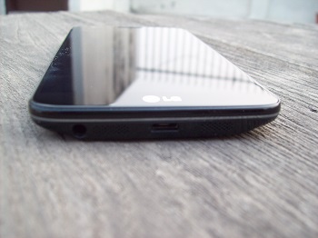
There is a diagonal line pattern for looks’ on the back; there isn’t much LG has tried to achieve with the materials used here. To put it bluntly, I’m not at all impressed with the material selection here, while the bezel part is a top-notch approach for a phone this size. On the right side, the SIM tray sits, and there’s no other port here. The bottom gets the microUSB port as well as the 3.5 mm headset jack and loudspeakers. Touch buttons are on-screen, and there is only the usual LG logo under the screen. Just above the screen, other than the front-facing camera, you have the sensor, speakers.
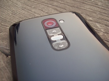
G2 cameraCamera: The G2 comes with a 13 MP camera that can shoot 1080p videos at 60 FPS. The camera has different shooting modes, as usual, and here’re a few images (https://app.box.com/s/1u8w9h78llhepy8tspe7) clicked with it. One more thing, I didn’t face any focus problems that have been the case with previous LG phone cameras. It’s good to see that LG has fixed it. Also, there are options to choose manual focus for a better control over your camera settings.

The camera is pretty good. More or less, you won’t be disappointed by its performance, but it could have done a better job with low light condition and without too much sharpness.

Audio: Coming to audio performance, the G2 is a serious phone in this department. It does 24-bit audio recording and playback, and its audio output is very good. You should ideally not be using the bundled earphones. Plug in your own headset par, and you will realise how well the phone drives them. The only downside is on the loudspeakers side. They are loud and clear, but their placement, at the bottom, might well be a problem for those who play a lot of games. Playing in portrait mode means on of your hands covering the loudspeakers and all the sound getting muffled. There were no issues with the phone’s call quality, and I didn’t notice any network reception problems either.

What’s different: Usually your phone has volume buttons on one side and Power/Lock button on the top or on either side, but, here it is different. All those are around the camera sensor. You have to click there to adjust volume (can also be used for the camera), Power and lock screen. LG has also added ‘double tap to wake and lock’ feature, which was previously seen on Nokia’s N9, when on a home screen, you just had to tap the screen twice to lock it and double-tap it again to unlock it. This works for 7 out of 10 items, and is indeed a very handy feature. You might just start doing it once you get another phone, and miss this feature on it. At least I did, and I certainly liked the double-tap feature. But not so much the buttons placements, I hardly ever pressed the right button on the back accurately, and found it cumbersome when the phone was actually placed somewhere and you can’t adjust the volume from either sides.

The best part: Let’s take a look at the full HD IPS (423 ppi) used here. In my opinion, this is the best part about this LG phone. And that isn’t very surprising considering LG has been consistently coming out with great screens for the last year or so. The screen is very bright, colours seem rich and it has got decent viewing angles. Watching a full HD video on it, on the go, is a treat. It is coated with Gorilla Glass 32, which is a bit noticeable once you closely look at the sides of the screen – it appears pretty nice, though.

What could be better: While LG’s skin is lightweight, it is far from stock Android designs, and you have to really dig to see if they have left any part of the OS untouched. A few additions to the whole stock Android experience are definitely needed – camera, QSlide apps – many changes could be avoided, but then that’s what custom Uis bring to the table.

All in all, LG has done a really good job with the G2. It is good to see more and more manufacturers realising that battery life, camera optics, software enhancements are important. The screen, battery life and audio are its best part, the only things the G2 falls short are its material choices and it could probably do with a little less customisation on the Optimus UI side.
Categories
Tech

Apple announces new iPad Air and iPad mini

New tablets were unveiled and new devices announced in Apple’s fall event. Here’s a quick review of the new offerings.
by Manik Kakra

Apple has announced two new iPads in its fall event – iPad Air and iPad mini Retina. The company also announced the new MacBook Pro, Mac Pro, OS X 10.1 Mavericks and new iWork and iLife software. Let’s take a look at what all Apple unveiled on the tablet side:

iPad AiriPad Air: The iPad Air is Apple’s fifth generation iPad, but now you have the term ‘Air’ added to its name –specifically because the new iPad is lighter (1 pound) and thinner (0.75mm) than the previous generation models. Apple has decreased the bezels on the iPad Air’s side to improve screen estate in the same size.

The new iPad Air is powered by the A7 (64-bit) chip that we previously saw on the iPhone 5s. Sporting the same 9.7-inch Retina screen as the previous two models, this iPad also boasts M7 commotion processor for saving battery and doing tasks related to motion like accelerometer, gyroscope, etc. On the back, there’s a 5 MP camera; while the front gets a better iSight camera with larger pixels for low-light performance.

Connectivity-wise, there WiFi with MiMo techlology thanks to its dual antennas for faster data exchanges, 3G and LTE (depends on model). The iPad Air also features dual microphones for better voice recognition and calls. The tablet goes on sale in the US and several other countries starting November 1, with a base price of $449 for 16 GB WiFi-only mode, and goes up to $929 for 128 GB WiFi + cellular model. The iPad comes in silver + white and space grey + black colour options.

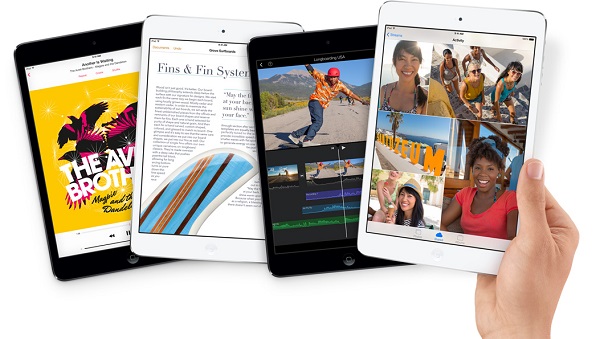
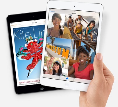
iPad mini Retina: The Retina display on the next-gen iPad mini (in featured image above) was very much on the cards. It will be interesting to see how much its battery life is, considering that the size is pretty much the same, while the display is now much better than before. With its 7.9-inch Retina screen, with the same resolution as the iPad Air (2048 x 1536), the new mini is also powered by the same A7 (64-bit) chip and M7 motion coprocessor.

Having the same MiMo technology as the iPad Air for WiFi, and Bluetooth 4.0, the mini Retina also comes with a 5 MP rear camera, and the same front-facing 1.2 MP iSight camera. The tablet will start selling from November 1 too, with its base price for 16 GB WiFi at $399, and going up to $829 for 128 GB WiFi + cellular. The iPad mini Retina comes in silver + white and space grey + black colours.

The official covers for the iPad mini Retina and iPad Air are available in blue, green, pink, yellow, black and red, and the smart case for the iPad air will be available for $79, and $69 for the iPad mini Retina.

Apple also announced that it will continue selling the iPad 2 16 GB WiFi for $399 and 16 GB WiFi + cellular for $529, and the iPad mini 16 GB WiFi for $299 and 16 GB WiFi + cellular for $429.

Exit mobile version