Categories
Tech

Nokia launches Lumia 1320 and Lumia 525

Two new phones from the Nokia Lumia stable hit Indian shores today. A look at what’s good and what’s hot.
by Manik Kakra

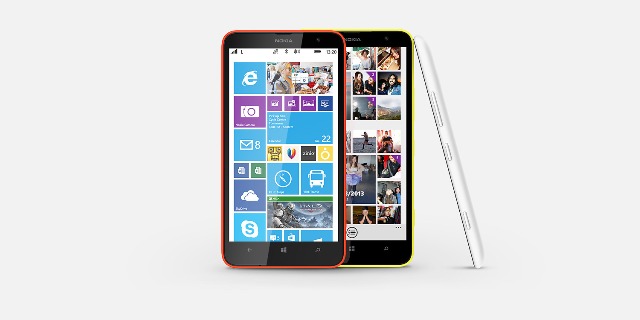
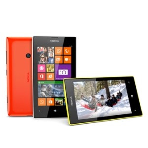
Nokia today launched its Lumia 1320 (see image above) in India. The device, first seen at the last Nokia World, sports a 6-inch 720p LCD touchscreen with Corning Gorilla Glass 3 on top. The phone has a 5 MP rear camera (f/2.4) along with an LED flash and it can shoot full HD videos at 30 FPS; while the front has a VGA camera.

Under the hood, this Windows Phone 8 device has Qualcomm’s 1.7 GHz dual-core Snapdragon S4 SoC, with 1 Gb of RAM. Connectivity-wise, the Lumia 1320 has microUSB 2.0, Bluetooth 4.0, WiFi b/g/n, NFC, A-GPS, and 3G. Powered by 3,400 mAh battery, the phone comes with 8 GB of internal storage, which can be expanded up to 64 GB via microSD card, and users also get free 7 GB of storage space on Microsoft’s SkyDrive cloud service.

Yes, it does seem like the Lumia 1520‘s budget version, and it’s pretty much so. The Lumia 1320 comes in red, yellow, white and black colours, and has been priced at Rs 23,999.

Nokia_Lumia_525_Coming to the Lumia 525, it is the successor to Nokia’s popular Lumia 520. The phone has the same 4-inch (800×480) touchscreen, and Volume, Camera and Power/ lock keys. The Lumia 525 has microUSB 2.0, WiFi b/g/n, Bluetooth 4.0 and 3.5 mm headset jack. Powered by 1,430 mAh battery, this phone has a 1 GHz dual-core S4 SoC and 1 GB of RAM, which is double that of the Lumia 520, its predecessor.

Just like the Lumia 1320, the Lumia 525 also comes with 8 GB of internal storage, and microSD card slot for expanding storage and 7 GB of free SkyDrive storage space. Nokia’s Lumia 525 comes in black, white, orange and yellow colour options. Lumia 525 users will also get games, like Asphalt 8, N.O.V.A 3, up to Rs 2,025 free till end of March 2014.

Categories
Tech

Review: LG’s Nexus 5

LG’s newest offering adds punch to a device that improves on its predecessors, if you can ignore a few niggles.
by Manik Kakra

The Nexus series has only gained popularity ever since it was rolled out by Google. With the Nexus One and even the Nexus S, the series of phones was only aimed at developers and modders who are interested in their phone’s internal – be it software or hardware. With the Galaxy Nexus, we saw quite a few users starting to take an interest in the phone (big thanks to its pentaband capability).

Then came the Nexus 4, and Google along with LG, decided they would also play with the price factor. The device was shiny, made out of glass, almost latest hardware, and latest software. And now the Nexus 5 – latest hardware, software, simple design, and again a price that won’t make your wallet cry as most of the other flagships today may.

What’s really up with the Nexus 5?

Hardware: LG’s Nexus 5 (D821) is more or less, at least internally, based upon the LG G2. Powered by the Snapdragon 800 SoC (2.2 GHz Krait 400 quad-core, Adreno 330 GPU) and 2 GB of RAM. It comes in 16 GB and 32 GB storage options, and packs 2,300 mAh battery. Running on the latest Android 4.4.2 OS, the phone has, of course, stock Android.

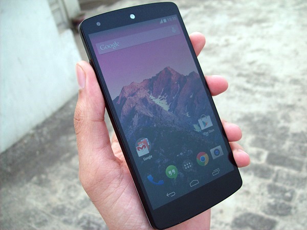
Sporting a 4.95-inch full HD LCD touchscreen, the phone is slightly smaller than the G2, but larger than the Nexus 4. On the back, there is an 8 MP (AF) camera, along with an LED flash; while the front has got a 1.3 MP camera.

Design: The phone has a very simple design. You won’t be left breathless with its looks, but it is not boring at all. With rounded edges and a curved back, the phone fits nicely into your hand. The plastic used (white model in my case) on the back is not very glossy or slippery. Similarly, the front is also not completely coated in glass like the Nexus 4.
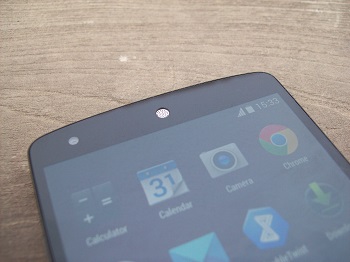
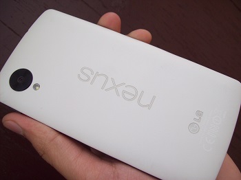
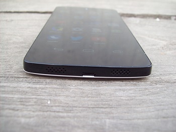
LG Nexus 5On the front, above the screen, there is a distinct white speakergrill, and below the screen. Two grilled speakers at the bottom (only one is a loudspeaker, while the other one is a mic), with the microUSB port placed between them, sort of reminds me of the iPhone 5. On the back, the Nexus logo, which is reflective on the white model, looks nice and certainly adds to the phone’s overall looks.

The camera protrudes a bit at the back. On a side note, pressing the back of the phone with your thumb or finger, especially on the logo, causes the back panel to get pressed, and that might bother those who care a lot about their phone’s body. That pretty much tell you this isn’t your HTC One or iPhone 5 when it comes to build quality. On the left side panel, you only have the volume rockers, and on the right side panel are the micro SIM slot and Power/ Lock button placed right next to it. These buttons are made out of ceramic and are quite sharp than your usual physical buttons, which could be a bit uncomfortable for some, it was just fine with me. Thanks to these buttons construction, you get a nice feedback on pressing them pretty much every single time.

Having said that, if you try shaking them left and right (rather, rattling them), you’ll see they aren’t very well put together in the whole body – this definitely bothered a little. The top has the 3.5 mm headset jack, secondary mic, and there is an LED light right under the screen, where you would normally have physical buttons.

Screen: The phone has a 4.95-inch 1080p LCD. LG hasn’t really disappointed us before when it comes to screens, and it isn’t very different here. The screen is quite bright, colour-rich, and has got decent viewing angles. My review unit had a light leaking issue (right next to the volume buttons and front-facing camera, probably just a one-off case), but it isn’t really an issue in any other units I’ve seen. While the screen isn’t as nice as the G2 or Note 3, it is pretty good and holds quite well against today’s flagship phones’ screens. And yes, it is very well calibrated.

Camera: The phone boasts an 8 MP camera that also has OIS and can shoot 1080p videos. You can check a few sample images here.

The camera is not bad. The 4.4.1 (presently on 4.4.2) update made the stock camera app faster, images sharper, but you may feel you’re still missing out against the likes of the iPhone 5s, LG’s own G2, S4 or even a year-old iPhone 5. Google has also introduced HDR+, which isn’t exactly your traditional HDR mode. HDR+ seems to give different result than what you would expect from HDR, but the mode definitely helps in taking good shots with the Nexus 5’s camera.

You can change the default camera app, but it may not enjoy access to core level as the bundled app does, which means less options and power available to you while taking shots. So, the camera quality is pretty good in daylight, but is just average when the conditions aren’t favourable. To sum the phone’s camera quality, it is noticeably better than the Nexus 4, but well short of the G2.
Audio: The phone’s in-ear audio quality is clear and quite loud (using the bundled headsets). But the loudspeaker’s output is disappointing. It is tiny and distorts at the two highest volume levels. It is way below the G2‘s quality.

The call quality is fine, though I have used phones with louder in-ear sound, I didn’t have any problem with what the Nexus 5 does. WiFi reception holds just as well, and network reception is just as good as you would expect from a flagship smartphone today.

Software and performance: Android 4.4 marks the platform’s move from Dalvik cache to ART (Android RunTime), apart from visual tweaks, new APIs and features. While it is still in the testing stage, you can enable it from Settings in order to give this new runtime a shot, and it’s clear that Google probably wants an alternative to the long-running Dalvik, but whether this is to support mid-range Android devices or just to give an overall performance boost, is yet to be seen.

Android 4.4 KitKat has, other than anything else, given the OS a visual change. There are quite a few changes you’ll see as soon as you start using the device. The icons are now slightly larger than before and that’s definitely a good move by Google. Simply making them larger has given the stock launcher a facelift and also icons in the dock much nicer. I wish fonts used would have also been something different, but that may be just me. It has three Home screens by default, plus, Google Now on the leftmost (swiping left to right) and uses “OK Google” to start the voice assistant.

You still have the Google search bar put on Home screens, same folder and icon arrangement – no changes there. Pull down notification bar is also a bit changed. Settings has now been given a place in the bar and its icon has changed to a cog. The more you use the OS, you will see Holo design has been, umm, whitened. It has been made a few shades lighter, and I am not complaining.

Another addition to the OS is better native emoji support. This means there are no more blank boxes or half missing emojis in any app. The stock google keyboard gives you emojis on long-pressing the Enter key.

Oh, and Google has replaced the default SMS app to Hangouts. So, your video calls, GTalk and phone messaging are all under Hangouts. Is it done neatly? No. This was probably the only half-baked part of the OS. If you’re a heavy SMS user, installing a dedicated SMS app and making it the default is suggested, especially since the Hangouts app doesn’t do good job at separating messages, GTalk IMs and video calls from one contact from your Contacts list.
Using TrueCaller? Well, Google has sort of come with its own way to give users identification to numbers in their call list. If the number is listed in Google’s Business data, you can search the number in Dialer to see the contact details. Handy.

As far as the phone’s performance is concerned, Google has already released two minor updates since the phone got out, and Nexus 5 surely utilises its software and hardware combination in a great way. The OS runs very smoothly – I had no app hiccups (ART may not be your best option here), and I didn’t notice any performance issues throughout my usage. The Nexus 5 is, without a surprise, one of the smoothest smartphones out there.

I think LG’s Nexus 5 is probably the best smartphone you could by in Rs 30,000 today. If you are okay with its camera’s performance, and those little hardware niggles (buttons and back) aren’t going to worry you, this is a great phone for you that guarantees prompt OS updates and gives good hardware inside to power all of it.
Categories
Tech

Sony unveils PlayStation 4 in India

The device will be available for purchase in India from January 6, 2014, for a price of Rs 39,990. Know more.
by Manik Kakra

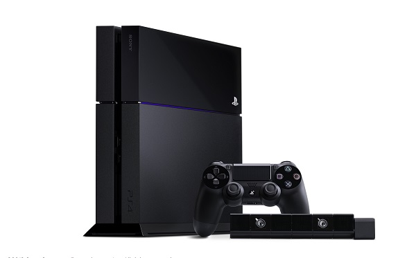
Sony today unveiled its popular and much awaited gaming console, PlayStation 4, in India. The system has got loads of chips inside, and let’s a brief look at those:

– Octa-core AMD Jaguar processor

– 8 GB GDDR5 RAM

– AMD 1.84 TFLOPS GPU

– One AUX Port, Ethernet Port, WiFi b/g/n, Bluetooth 2.1 (with EDR), HDMI out, and Digital Optical Port

The new DualShock 4 controller comes in black, blue and red colours. It is equipped with tw=point touchpad, light bar, standard four-way directional buttons, vibration, PS button, Share button Options button as well as built-in speakers. Consisting of Bluetooth 2.1 (with EDR), the device is powered by 1,000 mAh battery.

The camera with the console can shoot up to 1280 x 800 videos at 60 FPS. Using the official PlayStation iOS and Android apps, you can extend your smartphone as the second screen for your game console.

The PS4 goes on sale in India on January 6, 2014, and has been priced at Rs 39,990. This will get you the main system, one controller and one camera, along with standard cables. Buying another camera and controller will cost you Rs 4,990 each. Some of the launch titles are KillZone: Shadow Fall, NFS: Rivals, Knack and Call of Duty: Ghosts.

Categories
Tech

Lenovo launches Vibe X

Lenovo’s latest offering in India is an Android smartphone that costs Rs 25,999, marking the launch of the Vibe series.
by Manik Kakra

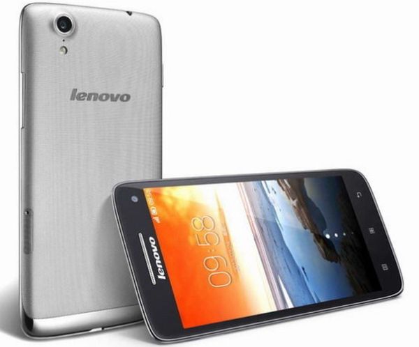
Lenovo today unveiled its new Vibe X Android 4.2.2 smartphone in India. The device marks the launch of the company’s new Vibe series of handsets. Weighing 121 grams, the Vibe X sports a 5-inch full HD screen with Gorilla Glass 3 on its edges. Under the hood, there is a 1.5 GHz quad-core MT6592 chipset and 2 GB of RAM. It comes with 16 GB of on-board storage, and is powered by 2,000 mAh non-removable battery.

On the back, there is a 13 MP (AF) camera (with LED flash); while the front side has a 5 MP camera. Connectivity-wise, the phone is equipped with 3G, Bluetooth 3.0, microUSB 2.0, WiFi b/g/n WiFi Hotpsot and A-GPS.

The Vibe X comes in only silver colour, and is priced at Rs 25,999. It goes on sale on December 21, 2013, and can also be pre-ordered here, where you will also get a free flip cover along with the phone.

“Our ultimate goal is to use innovation to differentiate Lenovo and become a leading PC + brand. We are confident that the Vibe X will be a popular choice in the Indian market where consumers crave for intelligent performance in a slim and light package. With this launch, we strengthen our focus on the smart connected devices segment,” Amar Babu of Lenovo explained.

Lenovo has been quite aggressive in the Indian market for quite a while now. It has been doing great in the PC market, and is now looking to get a larger share of consumer phone market with this offering, and six other Android smartphones it had launched a few months back. It will be interesting to see how they differentiate their products, and if we get to see OS upgrades from them or not.

Categories
Tech

Just in: XOLO Play Tegra Note

XOLO’s new tablet, the Play Tegra Note, was launched in the country yesterday; carries a price tag of Rs 17,999.
by Manik Kakra

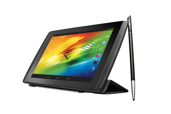
XOLO yesterday launched its new Play Tegra Note in India. The tablet sports a 7-inch (1280×800) LCD, and comes with a stylus for writing and drawing purposes. Under the hood, there is a Tegra 4 SoC (1.8 GHz quad-core A15 and 40S GPU), along with 1 GB of RAM.

The Play Tegra Note features WiFi a/b/g/n, WiFi hotspot, Bluetooth 4.0, microUSB 2.0 and GPS for connectivity options. On the rear, there is a 5 MP camera; while the front has a VGA camera. It is powered by 4,100 mAh (15.`7 Watt) battery. Running Android 4.2.2 (near stock), it is said to be upgraded to Android 4.3 soon. Other usual features include Light Sensor, Gyroscope, 3.5mm headset jack, and Proximity Sensor.

The tablet has been launched at a price of Rs 17,999, and comes in only one colour. You can also pre-book one here, which will get you a smart cover worth Rs 2,499 (as per the company website) for free.  Looking at its price, it is quite clear that the company wants to get some consumer attention, with the Nexus 7 and iPad mini Retina currently in the top two places; it will be hard for XOLO to compete if they price their devices at par with these known contenders. This new tablet seems good on paper, but can only be described once tried for a fair amount of time.

Categories
Tech

State of Zen – the new Ultrafone 701 FHD

Zen’s new smartphone, the Ultrafone 701 FHD could do with a few bug fixes for a device at that price.
by Manik Kakra

Zen has been one of those Indian brands that have getting a lot of attention recently. The company launched the Ultrafone 701 HD a few months back, and has now come up with its successor –the Ultrafone 701 FHD. The Ultrafone 701 FHD is an Android 4.2.1 smartphone powered by Mediatek’s MT6589 chipset, along with 1 GB of RAM. Boasting a full HD screen, the phone makes the sub 20k phone range more interesting. Without further ado, let’s start with our review.

Hardware and design

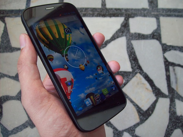
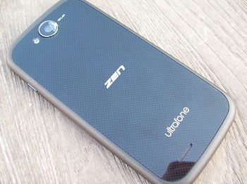
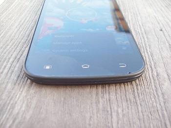
The Ultrafone 701 FHD follows the usual slab design without much added or removed from the picture. As soon as you hold the device, you realise it’s not bulky and fits well in the hand. A glossy back with plastic coating on top, it is probably the only design part which makes the phone different from a lot of slab-styled phones out there. Having matte grey edges, just like its front edges, these are certainly better while holding the device and performing a task with one hand.

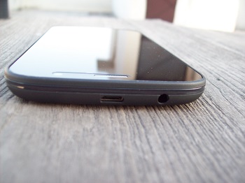
The front sports the screen with speaker grill and camera above, and three capacitive buttons – Options, Home and Back – on its bottom. The bezel below the screen is a bit too noticeable, especially considering how much space is left even after providing some for buttons. On the right side, you only have the Power/Lock key. On the left, you have the volume rockers. And the top gets 3.5 mm headset jack along with microUSB port. The back boasts a 13 MP camera, Zen logo in the middle and loudspeakers at the bottom – all black back with a diagonal pattern.

New Zen UltrafoneScreen

Talking about the screen, the phone has a full HD display, which is pretty much its USP. The screen quality is, let’s just say, good. It’s not very bright, but videos mostly look just fine. Colours are not very rich, but a bit washed out, and probably the way you would expect when the company wants to save on some bucks. The resolution seems good when viewing images. And visibility under direct sunlight it also average. I was expecting the screen to be much better, considering how much effort the companies make on them these days.

Camera

The phone sports a 3 MP rear camera that has a Bsi 2 sensor for better photographs under not-so-good light conditions. Here are a few sample images: http://imgur.com/a/cgfZT

The images mostly came out nice and clear. My experience with this camera in low-light conditions wasn’t too good. It was just okay, but in daylight and in general, it’s probably as good as you can get from an Android device priced around Rs 15K, apart from unusual over-sharp images. Just that the stock camera app isn’t the best, and you may well try a few third-party apps to get more out of the camera.

The front facing 8 MP camera is nice, wide angled and really good for your video calling and mirror needs.

Audio

I was very irritated due to the placement of the loudspeakers – right at the bottom on the back. I had missed so many calls and alerts due to sound getting all muffled with the phone New Zen Ultrafoneplaced back side down. Though the sound is actually quite loud and clear, the moment you place the phone down, you wouldn’t hear a single thing. In-ear sound quality is just fine, but I have tried phones with much better sound quality than this, even at this price point.

Call quality wasn’t an issue with the smartphone. I was satisfied with the audio during call, and also didn’t notice any network reception trouble during my usage.

Battery

The phone is equipped with 2.050 mAh battery, and takes more than three hours to get charged, which is a bit too much for a battery cell this size. I usually got about 18 hours of battery life with about four hours screen on time. It’s apparent that the full HD screen takes a toll on the battery life, and the phone could do with a firmware update to get better battery utilisation.

Software and Performance

The Ultrafone 701 FHD runs on Android 4.2.1 with near stock software. You get a few pre-loaded apps like WhatsApp and Saavn, but it is more or less stock Android Jelly Bean. Under the hood, there is a quad-core MT6589 SoC, along with 1 GB of RAM. And here’s the thing: the phone works smoothly when you are using two to three apps and keep exiting each one. But when you are in an app, using it for more than, say, half an hour, you realise that the RAM capacity isn’t enough.

The company says the chipset used here isn’t much optimised for 2 GB of RAM, so that had to put in 1 GB. That was my main issue with the phone’s performance; it will remain smooth but definitely lags and stutters in apps when an app or two are used (on-screen) for a bit. The capacitive keys, when pressed in an app or when using the default keyboard, will show you what I am saying. Smooth initially, but mostly sluggish performance after using for about half an hour.

New Zen UltrafoneThe OS isn’t much different from stock Android and that isn’t really a bad thing. We have been told that the phone will get Android 4.3 update in a month or so, but there is no official word on 4.4. There are five Home screens by default, you can customise the way you need. The App Drawer, Notification Center, all are exactly how we are used to seeing, not much different even from the 701 HD.

All in all, it is clear what Zen is trying here – bring in quad-core devices with full HD screens and offer them in sub 18k range. The 701 HD was a pretty good device for under Rs 13,000, but the 701 FHD could do with a few bug fixes – battery optimisation and general performance – on order to give the Sony and Nokia phones in this range a run for their money.

Exit mobile version