Categories
Tech

Review: Lenovo S860

The latest smartphone from Lenovo has a good battery life but leaves much to be desired on software performance and UI.
by Manik Kakra | @Manik_K on Twitter

Lenovo is a name well known and trusted when it comes to the PC industry. In the last one year or so, the brand wants to expand into the Indian smartphone market. There are quite a few phones from Lenovo that have been launched recently, and the S860 seems to be an interesting one. Let’s take a look at how worthy is the phone of its price tag of Rs 20,000.

On the face of it
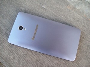
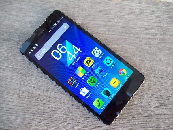
100_5100The Lenovo S860 is a solid rectangular piece with nice hairline metallic finish on the back. Once you hold it, you soon realise that it’s quite heavier than most phones and feels nice to hold, but not very slim and compact for most users. The weight is 190 grams, and it is on the heavier side mainly due to an unusually large 4,000 mAh battery unit stacked inside the phone (more on that in a bit). The front is dominated by the 5.3-inch (1280 x 720) IPS display and navigation touch keys below – Options, Home, and Back keys, and Front-facing camera, sensors and LED notification light above.

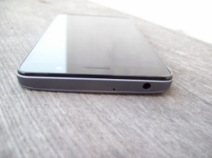
On the back, with the Lenovo logo a little higher than the middle, camera and LED flash, there is not much different from most other smartphones out there. On the right, there are volume rockers and Power/Lock key below it, while the left side panel has the microSIM slot. On the top are the 3.5mm headset jack, and mic; while the microUSB, loudspeaker and primary mic port are placed right at the bottom.

Screen

The 5.3-inch display is a decent one at this price. Videos and images look good, but brightness and viewing angles aren’t very impressive. Having said that, most people will be satisfied with the screen quality, especially when it comes Web browsing and watching videos.

Coming to the 8 MP rear camera, let’s just say that images are decent, but you miss out details sometimes. Photos under low-light conditions are average, but using the camera in decent conditions gives nice, sharp images with rich colours. You could say it’s just an above average snapper. Lenovo has done a good job with the camera app; it is quick to focus and doesn’t have any shutter lag (settings option); it is simple to tweak your settings, choose different modes without having to go through any cluttered UI.

Audio

The S860 is a good performer on audio. The sound from the bottom loudspeaker is quite loud and decent for playing games. In-ear sound quality with the bundled earphones is actually good and there’s not much to complain about the in-call audio. The phone’s network reception is okay (using single SIM).

Battery

The phone’s USP is its bigger-than-usual 4,000 mAh battery unit. You have to sacrifice a bit because of the size, like the weight, size, but is it worth it? Yep, the battery life on the phone is above par, probably any other smartphone out there. I got about 32 hours of usage out of it (single SIM, Emails, Twitter, a bit of Web browsing, a game in between, and an hour of music).
You can also choose to select the power-saving mode if you need to extract more juice by disabling some of the functionalities on the phone. Inside the box, you get Lenovo’s larger capacity charger (QuickCharge), which allows you to charge your phone quicker, and is compatible with many other phones like the Galaxy S5, One (M8), etc. Thanks to this, you can charge the S860 from zero to full in about four hours, which is not long considering the battery capacity. Thumbs up to Lenovo for coming up with such a useful trick, this might just seal the deal for quite a few buyers today. Also, the phone supports USB On-The-Go, and you get a USB OTG cable in the box.

Software and performance

The Lenovo S860 runs on Android 4.4.2 (upgraded a few days back) with Lenovo’s own custom UI on top. The whole look and feel is very different from stock Android. The main concept is similar to a few other Android OEM skin, where you get all the app icons and shortcuts right on the Home screens with no separate Menu or App launcher. You can customise it as you need and also add widgets if you like.

In fact, you can even choose a different boot animation, something that we don’t often see on phones. Most icons – colour and shape – need some work as they are not very pleasing to look at. Plus, it seems Lenovo is adamant about changing the whole UI inside, like Settings, but if it would be okay if they’re giving much time to performance enhancement, which they are not. Just check the notification center once to see how different, but not-so-well-designed, the whole skin is.

The phone has a MediaTek 6582 (1.3 GHz quad-core processor, Mali 400 MP2 GPU) chipset coupled with 2 GB of RAM. The overall performance of the device leaves a lot to be desired. There is a pre-loaded anti-virus scanner, which also gives a few handy utilities like limiting your data (already available in Android) or setting data limit per each SIM, giving an estimated time about battery life, time to recharge the battery pack. All in all, if Lenovo is serious about putting a separate skin on top if Android, they need to put in a lot of work on it. There is a ton of performance improvements required to make the experience anywhere near to being called satisfactory and smooth for a phone today that is priced around Rs 20,000.

All in all…

The S860 might be a good smartphone for somebody looking for a large screen phone with a great battery life, decent screen and a good camera. But when it comes to performance and UI, especially with the likes of the phones available today in this price range, the phone is hard to pick. Lenovo has thought well with respect to the whole battery scenario, and now it needs to work a lot on the software side. If the company can bring smoother and better looking skin (if it really wants one on top of stock Android, that is), then we can think about Lenovo doing some great work in the Indian market.
Categories
Tech

HTC launches Desire 616 and One E8 Dual SIM

HTC’s two new devices launched in India at Rs 16,900 and Rs 34,900. Here’s what you can expect from both.
by Manik Kakra | @Manik_K on Twitter

HTC launched two new Android smartphones in the Indian market. Both these devices are dual-SIM smartphones and are aimed at providing more affordable phones than what the company has done so far.

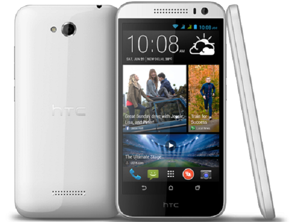
One (E8)The Desire 616 is an Android 4.2.2 that has a MediaTek 6592 chipset (1.4 GHz octa-core processor and Mali 400 GPU) along with 1 GB of RAM. Boasting a 5-inch 720p screen, it comes with 4 GB of on-board storage, which is expandable up to 32 GB via its microSD card slot. On the back, the phone sports an 8 MP (AF) camera; while the front has a 2 MP camera. The phone is powered by a 2,000 mAh battery unit.

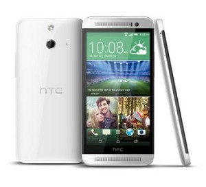
Coming to the One E8 (in pic on left), this is more of a dual SIM variant of the One (M8) with a rubberised back and a few other noticeable changes in looks. Sporting a 5-inch full HD S LCD 3 display, the phone runs on Android 4.4.2 with Sense 6 on top. It boasts a Snapdragon 801 chipset (2.5 GHz quad-core processor, Adreno 330 GPU), coupled with 2 GB of RAM. Dual front-facing BoomSound speakers and a 5 MP (BSI) camera are same as the One M8, while the rear camera has been changed to a 13 MP (AF) one. It is powered by a 2,600 mAh battery unit.

Connectivity-wsise, both these devices feature Bluetooth 4.0, WiFi b/g/n (plus a in the One E8), 3G connectivity, NFC, microUSB 2.0, and GPS. While the Desire 616 comes in black and white colours, the One E8 comes in red, white and black colour options (its blue model is expected to arrive later in India). The Desire 616 goes on sale within a couple of days for a price of Rs 16,900; while the One (E8) will be available in about three weeks for Rs 34,900.

Categories
Tech

Review: HTC One (M8)

Has HTC lost its mojo? It would appear that its newest phone might bring the company back in the reckoning.
by Manik Kakra | @Manik_K on Twitter

The smartphone race is a hard one to win and retain in today’s day and age. Companies need to bring up something new or improved to the table and make sure they don’t miss out on support for their customers, otherwise they’re going to switch quicker than you can act. HTC’s recent story has been a bit like this. The company, known for their differentiated Android devices, seems to have lost its mojo for the last 18 months or so. It has produced several good phones, but just hasn’t quite been able to do what it takes. With the One (M8), HTC tries to capture more and deliver better. And does it succeed in doing so? Let’s try and find out.

HTC’s One (M8), as the moniker suggests, is the successor to the One (M7). HTC continues to drive its ‘One’ series, which should probably help them identify better and longer with the buyer. In addition to that, HTC hasn’t changed too much when it comes to design ad form factor of its new flagship device. The One (M8) sports an aluminum unibody, claimed to be about 80 per cent of the whole body by the company, with a little usage of plastic here and there.

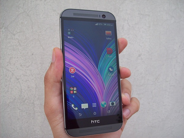
As soon as you hold the phone, you will notice its curved back and round edges, which fit quite nicely into your palm and it is similar in front design to the One (M7). The device feels very nice to hold and has a premium feel to it, but you might find it hard to grip it at times as it is still a bit slippery, especially while sliding it out of your pocket.

Dominated by the 5-inch full HD S LCD 3 panel, you get the popular BoomSound loudspeakers grilled very nicely on top and bottom of the screen while the front-facing camera, and sensors are placed on their usual places. The LED notification light is hidden inside the top front speaker, and now, in a bit of a change from their previous flagship, the HTC logo in imprinted right on a strip between the screen and the rest of the bottom part of the body.

This space reserved on the outside just for the logo, may not be liked by many because you lose out on space and it makes the device bigger, but on the internal side, there are a lot of components and screws in place, which, HTC, says, is the reason they had to give some space to this plastic strip.

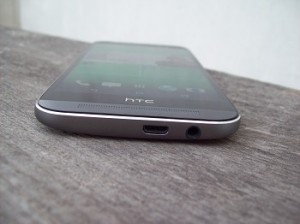
On the top, you get the Power/Lock button and the Infrared port, both are placed on a plastic black strip. On the bottom, you have the 3.5mm headset jack and the microUSB port. On the right, there’s microSD card slot and volume rockers, which gives a nice clicke-ty feedback when pressed. The nano SIM card slot is placed on the left side panel.

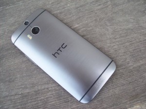
On the back, there are now two camera sensors (more on that later), and a dual LED flash, bifurcated by a thin plastic strip, which is used to ensure there are no network reception issues. The HTC logo is bang in the middle, with another plastic strip toward the bottom half.

Screen

HTC is known for their great display panels, and the One (M8) doesn’t disappoint, either. The 5-inch (1920 x 1080) S LCD 3 panel, with Gorilla Glass 3 on top, is fantastic to work on. Colours look rich, images appear sharp, detailed and viewing angles are also good. While watching full HD videos or reading text, you’ll realise how well HTC has put the screen in place. It is certainly one of the best phone screens out there, and one of the best things about this device.

Audio quality on phones is mainly pertained to their in-ear sound and in-call voice, as the loudspeakers are usually not that great to listen to. But HTC decided with its M7 that it needs to bring more and delivered with the M7’s speakers. The case is similar with the M8. These BoomSound dual front-facing stereo speakers are loud, crisp and clear. It is quite surprising that nobody after more than a year has been able to give HTC’s speakers any tough competition. The more you try them – whether for videos, games music or podcasts – the more you’ll see how much of a difference having a good pair of loudspeakers on your phone can make, and for good.

The in-ear quality is pretty good and not much to complain about. I didn’t counter any network reception throughout my usage and found call quality to be top notch.

Camera

HTC has again used what it calls ‘Ultrapixel’ technology for its camera. This time, we have dual sensors on the back, which are done to capture better depth for an image, so that you100_5088 could change the focus in an image as and when you like in your photo. As a result, you miss out on the OIS functionality and are still getting a 4 MP ‘Ultrapixel’ F/2.0 (and 2 microns) sensor. Here are a few sample images.

As you can see, more or less, the pictures look nice and you can use the camera in low-light conditions, too. You may get some noisy images in low-light, but they’re decent for your phone. To get consistent and clearer pictures, you may want to tone down the sharpness level from settings, though. Zoe, which are short video clips (also available in Gallery), can also be made, but I couldn’t find any dedicated Zoe-sharing service like there was the last time. As far as UFocus is concerned, it works half the times because it requires favourable conditions. The camera UI is even better and quite intuitive to work with. Credit to HTC for making it simpler without missing out on needed setting options. Oh, and the 5 MP front-facing camera is actually good, giving good detailed shots in decent light conditions.

Battery

The phone carries a 2,600 mAh non-accessible battery unit. I found the battery life to be average. I was expecting it to be a bit more than what it usually got, which was around 18 hours on an average, and you could stretch it by using the power-saving mode or the Extreme Power-saving mode, which only allows you to make and receive calls, messages, check the native Email client or alarm, can give you several days of standby time. The phone supports QuickCharge 2.0 (can be seen on a few devices now), but you don’t get the supported data cable and charger in the box.

The HTC One (M8) runs on Android 4.4.2 (4.4.4 should be out soon) with HTC’s proprietary Sense 6 on top. Under the hood, there is a Snapdragon 801 (MSm8974) SoC (2.5 GHz quad-core processor, Adreno 330 GPU), along with 2 GB of RAM. The phone performs very well and is smooth to work on. I didn’t come across any frame rate drops, lags or app crashes to complain about. The Sense Ui seems to have been tweaked and made a bit lighter on the inside. It feels a bit more colourful, and more cohesive to work around.

If there one OEM skin I would have to pick, it would still be HTC’s Sense. Having said that, it is far from being flawless. BlinkFeed continues to exist and sits as the leftward-most Home screen. You can now add a lot more content to it. HTC has also equipped the device to make “double tap to wake” work and work well. Swipe left to get to the last Home screen; swipe right to arrive straight to BlinkFeed; when in portrait mode, click the volume rocker to open the camera app directly. It’s neat and works well, but I wish I had been given the option to double tap on any Home screen to lock it.

HTC sense TV has also been updated and it now supports Indian channels. It does help to have an extension of your smartphone as a TV remote, especially if it displays some relevant content. FitBit is now supported natively in Sense UI; it gives you a proper count of your calorie burn, steps taken, run, etc., but do keep an eye on the app and service hogging battery. More or less, these are the main changes in the Sense UI, and you will find yourself at home if you’ve used Sense 5.5 or even 5 last. The phone comes in only the 16 GB (11.8 GB available) variant for the Indian market, and you can expand it up to 128 GB using a microSD card, plus, the user gets 50 GB of free storage on Google Drive for two years.

All in all, the HTC One (M8) seems to deliver in a lot of areas. HTC seems to know what its potential users want – except for may be that camera in place – like sporting a microSd card slot or providing a different style of Dot View case or making exceptionally great speakers on the front. This is a serious contender to be the best smartphone out there, as there aren’t too many places you could put your finger on and say I expected much better. Apart from an average battery life and a camera that needs some tweaking to be done, you get a great full HD screen, premium material on the phone, and a smooth software that doesn’t isn’t a letdown, the phone has got a lot going for it, and it may just be what HTC needs to be back among the top phone manufacturers.

Categories
Tech

Samsung launches Galaxy Tab S 8.4 and 10.5

The devices are priced at Rs 37,800 and 44,800, and will go on sale in the country next week onward.
by Manik Kakra | @Manik_K

Samsung yesterday launched its brand new tablet series in India, Galaxy Tab S, with the showcase of the Galaxy Tab S 8.4 and 10.5. Both are touted to be entertainment devices, and are being differentiated from the company’s Galaxy Note series, which, Samsung says, is made with productivity in mind.

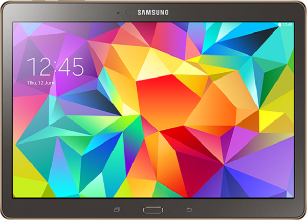
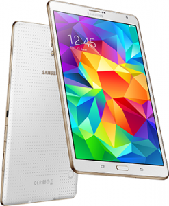
Galaxy Tab S 8.4Weighing about 298 and 467 grams respectively, the Galaxy Tab S 8.4 and 10.5 sport (2560 x 1600) Super AMOLED panels and have been launched in WiFi + 3G models, while the 4G LTE variant will be launched quite soon. On the back, there’s an 8 MP camera (with an LED flash) while the front carries a 2.1 MP camera.

Under the hood, there is an Exynos 5 chipset (octa-core processor), coupled with 3 GB of RAM, and 16 GB of internal storage space, which is expandable up to 128GB via microSD card. Connectivity-wise, there is microUSB 2.0, Bluetooth 4.0, WiFi a/b/g/n/ac, 3G (voice and video calling available), Fingerprint scanner, Infrared, 3.5mm headset jack, and GPS. While the 8.4 model packs a 4,900 mAh battery unit, the 10.5 model has a 7,900 mAh battery unit.

Just like the Galaxy S5, these Android 4.4.2 tablets come with premium services for users, including Kindle, Magzter, MyPlex, Marvel Comics etc.You can pre-book these Samsung devices till July 11, 2014, and the tablets hit the market in the second week of the month. Available in titanium bronze and dazzling white, the tablets have been priced at Rs 37,800 for the 8.4-inch model, and Rs 44,800 for the bigger 10.5-inch model.

Categories
Tech

Flipkart launches its first tablet, Digiflip Pro XT712

The company launched its first tablet at Rs 9,999 in a ceremony last week. The device is already on sale.
by Manik Kakra | @Manik_K on Twitter

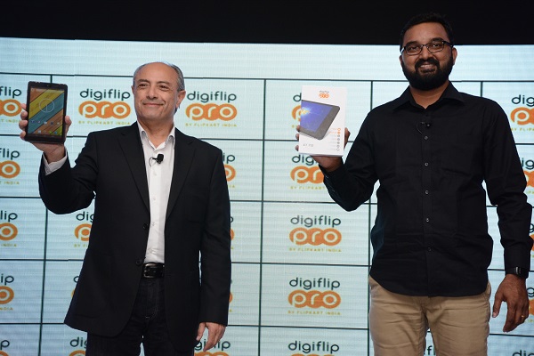
After several leaks and rumours, Flipkart last week officially launched its first tablet, made by one of the product manufacturers on their online portal, Digiflip, named Digiflip Pro XT712.

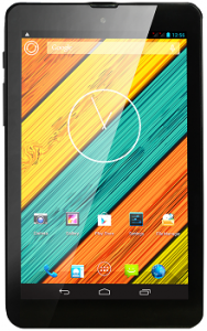
Digiflip Pro XT712 - BlackThe tablet boasts a 7-inch (1280×800) IPS display, and has on-screen navigation keys. Running on Android 4.2.2, with a couple of Flipkart apps pre-loaded, the company said it may upgrade the device (over-the-air) later this year, but there’s no confirmation on that.

Under the hood, there is a MediaTek 8582 chipset (1.3 GHz A7 quad-core processor) along with 1 GB of RAM. Loaded with 16 GB of internal storage, which is expandable up to 32 GB via microSD card, the tablet packs a 3,000 mAh battery unit.

This 3G dual-SIM capable tablet has WiFi, GPS and Bluetooth 4.0 under the connectivity options. On the back there is a 5 MP (AF) camera with an LED flash; while the front has got a 2 MP camera. The Digiflip Pro XT712 comes in black colour for now, while the white variant will be available in a while, and has been priced at Rs 9,999.

The tablet is already on sale, and is only available on Flipkart.

Categories
Tech

BlackBerry launches Z3 in India at Rs 15,990

The largest and cheapest BlackBerry in the market launched yesterday amid much fanfare. We take a look at the specs.
by Manik Kakra | @Manik_K on Twitter

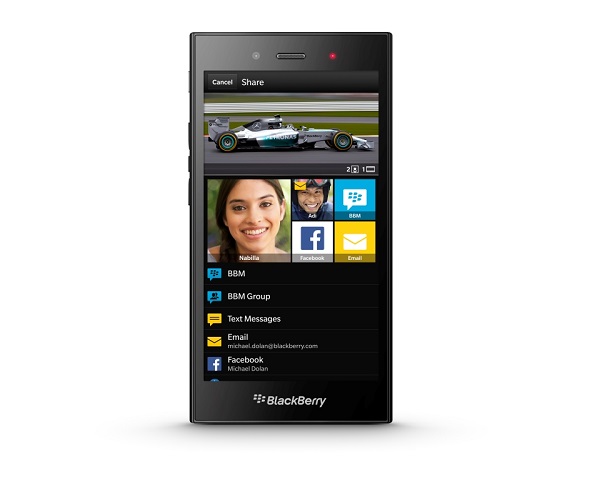
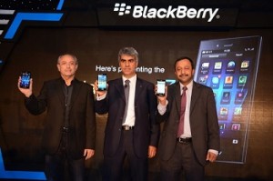
Sunil Lalvani, MD, BlackBerry India, Michael Adnani, VP-Retail & Head of...Yesterday, BlackBerry launched its new mid-range BB 10 device, Z3, in India. The phone boasts a 5-inch (540×960) screen, making it the largest and cheapest BB 10 device in the market.

Under the hood, there is a Snapdragon 400 chipset (1.2 GHz dual-core with Adreno 305 GPU), coupled with 1.5 GB of RAM. It packs in 2,500 mAh battery, and the company promises 15.5 hours of talktime on it. Further, the phone has 8 GB of on-board storage, which is expandable via microSD card.

Running on BB 10.2.1 OS, it introduces BlackBerry Maps especially for Indian users, with updated data points and destinations. On the back, there is a 5 MP camera; while the front carries a 1.1 MP camera. This is BlackBerry’s first phone to be manufactured by Foxconn after their recent agreement; the phone has a textured soft material on the back for better grip and does not compromise on the premium feel.

The phone can be pre-ordered on Flipkart or The Mobile Store, with both online portals giving buyers vouchers worth Rs 1,000. The device is available in black, and goes on sale starting July 2, 2014 across the country.

Exit mobile version