Categories
Tech

Review: Xiaomi Mi 3

Most Chinese smartphones in India are providing high end hardware at mid-range prices, but Xiaomi Mi 3 goes one better.
by Manik Kakra | @Manik_K on Twitter

We have seen a few China-based smartphone players enter the Indian market in the last one year or so, and now there’s Xiaomi. Most of these companies compete on providing high-end hardware at mid-range prices, and Xiaomi, to add to it, bets at selling units near to cost and playing on sale units. The Mi 3 is Xiaomi’s first device to be officially available in India, creating a quite a lot of online buzz – whether it’s for the limited supply, or for their India launch – so, let’s try and see if the phone actually delivers or not.

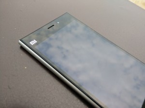
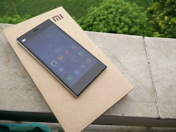
Xiaomi’s Mi 3 (MI 3W) is a full-fledged mid-range Android 4.4.2 smartphone that tries to compete with its near-cost market price. The device follows a similar form factor that we are used to seeing these days. It sports a nearly all-black front and silver back and sides. Alongside the MI logo and sensors, are the speaker grill and the 2 MP front-facing camera on the other side.

The looks
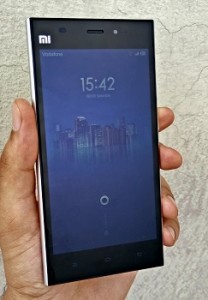
Other than the 5-inch full HD screen, the front has three touch keys – Menu, Home, and Back (from left to right). The keys are well spaced, but are a bit too dim relative to what we have been used to. The right side panel houses the volume rocker and Power/Lock key (near the middle); while the left side is completely plain.

The microUSB port and speakers sit at the bottom, and the 3.55mm headset jack and SIM card (normal mini SIM) slot are located right at the top. The first thing you notice on holding the device is that it has no aluminium build but hard plastic, which doesn’t feel cheap or doesn’t creak anywhere. There seems to be a decent effort taken to make the device grip well in your palm, thanks to the slight curve at the back and edges. It may not be a premium-built device, but it is definitely not something to complain about, either.

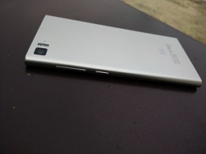
At the back, other than the logo and product ID, you have the 13 MP camera with twin LED flash and the secondary mic (sitting near the top left). One more thing you may realise is that the phone feels a bit heavier towards the bottom half, which may well be due to the battery unit placement (non-user accessible), but this isn’t something you see in many other phones these days.

The screen

Coming to the phone’s 1080p LCD touchscreen, this is a good, bright display. Videos, text, web surfing are nice and readable on the screen. On one hand, it is hard to see it toppling the high-end screens on the Ones and S5s, but on the other hand, this is pretty much the best screen on a phone at this price. So, we could say that the screen delivers and doesn’t disappoint keeping the price in mind.

Battery

The phone houses a 3,050 mAh battery unit. I mostly got 22 hours from the phone with a good amount of usage, which included a few videos streamed (around half an hour), a lot of Twitter and emails, a few calls and about half an hour of music. Connectivity-wise, Bluetooth 4.0, GOS work well with no real qualms in pairing or locking the position.

Loudspeakers and audio

The phone’s loudspeakers are placed right at the bottom. The speakers are single unit and are not at all loud. In fact, they are probably the worst unit I have seen on a smartphone for a long time. Forget multimedia, you won’t be able to hear your phone ringing if it is a few feet away from you; due to this, I missed quite a few calls within a day of using the phone. I was sent a Chinese unit, so I am not too sure if this issue is particular to the Indian mode, too. In-ear audio and call quality reveal a different picture, though. Call quality is good, audio is loud and clear, plus, in-ear audio quality is also pretty decent and would be even better with your third-party headphones.

Camera

The Mi 3 boasts a 13 MP (EXMOR RS) camera on the back, along with twin LED flash. Here are a few sample images: http://imgur.com/a/7qBdU

The snapper on the Mi 3 doesn’t disappoint. It is fast to focus and use in general. As you can see, the photos look detailed, quite sharp and colours come out pretty well, too. But, when used in dark conditions, the camera shows its weak spot. Photos come out noisy and dark enough to not be considered good by any means. The default camera app is smooth to operate with a lot of options to choose from. It is safe to say you won’t be disappointed by the native app. Just to add, the front-facing camera isn’t much to write about. It looks like a cheap 2 MP sensor, which does about its job just for the sake of it.
Software

Now let’s talk a bit about the software on the phone. The Mi 3 runs on MIUI 5 (buil number 23.0), which is based on Android 4.4.2 KitKat. A lot of you who are into flashing custom ROMs and putting mods on your phones would be familiar with the name MIUI. The software has grown and improved a lot since its first version came out four years back. Xiaomi has done a lot of work on the OS, and the community, with an increasing number of moders and users, has been shaping up well.

The OS doesn’t have separate app launchers and all your apps are placed on Home screens (something we have used on a couple of other OEM skins as well). The overall feel and look of the MIUI 5 OS is different from stock Android. Indian units come with Google services and apps loaded, but this isn’t the case for Chinese users. App icons, UI, etc., all are well-thought out and appear they are not rushed into.

Long-pressing the Menu key brings up recent app view (horizontally put in the bottom half of the screen), long-pressing the Home key takes you to Google Now. You can change these settings, even add for the Back key, as per your wish, from Settings. There are a number of nifty tools like Permission Manager, which allows you to set which app can access what, cleaner to keep a check on traso and temporary items. , and so on. The notification center can be pulled down from any part of the screen and not just its top. Overall, MiUI seems a reasonably good and usable custom skin to use and the recent history is to be believed, you can expect a lot of updates and improvements from Xiaomi for the same. Oh, and for those interested, Xiaomi allows you to flash official MIUI ROM zips on the phone on your own without having to void your warranty.
Under the hood, there is a Snapdragon 800 SoC (2.3 GHz quad-core processor, Adreno 330 GPU), along with 2 GB of RAM. The phone is smooth and fluid to work on. I didn’t see any lags for the most part, and there wasn’t any stuttering or any noticeable drop in frames while playing games or high quality games on the Mi 3. Overall, the phone breezes through general usage and handles a few apps running in the background just well.

Concluding our review, the Xiaomi Mi 3 is a very attractively priced Snapdragon 800 smartphone that delivers for most part and doesn’t disappoint when keeping its price in mind. Good screen, decent battery life and camera, above average design, there isn’t much to pin point where the phone lags behind. It will be safe to say that with Xiaomi and maybe a few more players in the market, the price wars have become more interesting, but, without having to compromise on performance, experience and design. The Mi 3 seems like the best phone (if you’re okay with no storage option beyond on-board 16 GB) for a price around Rs 14,000 with no major shortcomings, which can only mean better choices for the user in the near future.
Categories
Tech

Oppo launches N1 Mini

Launched recently in India at Rs 26,990, this phone is a smaller version of the company’s previous flagship, the N1.
by Manik Kakra | @Manik_K on Twitter

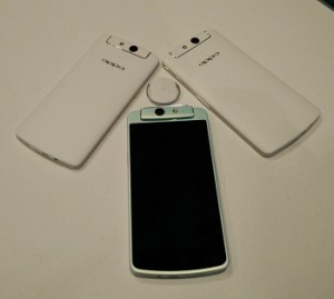
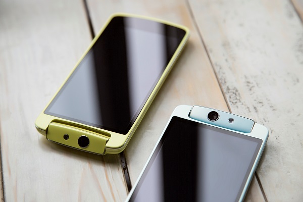
Oppo recently launched its new Android 4.3 smartphone in India – N1 mini. As the name suggests, this is a smaller avatar of the company’s previous flagship, the N1.

The phone boasts a 5-inch 1280 x 720 LCD touchscreen, and supports various gestures that we have seen on other Oppo phones. Under the hood, there is Snapdragon 400 (1.6 GHz quad-core processor) SoC and 2 GB of RAM. Running Oppo’s ColorOS 1.4, the phone has a 13 MP f/2.0 (Sony Stacked CMOS sensor) rotating camera (with an LED flash) similar to the one we saw on the N1. The phone comes with 16 GB of on-board storage but there is no expansion slot. The N1 mini packs a 2,140 mAh battery unit, and supports the O-Click accessory.

Connectivity-wise, there is Bluetooth 4.0, WiFi b/g/n, NFC, DLNA, microUSB (with USB OTG) and GPS. The phone comes in white, light blue, and mint colours, and has been priced at Rs 26,990. Looking at the price tag, it does seem a steep price to pay for what is being offered, especially after considering what the likes of Xiaomi, and Motorola before that, have been up to for the Indian market.

Categories
Tech

Review: Oppo Find 7

Oppo’s newest phone, Find 7, has some great features and may entice users of other smartphone brands to switch over.
by Manik Kakra | @Manik_K on Twitter

Oppo has been quite a name in the smartphone category when it comes to emerging players. The Find 7 does manage to turn heads and is probably the right marketing tool to get Oppo some brand recognition? But does the device justify its price? And what does it do different than its competitors?

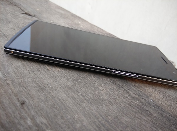
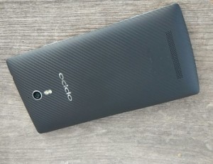
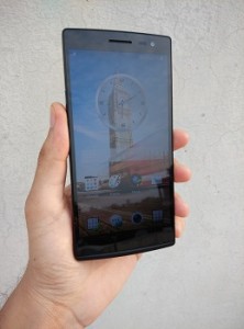
Oppo launched the Find 7 (X9076) and 7a together, and the two are almost twins if you don’t consider a couple of hardware differences. The Find 7, with its 5.5-inch 1440 x 2560 IPS LCD, is a big and quite heavy (173 grams) phone, but not an uncomfortable device to hold. Thanks to the textured plastic material, and the slightly curved back, most people would find gripping the phone not much of a hassle in their daily use.

One thing I’d like highlight is Oppo’s retail packaging – it is really well done. The hard plastic box, with very neatly-assigned spaces for the phone and accessories, such that you can conveniently put back things into their place in the box, is something that you won’t find in a lot of phone retail boxes.

The looks

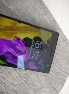
Dominated by the 5.5-inch Quad HD screen with Gorilla Glass 3 on top, the front also sports three capacitive touch buttons for Menu, Home, and Back. The buttons feel a little small in size than what they could have been considering the phone’s dimensions, plus, they are noticeably dim. The vibration feedback from the buttons, on the other hand, is just as as it should be. T

The top hosts the 3.5mm headset jack; while the microUSB port and primary mic sit at the bottom. Above the screen is the 5 MP front-facing camera alongside sensors and speaker grill. It’s below the screen that things get different – there’s a skyline notification LED, a unique feature in the Find 7. The skyline notification LED, just as the name suggests, glows up in a curved shape whenever a notification arrives, and it looks refreshing and unique when put next to a lot of other smartphones.

The Power/Lock key is placed on the left; and the Volume keys are placed at a similar height on the right (slightly above the middle) and a tiny SIM card-extracting pinhole. The keys, paired with dual chrome lines along the edges, need to be pressed a bit firmly and raised just enough to give a nice feedback when pressed. On the back, you get the 13 MP camera, speaker grill towards the botton and the Oppo logo below the camera and LED flash. Though angular and a bit wide, the phone gives a premium feel and seems solid to hold. It would be fair to say Oppo has done a good job on the finish and design front.

Display

The phone’s 5.5-inch 1440 x 2560 IPS LCD is obviously one of its USPs. The display is the first Quad HD phone screen to be launched in India (LG’s G3 is the second one), and marks the smartphone penetration into screen resolutions beyond full 1080p. The first time you use the phone, it’s a bit hard to tell it apart from a 1080p screen, but when you start reading fine text or view very high resolution images or even videos, that’s where, I think, the difference pops up.

The screen on the Find 7, with whatever toll it takes on a few other aspects of the device, is crisp to look at, read text, and view images. It has good viewing angles and even the contrast doesn’t disappoint while you flip through images or webpages on the phone. Though not a very bright panel, which fails to impress when used under direct sunlight, the 5.5-inch IPS LCD, the first one with these many pixels, does quite do justice to the hype it created.

Audio

The phone has a loudspeaker at the back. The speakers are very loud and clear. They hardly distort and are good enough for gaming and video. Though not as good as the One’s BoomSound speakers quality-wise, they are just as loud as and certainly better than most other phones. In-ear sound, too, is impressive and the bundled headsets are actually not bad (but still get your own pair of headsets). The music player and phone settings give you a lot of audio setting options and do a good job to make your audio experience worthwhile.

Camera

Let’s move to another major part of the phone – its 13 MP f/2.0 rear camera (Sony EXMOR CMOS Sensor). Oppo has deployed something called ‘Super Zoom’, which basically allows you to snap 50 MP images from the 13 MP sensor. Don’t get your hopes up. The phone takes about a dozen photos to stitch a single 50 MP image. The trick isn’t very neat, and is far from being as efficient as what Nokia does with their high megapixel sensors. Having said that, the camera, with its 13 MP and other usual ray of settings, is capable of taking really good shots. Here are a few sample images.

As you can see, the phone can take a lot of really bright and sharp images. You won’t be disappointed with the camera’s responsiveness, contrast handling or processing. Coming to the native camera app, you will find a plethora of setting options to choose from, but without manking the UI cluttered or very hard to work on. For instance, you can make GIFs, audio photos, HDR and even take RAW (.DNG) samples with it. For those who care about the front-facing 5 MP camera, there’s good news. You can take proper shots with editing options right in the camera app and you won’t be disappointed with the result.

Call quality

As far as call quality goes, the phone doesn’t disappoint when it comes to voice. There were no network reception issues throughout my usage and the phone held well whether for WiFi, Bluetooth or locking in with its GPS.

Battery

The phone houses a 3,000 mAh battery unit, which is user-accessible. The battery life on the phone, on an average, came out to be about 23 hours  with brightness at about 30%, but notch it up a bit to 45% and the battery life comes well below 20 hours, which just shows the toll that the screen takes on the phone’s battery.

Oppo has equipped the Find 7 with their VOOC battery technology, which allows you to charge the phone from 0 to about 75% in half an hour. The bulky charger and the relevant tech in place do their job excellently, meaning you don’t have to worry about waiting to get the phone charged to a decent level before you unplug it.

Software

The Find 7 runs on Android 4.3 with Oppo’s own ColorOS 1.2.4i on top. The whole look and feel of the OS is identical to that of N1. The launcher, customisation, etc. work almost like what you see on most other Android flagships and there isn’t much difference to talk about from what we already did for the N1, but it is high time the phone gets updated to Android 4.4.

Other features

About the navigation keys, long-pressing the options key brings up the recent apps list, while doing the same on the Home key brings up Google Now, by default. You can double tap to wake the screen, though it doesn’t work to lock. The whole look is not something to complain about. Icons, themes, default wallpapers are all taken care of.

Three default Home screens with a different pane for music and camera is a good thought for some. For those interested, Oppo allows you to flash ColorOS ROMs through the factory-installed recovery without having to void your device’s warranty.

Something worth mentioning is that most of the OS components and probably all the Android apps are not yet made for the resolution we have on the Find 7. Powered by the Snapdragon 801 chipset MSM8974 (2.5 GHz Krait 400 quad-core CPU, and Adreno 330 GPU), along with 3 GB of RAM, the overall performance on the Find 7 is about satisfactory. Keep in mind the high resolution screen in place and what all tasks it would take to keep the screen running.

You may notice a bit of a stutter while scrolling through settings or even when switching between apps or changing clips while watching from Gallery. But on the other tasks, for music, Web, Camera, the phone feels quite smooth. While it is far from being judged the smoothest Android phone out there, it is surely not a slouch and good enough to get your work done.

Oppo has done a really impressive job with the Find 7. Great screen and design, fantastic camera and audio quality, and decent battery life and intelligent battery technology; this new flagship handset is right there to take on the more popular flagships and can lure more people into buying their first Oppo device.

Categories
Tech

Spice launches Stellar 520 and Stellar 526

Reasonably priced at Rs 8,999 and Rs 11,499, the Android smartphones are dual SIM devices in the mStellar 526id range segment.
by Manik Kakra | @Manik_K on Twitter

Spice today launched two new Android 4.4.2 smartphones – Stellar 526 and Stellar 520 – in the mid-range segment.

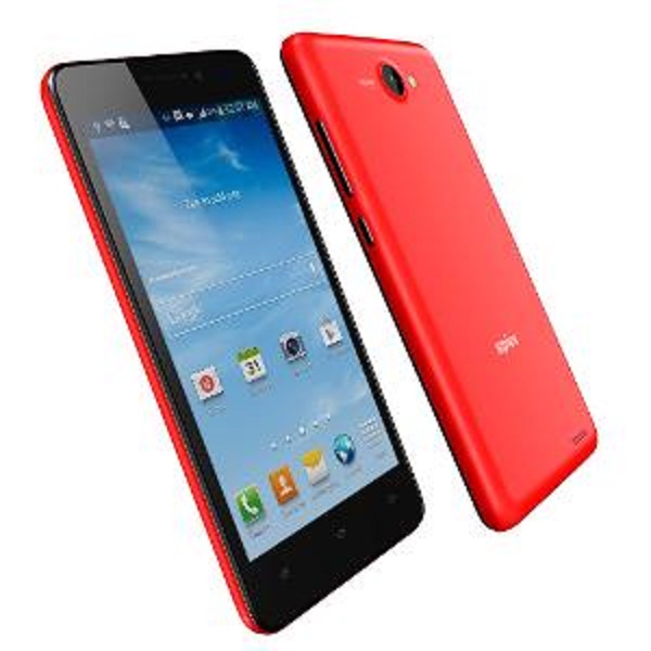
The Stellar 520 (in pic above) is a dual-SIM (3G + 3G) device that sports a 5-inch HD (OGS laminated) screen, and is powered by a 1.3 GHz quad-core processor with 1 GB of RAM. On the back, there is an 8 MP (AF) camera; while the front has a 2 MP camera. The phone packs a 2,000 mAh battery cell and comes with 4 GB of on-board storage, which is expandable up to 32 GB. The phone comes in yellow and red colour options. It is equipped with 3G, Bluetooth 3.0, WiFi, and A-GPS.

The Stellar 526 Iin pic on left) is a dual-SIM (3G + 2G) smartphone that sports a 5-inch HD screen, and has a 1.5 GHz hexa-core processor with Mali 450 GPU, along with 1 GB of RAM. The back has an 8 MP (AF) camera that can shoot 60 FPS videos; while the front has a 3.2 MP camera. Powered by a 2,500 mAh battery unit, the Stellar 526 comes loaded with 8 GB of storage, which is expandable up to 32 GB. Connectivity-wise, there is Bluetooth 4.0, (dual band) WiFi, 3G, FM Radio, and A-GPS. It comes in white-silver colour.

Both these devices are available as of today from retail stores as well as online portals. While the Stellar 520 is priced at Rs 8,999, the Stellar 526 is available for Rs 11,499.

Categories
Tech

LG launches G3 in India

The company launched its flagship phone, the G3, and an IP67-certified G Watch in a ceremony held in Mumbai today.
by Manik Kakra | @Manik_K on Twitter

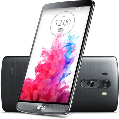
LG today launched its much talked-about new flagship, G3, in India. The G3, after Oppo’s Find 7, is the second smartphone in the country to boast a resolution of 2560 x 1440.

Other than the 5.5-inch Quad HD display, the phone’s USP is the 13 MP (AF and OIS+) camera, which not only comes with the usual dual LED flash, but also with a unique laser focus for quicker and more stable focus on your subject while taking photos. For people concerned about the front-facing camera, there’s a 2.1 MP camera on the front. LG has also equipped their new flagship with 1W with Boost Amp.

Under the hood, LG’s G3 is loaded with Qualcomm’s Snapdragon 801 SoC (2.5 GHz Krait 400 quad-core processor, Adreno 400 GPU), along with 3 GB of RAM. The phone is powered by a 3,000 mAh battery unit and supports wireless charging. The 16 GB and 32 GB model have been launched in the Indian market, which is expandable up to 128 GB.

G WatchConnectivity-wise, there is Bluetooth 4.0, NFC, A-GPS, 3G, 4G LTE (VoLTE), and microUSB 2.0. The phone is already available in the market in Shine Gold, Silk White and Metallic Black for Rs 47,990 for the 16 GB model, and Rs 50,990 for the 32 GB model, which also include a QuickCircle case worth Rs 3,500.

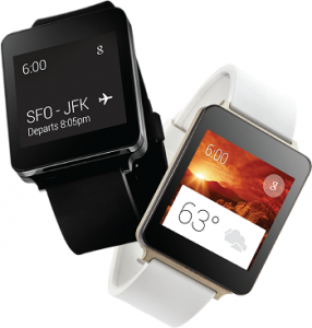
LG has also launched its IP67-certified G Watch (was already available from the Play Store) in black and white for Rs 15,000. When bought with a G3, you get a discount of Rs 5,000.

Categories
Tech

Xiaomi enters the Indian market

After much hype, the Chinese handset manufacturing company recently launched the Mi 3, Redmi Note, and Redmi 1S in India.
by Manik Kakra | @Manik_K on Twitter

After a lot of hype and rumours, the popular Chinese handset manufacturer, Xiaomi, entered India with the launch of three of its smartphones in the market – Mi 3, Redmi Note, and Redmi 1S.

The Mi 3 is an Android 4.4 smartphone with MiUI on top. Under the hood, there is a Snapdragon 800 chipset (2.3 GHz quad-core processor, Adreno 330 GPU), coupled with 2 GB of RAM. Boasting a 5-inch full HD display, the phone sports a 13 MP (CMOS) camera (with dual LED flash) on the back; and a 2 MP front-facing camera. The Mi 3 is powered by a 3,050 mAh battery cell, and comes with 16 GB of on-board storage. It will be available on Flipkart (http://www.flipkart.com/mi) exclusively for a week, and will go on sale from July 22, 2014. It is priced at Rs 13,999.

Redmi NoteThe Redmi Note, running on Android 4.2 with MiUi 5 on top, features a 5.5-inch (1280×720) IPS display, and is powered by MediaTek’s MT 6592 SoC (1.7 GHz octa-core processor, Mali 450 GPU), along with 2 GB of RAM. It carries a 3,100 mAh battery unit, and comes with 8 GB of on-board storage, which is expandable up to 32 GB via a microSD card. On the back, there is a 13 MP camera; while the front has a 5 MP camera. Available in white, the phone will be available in a few days for Rs 9,999.

Coming to the Redmi 1S, this is a dual-SIM Android 4.3 smartphone with MiUi 5 on top. The phone has Qualcomm’s Snapdragon 400 chipset (1.6 GHz quad-core processor, Adreno 305 GPU and 1 GB of RAM. Featuring a 4.7-inch (1280 x 720) screen, the phone has an 8 MP rear camera; and a 1.6 MP front-facing camera. Powered by 2,000 mAh battery, there is 8 GB of internal storage, expandable up to 64 GB. It comes in red, white and black colour options, and will soon be available for Rs 6,999.

All these phones are well capable connectivity-wise with Bluetooth 4.0, WiFi, NFC, microUSB 2.0, 3G, and GPS. With their aggressive pricing, it will be interesting to see how Xiaomi does in the Indian market, especially after seeing how well Motorola has been doing this year.


Exit mobile version