Our tech reviewer tests the new and interesting BlackBerry Z10, and explains some of the fuss behind Blackberry’s newest offering.
by Manik Kakra
BlackBerry has been in a lot of trouble for the last two years or so. Their loyal customers have shifted to iOS and Android, and their financial statement doesn’t look impressive, either.
In an effort to overhaul its whole mobile business, BlackBerry has come up with its new operating system, built again from the ground up, BlackBerry Z10. BlackBerry Z10 is the veritable messiah to take this OS into the market. We take a look at this device and the new OS, and how it differs from the existing players in the market.
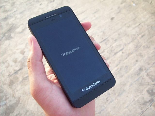
What it looks like: The BlackBerry Z10 sports a 4.2-inch (1280×768) screen, and has a rubberised back. The phone feels like a premium piece as soon as you hold it, and fits in your hand very nicely. There are no cheap materials or colours on its body.
 On the right, there are volume rockers and a voice control button in between (see pic on left); the left side has an HDMI port and microUSB port. The front is dominated by that screen. On top of the screen, there’s a 2 MP front-facing camera, LED light and speaker + sensor. On the bottom of the screen, you get a bold BlackBerry branding and primary mic. On the back, there is an 8 MP camera with an LED flash, and BB logo in the middle. On the phone’s top, there is a 3.5 mm headset jack, Power/ Lock key, and secondary mic. The bottom side has just a loudspeaker.
There are no physical buttons on the front, making it a full-touch device like the Nokia N9.
Screen test: The phone’s screen is quite bright and colours look very vibrant on it. There is not much chance you would see any pixels, and usually videos look impressive on it. The buttons on the side are also of high quality – you get a good feedback on pressing them. BlackBerry has done well in the construction of the phone as there are no rough edges. The call quality and network reception on the device we tested were top notch.
Camera quality: The 8 MP camera isn’t something extraordinary. It performs well in daylight conditions but the images aren’t the best from among the high-end smartphones out there. Although the lowlight images were really bad, most of the images in natural light should satisfy an average smartphone user. The focus works quite well, too. You can either tap on the screen to take a picture, or press the volume up button.
The camera UI is quite interesting. BlackBerry has overhauled it and made it quite convenient for the user to change settings within camera like TimeShift (burst mode), and frames.
Hear this: The audio quality on the phone through loudspeakers was disappointing. You get distorted sound even when playing on 70 per cent volume, and the loudspeakers, at the bottom, may get muffled while using the phone. Having said that, the in-ear sound was noticeably better. It was loud, clear, and the basic earphones, though no match for dedicated audio earphones, seem good.
Battery life: Battery life on the phone was average. I was able to get 16 hours on a single charge with regular usage.
Software brouhaha: Let’s now talk about the software – BlackBerry Z10. The software is nothing what we have seen from the company earlier. The BB10 OS is based on full-touch interface. The outlay is quite interesting. As soon as you switch on the phone, you get to see the Menu (or App tray). By swiping left from the first menu screen, you go to Hub, and swiping right takes you to other Menu screens.
Hub, as the name suggests, is one-stop umbrella for all your messages – Email, Twitter mentions, BBM, and SMS. You get all of them neatly placed in the Hub. Whenever there’s a new message, the LED notification light starts blinking, just like in the older BB devices. When you go into an app from the Menu, you have to swipe up from the bottom of the screen (ahem, webOS) to come out of the screen, and you will get to see multitasking view, showing you all the opened apps. All these preview panes have a small close ‘X’ button in order to close as well as remove the app from the multitasking page.
 At the end of it all: The phone performs really well, and the UI is very fluid and quite intuitive to use. With its 1.5 GHz dual-core S4 Pro processor, and 2 GB of RAM, the phone almost never lagged and performed smoothly. The app switching works brilliantly and there were no app crashes.
Talking of apps, the BB AppWorld is seriously a downside to the OS. Though there are nearly 1 lakh apps available, there are too less good quality, important apps. BlackBerry has tried to give several native apps – Twitter, Facebook, FourSquare, Dropbox – but most seem half-baked. Take Twitter for instance; there’s no way to change font size, you cannot remain on your timeline position, and so on.
Email, which has been a strong point for BlackBerry, remains a solid point. The Email experience is one of the best you could get. That, along with the keyboard, are the best things about this OS. The keyboard is quite different from what we have seen on touchscreens, but once you start using it, you realise how nicely it works and how the prediction gets better. The Web browser is also very nice, and loads pages without showing too many weak links.
The OS doesn’t bring something new to the table for users which iOS or Android don’t already have. Yes, the gesture-based UI is good, but it could mean a new user has to learn how to use his new BlackBerry phone.
It is clear that BlackBerry has made a serious effort in the past one year. The BB Z10 is a really nice phone, but it may well be a little too less for users who are already used to iOS, Android, or Windows Phones. Having said that, if BlackBerry keeps providing updates and brings the Q10 to the market quickly, it could mean better time for BlackBerry in the Indian market.
