Categories
Tech

3 tips for a smooth video conference

We present 3 simple tips on acing your next video conferencing meeting – read on to know what they are.
by The Metrognome Team | editor@themetrognome.in

Technology has advanced so much in recent years that it has even made a significant impact on the way professionals operate. To a large extent, it has made things relatively easier for them; for instance, with AV equipment used in video conferencing. Apart from reducing the expenses and time required to travel for business meetings, video calling has also been said to propagate healthy relationships and communication between business partners.

Video calls with the use of AV equipment have now made it so that you can conduct your business in the privacy of your home conveniently.

Increase in efficiency and productivity can also be said to be a by-product and advantage of using AV equipment in this case. The time that would have been used to travel can be applied to doing more resourceful tasks.

Video conferencing is not foolproof, however. No matter what AV equipment used, video calls just like in face-to-face meetings can present some challenges that have to be curbed or checked to make sure the meeting runs well. Here are some tips to ensure that your video call goes smoothly.

#1 Make sure everything is in place before the video call starts

Double check and triple check your AV equipment, check the network connection, check the video conferencing software you plan on using during the meeting, test run the sound and audio prior to when the meeting starts. Check for lighting, check to make sure the conference room or wherever the meeting is holding speaks of professionalism, provide alternate measures in case something goes wrong. This would help you get adequately prepared and save a lot of time and potential embarrassment.

#2 Have an agenda or plan to follow during the meeting

A meeting done via video conferencing is not any different from face-to-face meetings and as such should not differ. You still have to plan well ahead and have an agenda that covers everything you would want to say. This would prevent awkward silences halfway through the meeting and save you the embarrassment of long pauses.

#3 Dress for the meeting

That it is a video conference doesn’t make it less of a professional meeting. Apart from making sure all the AV equipment is fully functional and are in good working condition, you also have to make sure that you and the other participants are dressed accordingly for the meeting. The impression you make during the course of the meeting is important and you should strive to make a very good one. Appear professional; be neat and coordinated.

Video calls are now the new rave; every organisation is making use of AV equipment and conducting their business via video conferencing. Making sure your workers or colleagues are well prepared for meetings and can handle the equipment in your absence would also go a long way in ensuring your video calls go smoothly. Keep the above-mentioned tips in mind and it is sure to help increase the efficiency of the conference meeting and also help to avoid any unpleasant situation.

Categories
Tech

How to choose the best mobile hotspot to stay connected everywhere

If your old router is giving you problems, it’s time that you get a new one – with these tips.
By The Editors | editor@themetrognome.in

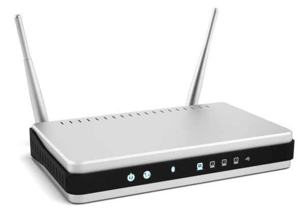
Choosing a router can be a tedious task as there are so many in the market. Here are some tips that will help you to decide on the perfect router.

1. Wireless standards

Make the best of a fast Internet connection. Get a router that offers 802.11ac or Gigabit Wi-Fi support. This wireless standard is supposed to be twice as fast as the previous 802.11n with a 1,300 Mbps throughput at the base level. This wireless standard is also compatible with older devices. However, with older devices, you will not benefit from the extra you get as in the case of newer devices.

2. Hardware

While selecting a portable router, it is important to ensure that it fits your pocket and is lightweight and easy to carry around. These routers also come in different colors, shapes, and designs.

3. Life span

Your Wi-Fi router is never going to last forever. Every day, it goes through a lot of load as it handles the Internet connection between your phone, computer, laptop, TV, and every other device at home or elsewhere. As more and more devices are connected to your router, the list keeps on increasing. This leads to degradation in your its performance. Also, wireless standards change often that make your router obsolete sooner. Depending on how many devices your router can connect to before showing a dip in performance as well as its technology, the life span of the router may be determined.

4. Coverage

This is a very important thing to consider. Even if you may carry your router anywhere and everywhere, you do not want to use the Internet while hugging your router. Ensure that your router has enough coverage for you to manage it. You could even use your old router to extend the Wi-Fi range

5. Cost

There is a wide-range of router prices. However, if you just need a portable router for simple daily tasks, you may want to skip the extremely high-end ones. Another reason to skip high-end ones is that changing technologies would make the router obsolete after a few years. Depending on your needs, look for a budget-friendly option.

What to do with your old router once you get a new one?

Once you get a new router, it is very easy to just connect to it and throw out the old one. However, even this old router may be really useful. If your old router is working, you could use it to extend your Internet connection to a wide area. This will let multiple people use your router even if they are in different rooms. You could even exchange it with your service provider or retailer for a discount on your new router.

Before buying a new router, keep all of these points handy and make sure that your router meets them well. So, choose the cheapest, fastest, and most reliable router and enjoy a seamless experience with the high-speed 4G Internet.

(Picture courtesy Online Tech Tips)

Categories
Tech

Review: OnePlus X

We test the newest OnePlus phone and come away only slightly impressed. It’s a good phone for its price, though.
by Manik Kakra | @Manik_K on Twitter

We have seen quite a lot of smartphones this year that are not priced upwards of Rs 20,000 and still perform pretty well on most tasks. With the likes of Motorola, ASUS, OnePlus, Xiaomi, and a few more heating the battle up, it isn’t a bad situation for buyers. While the mid-to-high range devices are improving, what they still usually lack is premium build quality, a great camera and every feature at a reasonable price. Does the OnePlus X, priced at Rs 16,999, change that?

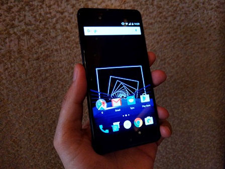
The looks. The OnePlus X (E1003) follows a considerably different material and design language than anything OnePlus has sold recently. The device has curved glasses on the front and the back, and is a flat slab on both sides with chamfered edges. Weighing under 140 grams and not measuring too tall, the device is not comfortable to grip as the whole body is quite slippery (you get a plastic case in the box, but you might want to get a better one that looks and feels less cheap).

With the 5-inchAMOLED on front, sensors and front-facing camera above it, and three capacitive touch keys (none of which light up), the bottom has the microUSB port surrounded by the loudspeaker and primary mic. The left panel has a three-way alert switcher (same as the OnePlus 2); the right side has SIM cards tray (nano + nano or microSD card) tactile volume and Power/ Lock keys (near the middle); and the top has secondary mic and 3.5mm headset jack. The back, sports the OnePlus logo apart from the 13 MP camera and LED flash on the top left corner.

Screen. OnePlus X is equipped with a 5-inch full HD AMOLED, which most people would find comfortable for most of their tasks. The screen is sharp, usable under sunlight and has deep rich black levels expected of an AMOLED today. The phone has the black theme selected by default for better battery and the screen does justice to it. Full HD videos and images look fine on it, but you may have to wipe the glass every now and then.

Battery. The device features a 2,525 MAh battery unit. The phone almost never lasted a full day with average to high use. With lighter usage, you can expect it to last about a day. Using a single SIM card, brightness level at 30%, don’t expect a lot from this device in terms of battery life. The phone takes a couple of hours to get fully charged.

Camera. The phone boasts a 13 MP (f/2.0) camera on the back, and here are a few sample images.

As you can see, the camera isn’t that great; images sport quite some noise and while the camera app itself is smooth and quick to capture, the results are not good. You can get some good shots with the right lighting and a still subject but the camera disappoints otherwise.

Software and performance. The OnePlus X runs OxygenOS 2.1.3-x over Android 5.1.1. It sports Qualcomm’s Snapdragon 801 chipset, which was used by a lot Android OEMs for their flagship devices nearly two years back. There’s 3 GB of RAM and about 10.5 GB of storage available to the user. OnePlus’s OxygenOS is close to the look and feel of stock Android, with a few tweaks and features. There aren’t too many additions done since we last used it on the OnePlus 2. The company has stated that the phone will be updated to Android 6.0 in2016’s first quarter. Performance-wise, the OnePlus X is a satisfactory performer. Throughout my usage, I didn’t see too many app crashes or stuttering between Chrome’s tabs. While I wouldn’t say animations and general scrolling are as fluid as, say the Nexus 5X’s, it isn’t bad and definitely as good as phones in this price segment today.

It is quite clear who is this OnePlus X meant for. You can choose it if you want something that looks and feels really nice, has smooth performance and good screen. The OnePlus X sort of makes the mid-range phone segment in the Indian market better and more competitive.

(Pictures courtesy Manik Kakra)

Categories
Tech

Review: LG Nexus 5

We take a look at the new Nexus smartphone and like a few features. But some others require more work.
by Manik Kakra | @Manik_K on Twitter

LG’s Nexus 5 remains the most popular Nexus device till date. The phone got a lot of things right, and was not only liked by power users who are into Nexus’s products but also general users. Two years since the Nexus 5’s launch, the LG Nexus 5X is out. But does it fare well?

The looks. The Nexus 5X follows a familiar soft-touch look and feel of the Nexus 5. The soft-touch polycarbonate material and rounded edges and light weight make the phone comfortable to carry, but as soon as you press those Volume buttons and power/Lock key on the right, you realise this phone doesn’t ooze a premium feel. The phone has a flat back, plus, front-facing speaker (which also houses the primary mic) and notification LED below the screen.

The ear-speaker grille is surrounded by the 5 MP front-facing camera, sensors, which are visible if you look closely. On the back is the protruding 12.3 MP camera along with dual LED flash. The phone’s design reminds a lot about the Nexus 5, but it doesn’t feel better than other phones priced around Rs. 30,000, especially with Xiaomi, Motorola and ASUS designing phones well below the Nexus 5X’s price point.

Screen. The device boasts a 5.2-inch IPS LCD that’s covered by Gorilla Glass 3. The screen does a great job in daily use for videos, images, and text. It’s not the brightest LCD on a phone today, but it definitely has great colour reproduction, sharpness, and richer Black levels than earlier. It doesn’t have the highest resolution possible but it handles colours and sharpness for videos and images well.

Camera. Nexus phones aren’t really known for imaging. The 12.3 MP (f/2.0 an 1.55 microns) camera is apparently better at low-light shooting. Here are a few sample images.

LG Nexus 5The camera seems capable of giving detailed and sharp images. In low-light and good light conditions, the camera doesn’t disappoint. You can open the camera app from wherever you are even if the screen is locked, by double-tapping the Power/ lock button. The new camera app is much improved too. Other than some unusual focus issue in broad daylight, the camera app works well.

Battery. The Nexus 5X is equipped with a 2,700 mAh battery unit. The phone required to be charged well within 20 hours of heavy to moderate use. But what’s better is Android 6.0’s battery optimisation feature (Doze). Thanks to this new feature, expect your phone to give much improved standby time, when the phone is idle with the screen switched off.

Audio. The loudspeaker on the front does a pretty good job and usually doesn’t distort. It is quite loud and clear, while not as nice as the One M9+ and Note5 (better placed, though), it isn’t really bad either. In-ear headsets are just about okay, and I would suggest getting a decent pair for your new Nexus phone. Basics like call quality and network reception are top notch. Bluetooth and WiFi connectivity caused no problem.

Software and performance. Under the hood, there’s a Snapdragon 808 SoC (hexa-core -1.8 GHz dual-core + 1.4 GHz quad-core CPU and Adreno 418 GPU) along with 2 GB of RAM. Belonging to the Nexus group, the phone is expected to be smooth in various tasks, have stutter-free scrolling, and so on. Does it deliver on those points? Mostly yes. The phone does well when scrolling in apps, paying HD videos in the YouTube app, and switching between apps from the Recent Apps key (on-screen keys here) has been improved in Android Marshmallow. The phone hardly ever lagged, and almost always provided stutter-free experience in games (FF Legacy).

Where it slightly lagged was when switching to Chrome with a few tabs open or using an image-heavy app like Instagram or Imgur and having to load images again when scrolling.

I found WiFi performance and animations to be noticeably improved. It feels a bit more polished and less buggy to use. On the other hand, there’re also a few added features with this new version. One of those is Google Now on Tap. The swipe-up gesture to bring Google Now has been removed and you now have Google Now on Tap, which you can trigger by long-pressing the Home button inside any app.

Wrapping up, the Nexus 5X scores well on these fronts – Screen, general performance, camera, but lacks a little for battery life and aesthetics. While we have seen quite a few manufacturers bringing great value-for-money smartphones in budget, in my opinion, this year’s Nexus launches (the Nexus 5X and 6P) show the Nexus program is here to stay and its advantages – first in line for OS updates, no third-party bloatware, typical smooth performance – are well in place for now. If you’re looking to buy one, you should go for the 32 GB model (24 GB available space) that is priced around Rs. 31,000.

(Pictures courtesy Manik Kakra)

Categories
Tech

Review: Samsung Galaxy Note5

This phone mostly performs well but stutters on a few basic parameters. It’s highly recommended for its display and camera.
by Manik Kakra | @Manik_K on Twitter

The Note series is perhaps the most popular line-up of smartphones that Samsung has produced in terms of dominance, incorporating a larger screen, a stylus, and various design parameters. Now, as almost all phone manufacturers have a large phone in their hand, what does Samsung have in store for us that others don’t?

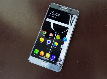
The looks. Samsung changed its design philosophy for its high-end smartphones late last year, and this year it decided to continue on that path with the Galaxy S6, S6 edge and S6 Edge+, and now with the Note5. If you remember the Note 4, it had a plastic textured back that was removable, but the Note5 sports a shiny metallic and glass back that tapers on both sides, giving the phone a pretty premium feel, but also making it a lot slippery than its predecessor. The back is also reflective and catches fingerprints and smudges quickly.

The protruding camera at the back is joined by LED flash, heart rate monitor and the Samsung logo. The phone’s front resembles a typical Samsung Android phone with its familiar oval-shaped Home button (doubles up as the fingerprint scanner) surrounded by Recent Apps List and Back keys that light up just the right amount you would want; front-facing camera, visible sensors, ear-grille, LED notification right above the 5.7-inch Super AMOLED panel.

Things become even more interesting at the bottom: 3.5mm headset jack, microUSB port, loudspeaker, primary mic, and the S Pen placed neatly into its place. The top gets nano SIM slot and secondary mic.

Screen. The Note5, just like the Note 4, sports a 5.7-inch quad HD (2560×1440) Super AMOLED, but it’s slightly better this time, in my opinion. Samsung has been doing great work when it comes to phone screens and it shows with the Note5. This screen has deep Black colours you normally associate with AMOLEDs, as well as rich and vivid colours fairly more accurate than the Note 4’s screen. High resolution videos and images look great and the screen is much usable under sunlight. The Note5’s screen is undoubtedly among the best smartphone screens we have seen and that isn’t just because of its resolution, but also about sharpness, visibility, dimness for using in dark conditions.

Battery. The phone is equipped with a 3,000 mAh battery unit, which is a little smaller than the Note 4’s, but I found its battery life to be satisfactory. More often than not, with moderate usage and screen brightness at 20% level, the phone lasted me almost a full day (four hours of screen on time). But with a lot of HD videos and games, prepare to put it on charge within 15 hours. What makes things better is the quick charging feature that means getting 0 to full charge in a little about 70 minutes. The device also supports wireless charging for those that have a Qi standard wireless charging pad.

Sound. The loudspeaker at the bottom is quite loud and clear, but due to its placement you may often put your hand over it while watching videos or games in landscape mode. Otherwise, it does a really good job of handling sound and not distorting most of the times. Connectivity-wise, I didn’t find much of a problem with WiFi, Bluetooth, 3G, though I did find network reception to be a little on the downside when used underground compared to other phones (apparently improved with the last firmware update).

Camera. The Galaxy Note5 features a 16 MP (f/1.9) camera (OIS) with an LED flash. Here are a few sample images.

This camera can take really nice and detailed shots in almost any situation. Images look sharp even in low-light. Its camera app has a lot of modes including manual mode to give you a host of controls while taking a shot. It even has a Live YouTube broadcast feature where you can directly broadcast something to YouTube using your Note5 (similar to what we saw on the Xperia Z3). You can also choose to get RAW (DNG) images for extensive editing. I found Double-tapping the Home button for opening the camera app useful and mostly lag-free. The front-facing 5 MP (f/1.9) camera is more than capable to handle your selfies and video calls.

Software and performance. Under the hood, the Note5 boasts Samsung’s own Exynos 7420 SoC (2.1 GHz octa-core processor, Mali-T760 GPU) along with 4 GB of RAM. There is 24 GB of internal storage available (32 Gb model) and you cannot expand it as there is no microSD card slot for the first time on a Note device. Every buyer gets free 100 GB of storage on OneDrive, though. Like the Galaxy S6, there is UFS 2.0 for internal flash storage, meaning faster read and write speeds as well as improved OS performance. The phone runs on Android 5.1.1 with TouchWiz UI on top.

For every day performance, I had no issues with playing games or watching high resolution videos. A slight issue is with animations and switching between apps not being very smooth. Mind you, this is a top-end device, so your expectations are just that little more than those priced significantly below. While multiple tabs and pre-loaded apps work mostly as you like, there’s often stuttering in general UI that seems to be TouchWiz’s fault. It’s quite disappointing that a device this powerful inside has this minor issue that, while not everybody may notice, some who care about their phone’s regular performance, especially when paying this much, will feel their overall experience being a little low on the scale.

The S Pen is a lot more natural to use now and the added feature where you can pull out S Pen and straight away write something on the screen without having to unlock the screen is a useful addition.

The Note5 has two sides to it: hardware – top of the line hardware inside, fine, premium design and build, and better S Pen, fantastic camera and top-notch screen; software – can handle games and video apps fine, but stutters when switching between apps or less-than fluid animation in a few apps. For those looking to get a phablet, and don’t care much about the aesthetic and build may look at the Note 4, but those who are okay with no storage expansion and want a no-compromise display and camera, should consider this Note5 provided you have Rs. 52,000 to spend.

(Pictures courtesy Manik Kakra)

Categories
Tech

Review: Oppo R7 Lite

Less than good performance and a few design stutters mar what could have been a really good smartphone by Oppo.
by Manik Kakra | @Manik_K on Twitter

Oppo has been in the Indian market for a bit now, and while it hasn’t been a smash hit among customers, it has usually done well on design and features. Let’s see if the new R7 Lite is worth your Rs. 17,900 or not.

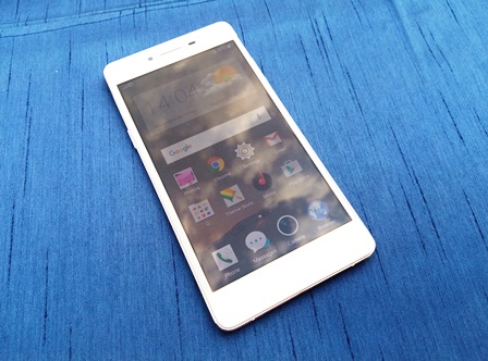
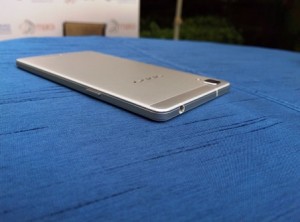
The looks. The Oppo R7 Lite (R7kf) has an all-around metal body with Gorilla Glass 3 on the front that curves around edges to give a nice feel when swiping near edges. The front has a small LED notification, an 8 MP camera, ear-speaker grille and sensors above the 5-inch HD AMOLED, and three capacitive keys — Options/Menu, Home and Back — that aren’t backlit. The Silver metal structure follows from the back and sides — with separate volume buttons and SIM and microSD card slots (micro + nano or microSD) on right, and Power/Lock key on the left side. On the back, you have the protruding 13 MP camera with an LED flash.

At 147 grams, it isn’t a heavy phone and is pretty thin, too. It has a familiar angular look that we have seen with previous Oppo phones and that means uncomfortable pocket baggage for some.

Screen. The device has a 5-inch (1280 x 720) AMOLED that has Gorilla Glass 3 on top. The screen is certainly not very high resolution compared to most smartphones in this price range today, but it does perform well when it comes to rich colours for images, videos and even text. The display does a decent job under sunlight, but many people may find its resolution to not be at par.

The device has a protruding camera at the back

Camera. On the back, there is a 13 MP (f/2.2) camera. Here are a few sample images.

I thought the camera app had plenty of modes to choose from. You get options like RAW mode, expert mode for more control, among the usual HDR, Oppo’s Ultra HD, etc. To try. As you can see, the camera performs well enough in daylight and can give good detailed shots, but struggles in macro and sharpness under low-light conditions. It isn’t the best smartphone camera under Rs. 20,000 today, but is surely a capable one for most use cases.

Sound. The loudspeaker on the back does a good job of giving punchy, clear sound for videos and games, but its placement (lower back) isn’t ideal for daily use. Basics like call quality, network reception and Bluetooth or WiFi connectivity worked fine, though for some absurd reason the phone doesn’t have a WPS option under WiFi, which is a basic thing for smartphones these days.

Battery life. The phone is equipped with a 2,320 mAh battery unit. The phone struggled to last a day (single SIM card) on moderate to heavy usage, but did show good standby time. It’s quite clear the battery really struggles when the screen is on for a longer time even with brightness level under 30%. Though the last firmware update did make the phone a bit more battery optimised, don’t expect much more from it. But the Power-saving mode might come in handy if you aren’t playing games of watching HD videos.

Software and performance. The R7 Lite is powered by Qualcomm’s Snapdragon 615 chipset Snapdragon 615 SoC (1.5 GHz quad core + 1 GHz quad core processor, Adreno 405 GPU), along with 2 GB of RAM. It runs on Oppo’s ColorOS 2.1.0i that’s based on Android 5.1.1. It’s good to see the company being serious about the base Android version and not shipping new phones that are running something far from latest. The look and feel of ColorOS is unchanged except for the notification bar, which now also gives you actions right under notifications just like other smartphones today.

The whole OS seems quite consistent, while much different from stock Android, its big bold icons, fonts are not really bad and kind of fit in well most of the times. The phone really loses out on everyday usage. It is fine for a few apps, but it struggles to keep up when you play a game. Frame rates drop and the phone really heats up. At this price point, it is disappointing to have this experience, and I am sure the 615 chipset (as with other phones having one of these) should be given some blame, and I would have really liked had Oppo gone with a better chipset even if it was last generation’s high-end one.

To sum up, the Oppo R7 Lite seems like a nice phone in terms of design and build quality. While it has average battery life, good screen, and a capable camera, its performance issues make it hard to recommend with the given price tag considering the likes of the Xiaomi Mi4, OnePlus One and Nexus 5 are priced similarly these days.

Exit mobile version