Categories
Tech

The 4 best smartphones under Rs 20,000

We list four smartphones you can get under Rs 20,000, complete with all the features and specs you would need.
by Manik Kakra | @Manik_K on Twitter

Chances are that you are using a smartphone right now, or are looking to buy your first one. If you don’t want to spend a bomb on a new phone and yet can’t afford to miss out on the good chipsets, decent memory, latest features, OS updates and smooth experience, this mid-range handset line-up is for you. We give a list of the best smartphones in the Rs 12,000 to Rs 20,000 price range today.

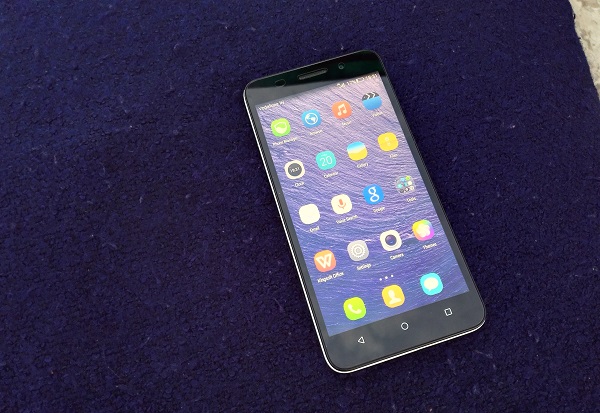
Lenovo Vibe X2: Lenovo’s past few launches have been really up to the mark. The company has sorted out a lot of its software glitches, has been more prompt with OS updates, and seems to be serious about this price range. And the Vibe X2, priced at Rs 19,990, shows this. With its smooth performance, stylish and unique layered look, this device is surely worth checking out.

Specifications: 5-inch (1920 x 1080) screen, Android 4.4.2 with Vibe UI, MediaTek 6595 chipset, 13 MP and 5 MP camera, 2,300 mAh battery.

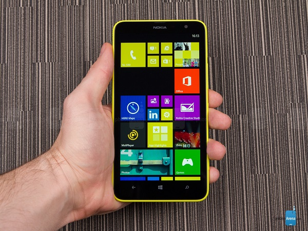
Lumia 1320: If you want a large-screen device and don’t want to sacrifice the performance as well as battery life, the Lumia 1320 could well be for you. Currently available for about Rs 13,500, this ‘phablet’ comes in a range of the usual Lumia colours, and has a lot going for those who don’t mind carrying a big phone, especially considering it’s one of the Lumia phones to get full features of the upcoming Windows 10 for Phones OS.

Specifications: 6-inch (1280 x 720) screen, Windows Phone 8.1, Snapdragon 400 chipset, 5 MP and VGA camera, 3,400 mAh battery unit.

HTC Desire 820Q: Successor to the popular Desire 816 and 820, the Desire 820Q is a great dual-SIM device that doesn’t compromise on performance, and gives big bang for the buck in the camera and audio departments. With a price tag of Rs 19,000, this HTC device is surely worth considering.

Specifications: 5.5-inch (1280 x 720) screen, Android 4.4 with Sense 6 UI, Snapdragon 410 chipset, 13 MP and 8 MP camera, 2,600 mAh battery.

Micromax Canvas Gold: This device has been one of the more popular phones in this price range, and its performance, screen quality and thinner looks addMicromax Canvas Goldto its appeal. The phone comes in gold colour, has a good camera, and doesn’t carry a lot of bloatware, which is a plus.

Specifications: (1920 x 1080) screen, Android 4.4.2, MediaTek 6592 chipset, 16 MP and 5 MP camera, 2,300 mAh battery.

Another phone worth mentioning is Xiaomi’s Mi 4, while I suggest its 64 GB model, which is priced at about Rs 22,000, a little over our budget here, it seems worth spending that extra much, making it among the best phones to buy today.

Have you tried any of these phones? Tell us about your experience in the comments section below.

(Pictures courtesy gsmarena.com, www.phonearena.com. Images are file pictures)

Categories
Tech

Review: CyanogenMod 12 OS on the OnePlus One

We take a look at the OnePlus One’s hardware and software specs, and come away impressed by CyanogenMod 12 OS.
by Manik Kakra | @Manik_K on Twitter

OnePlus’ story in the Indian market has been quite unique. The company gained popularity on the social media for its invitation-based buying procedure (which the company has now stopped). So, when I got a chance to try the phone (64 GB sandstone black model) for more than just five minutes at my own leisure, I was obviously interested in checking how well its hardware and software really stack up for its price of Rs 21,999.

The looks. As soon as you pick the device up, you realise how different it is to other smartphones and how well it fits in your palm. The phone is not small, which has a lot do to with its thick bezel in the front. The front has a 5.5-inch full HD (JDI) panel (Corning Gorilla Glass 3 on top) with three touch keys at the bottom and ear-speaker grille, sensors, LED notification and 5 MP front-facing camera above. The top and bottom have a silver ring all across and a noticeable curve to them and gel well with the overall look of the phone.

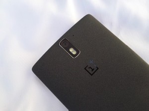
The left panel has the SIM card tray – you get one nano SIM card tray inside the phone and one micro SIM card tray in the box, so you can use whichever you need. The right panel gets the Volume rocker and Power/Lock key – I just wish these keys had more tactile feedback for pressing. The top has a nicely-drilled 3.5mm headset jack and secondary mic; while the bottom gets the microUSB 2.0 port in the middle and speaker grilles and primary mic around it. The back sports a 13 MP oval camera module with a dual LED flash, and the OnePlus logo near the middle. The more you use it, the more it seems the company had a good idea on the paper for its design.

Software and performance. Under the hood, the One carries a Snapdragon 801 chipset (2.5 GHz quad-core processor, Adreno 330 GPU) coupled with 3 GB of RAM. The phone had CM11S (Android 4.4.4) out of the box, but I flashed its official CM12 zip file (though the official OTA update must have started rolling out when this piece goes up).

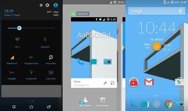
The first thing you notice on getting CM12 (based on Android 5.0.2) is the new Cyanogen boot animation. On getting the phone started, I liked how refreshing the new icons looked. There are no shabby or ill-fitted icons here. The default launcher has been assigned to the Google Now Launcher. The OS supports Ambient Display, which gives you a glance at notifications as soon as you pick the device, something we have seen on the Moto X and the new Moto E. It also supports double-tap to wake and double-tap to lock the screen. In the previous OS version, you can choose to either have on-screen navigation keys or keep using the physical touch keys.

As soon as you enable on-screen keys, the touch keys fade out and become non-functional. The pull-down notification and toggle button has been tweaked a bit. You can pull down to check notification and if you pull it lower you get toggle buttons, something that requires two swipes in stock Android, and this one feels better to use. You also get to see downloading speeds when updating or downloading an app from the Play Store, another thing that might be useful for a lot of people.

CM’s App Themer allows you to apply themes from their store, and also change icons, font, sound options. Using your Cyanogen Account, you can choose which ones you want to download and apply. Another interesting feature is Privacy Guard, which gives you full control of what apps (whether a system app or a third-party app) on your phone are required to access your location, network data, messages and phone resources.

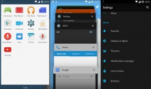
The recent app Menu is same as card-like stock Android with an added clear button for clearing all apps from the list at once. Though I was a bit disappointed by the camera app, which could do with a bit of work on its viewfinder, focus and even sharpness, there’s some work in progress for the same, apparently. It won’t be wrong to say that CM looks cohesive and nice on the OnePlus One. There are not too many changes done, but quite a few useful changes and addition made to Android that many will like how their phone functions. The phone works smoothly, is able to load u and exit apps just as one would need and can handle multiple Web browser tabs without struggling. The phone’s battery life is also satisfactory.

The verdict. Overall, the OnePlus One’s OS is cohesive, smooth, well-designed and has many options users will like. You get a good 64 GB (54 GB available space) smartphone for these many bucks (and about Rs. 19,000 for 16 GB), an active community if you’re interested in tinkering with your phone, which makes it even better than several other phones for some. The invite system is still the procedure you would have to follow (can’t say I like it), though there are now also no-invite normal online sales once every week.

Categories
Tech

Review: Huawei’s Honor 6 Plus

Huawei’s flagship device, the Honor 6 Plus, has a battle on its hands cracking the Indian market at its price.
by Manik Kakra | @Manik_K on Twitter

Huawei has been quite busy in the Indian market lately. The company launched two smartphones (we reviewed the Honor 4X a few days ago) and now the company’s flagship, the Honor 6 Plus, has arrived. Priced at a little under Rs 26,000, the phone clearly has an uphill battle against their rival’s offerings. So let’s try and see of the device is up to the task or not.

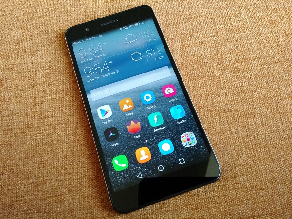
The looks. The new Honor 6 Plus (they really could have done with a better model name and not a known one) follows a glass and metal chassis design. What you will notice the first time you hold the device is its use of glass and metal frame (except for the bottom). The 5.5-inch full HD screen is accompanied by the front-facing camera, speaker grill and sensors at the top, and plain bezel at the bottom, as the phone had all on-screen navigation keys.

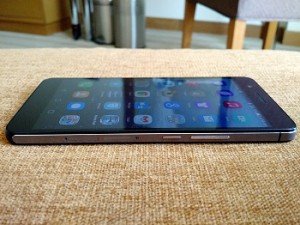
The left side panel has been left blank, making the right one look a bit busy with the Volume buttons, Power/Lock key, which are followed by nano SIM/ microSD card slot and micro SIM card slot. The keys don’t feel very tactile and firm, though. You can either use a nano SIM card or a microSD card, while using a micro SIM card in the other slot.

At the top, you have the Infrared port, 3.5mm headset jack and secondary mic, while the plastic bottom gets the microUSB port in the middle. Coming to the back, the subtle pattern looks nice. The dual-lens camera and the LED flash sit at the top right corner while the Honor logo is imprinted near the middle. The phone is quite big, but not too heavy for its size, its metal sides and glass back don’t feel slippery, but the metal sides get scuffed and dented even with minor falls and slips.

Screen. Speaking about the phone’s (1920 x 1080) LCD with Gorilla Glass on top, I don’t have too many complaints with the display, which looks quite sharp with decent viewing angles; it is quite bright and not bad for use outdoors in sunlight. Colour reproduction does seem a bit off, as the screen goes a warm yellow when viewing images.

Camera. One of the USPs of the phone, as per the company, is its dual sensor 8 MP camera. Using the dual sensor with the wide aperture mode on, you can change the focus area in an image as an after-effect. This ‘trick, previously seen on the HTC One (M8), Galaxy S5 among a few more, is becoming somewhat common in phone cameras these days. Here are a few sample images.

The camera on the back is pretty good, actually. It can take detailed and sharp photos in daylight conditions, and not too bad in low-light (if you don’t try zooming in). Colours come out quite bright, and the overall performance seems to be on par with best phone cameras (the Mi 4, LG G2) in this price range. The Wide Aperture mode for changing focus does work well if used in correct settings, and many users will like using it. The 8 MP front-facing camera is more than capable of taking good selfies and do video calls, so there’s not much to complain with what you use the front-facing camera for.

Battery. The phone is equipped with a 3,600 mAh abtetry unit, making it one of the largest among the smartphones available in the Indian market. The device lasted me a day, more often than not. With Email, Twitter, a bit of YouTube and music playback, I was able to get over 20 hours of usage a lot of times, and its battery was never really a big concern throughout my usage. Of course, with a lot of HD videos, games and camera usage, it is bound to go down.
Call and sound quality. The phone supports 3G, 4G LTE (no CDMA), WiFi and Bluetooth, all of which worked well for me except for the nano SIM card slot thata didn’t work on my review unit. Call quality and network reception hold fine on the device with no troubleshooting required.

Sound quality from the rear-facing loudspeaker is just about okay, though, getting the job done for games and videos, but I was expecting a better output from it considering how vocal Huawei has been about the phone’s multimedia performance. It might have helped if the speakers had dual speaker openings.

Software and performance. The Honor 6 Plus runs on Android 4.4.2 with Emotion UI 3.0 to go on top. Under the hood, there’s Huawei’s custom SoC HiSilicon Kirin 925 (1.3 GHz quad-core + 1.8 GHz quad-core, Mali-T624 GPU) along with 3 GB of RAM. The overall look and feel of the OS is very similar to that of the Honor 4X. I wish Huawei did a little bit of work to get their icon set and fonts look better or give more options than what they currently do under Themes. Since this is Huawei’s flagship device, it should be updated to Android 5.0, in my opinion, but there’s no official word when it’s going to be.

Messaging, dialer and Clock apps have been loaded with useful features (like blocking features in Messaging and Dialer) and gel well with the overall look and feel of Emotion UI. There’s one nifty little feature – where you can mark a particular WiFi access point to be a hotspot, so that the phone uses it just like your network operator data and not a full-fledged WiFi connection, meaning you save on data.

Performance-wise, the phone is just about okay. It handles most apps and tasks fairly well, but I wouldn’t count it as the smoothest smartphone in this price category, and rank its day-to-day performance below the Xiaomi Mi4 and OnePlus One. A few places like multi-app view, or three-four tabs in Chrome, show you where the OS stutters and doesn’t give a very smooth performance.

The Huawei Honor 6 Plus is pitched against the likes of the Nexus 5, Mi 4 and OnePlus One, so it surely has an uphill battle on hand, but from what I have seen and tried, the phone isn’t too behind its competitors. To buy an Honor 6 Plus, you have to register for Flipkart’s flash sale and then manage to order it when goes on sale. Huawei is offering decent promotional offers With Freecharge, Hungama, which makes a better deal. So, with a good screen, capable camera and satisfactory battery, the phone does have quite a few things going its way and it will be interesting to see how well it performs in the market against those three devices.

Categories
Tech

Review: Moto E (2nd Generation)

Motorola’s low-range phone is a good device, but buyers in this segment may opt for other models with enhanced features.
by Manik Kakra | @Manik_K on Twitter

It would not be wrong to say Motorola’s comeback has been a successful one, but the company has been doing really well to storm into at least the budget segment of the smartphone market. With the original Moto E and Moto G, it was clear that Motorola was here to make an impact, giving a good experience without costing a bomb. With the new Moto E, the objective seems to be the same, but expectations are now higher. Does the Moto E (2nd Generation) live up to those expectations or not? Let’s try to find out.

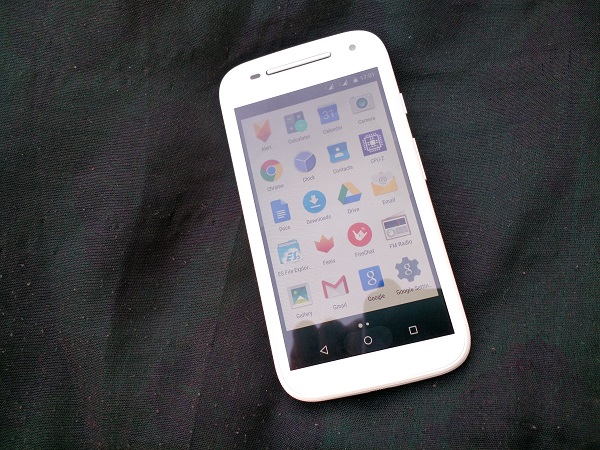
The looks. Motorola’s new Moto E (XT1506) isn’t too different from the original Moto E in terms of looks and feel. It follows the familiar Motorola curved back design, except the new Moto E doesn’t have a removable back cover; instead it has a unique rubberised band across the edges, covering the micro SIM card and microSD card slots. You can change this band with another band of your colour choice (called Motorola Bands).

The entire front panel is covered with Gorilla Glass 3 and the screen has anti-smudge coating that is quite effective. On the front, the big silver stereo loudspeaker and ear-speaker grill stand out, sitting next to the front-facing VFA camera and sensors; while there are no physical keys at the screen’s bottom. On the right side panel, you have volume rockers and Power/Lock key, which are tactile and firm to press.

At the top, there’s the 3.5mm headset jack, and the microUSB sits at the bottom. On the rear is the Motorola logo inside a little dimple, while the 5 MP rear camera (encircled in a chrome ring) is placed on the top-middle. The phone is compact, nicely built with no loose points.

Screen. The device features a 4.5-inch (540 x 960) IPS LCD, so it’s a little bigger than its predecessor but has the same resolution. The screen has good colours and viewing angles for a phone at this budget. It’s quite bright but just about okay outdoors. Where it lacks is sharp resolution for images and videos. It’s probably the biggest downside to the new Moto E, not bumping the screen resolution or improving outdoor visibility when there are better screens on phones priced similarly.

Camera. Here are few sample images from the phone’s 5MP rear camera (f/2.2).

The camera takes decent bright images outdoors, but struggles in low-light, whether it is to focus or capture details. It can capture still shots quite well, but don’t expect good performance for objects on the move. The camera app is similar to the previous Motorola Camera app, smooth in use, with basic options like HDR and Panorama to choose from. By default, it captures by a tap, but you can choose to focus by a tap and then capture an image by tapping again.

Audio and reception. Basics like call quality, dual SIM handling, 3G, WiFi and Bluetooth 4.0 connectivity are all in place. In-ear call audio is quite loud and clear, while network reception was never a problem throughout my usage. Audio quality from the front-facing stereo loudspeaker is actually pretty good, and one of the loudest outputs from a phone in this price category, so your audio needs for video and games have been taken care of well. The in-ear headsets, though, are just about okay, which is what you would expect from a budget smartphone.

Battery. As far as battery is concerned, the Moto E has a 2,390 mAh battery unit, and it lasted me about 18 hours on moderate usage. With two SIM cards in use, battery life decreased by two hours. The phone was kept at 30 per cent brightness with Email, Twitter, a few calls and music in use.

Software and performance. The phone runs on Android 5.0.2. Under the hood, there is the Qualcomm Snapdragon 200 (1.2 GHz quad-core processor, Adreno 302 GPU) coupled with 1 GB of RAM. In general, the new Moto E is reasonable. I wasn’t really blown away with how it fared in day to day usage. The original Moto E, running Android 4.4, was noticeably snappier. The new Moto E struggles slightly while running a few apps at once or while switching between a couple of heavy apps. It might be because of the new Android Lollipop and how it is more focused on animations and design, but I won’t call it the smoothest Android phone out there.

The new Android 5.0 OS is really refreshing and better-looking than Android has been. With flatter Menu icons, status icons, Settings, UI elements, there’s Material Design everywhere. The notification bar shows you notifications in one swipe and you have to either swipe with two fingers to swipe once again to access quick toggle buttons. You can now check and access notifications from the Lock screen, though Widgets are not supported on the Lock screen. Volume Settings have also been changed a bit, as you can now choose what type of alerts are allowed to notify you or not. There’s obviously the Google Now launcher in place with Google Now cards accessible by just swiping left to right on main Home screen.

The style of pop-up dialogue box, the dialogue box (appears near the bottom) have also changed and look much better now. There’s also multi-user support, so you can switch to Guest when you are giving your phone away to somebody and don’t want them to have access to your phone’s data.

Motorola Display is on this phone; as soon as you pick the phone, the Lock screen previews any notifications and you can access the relevant message right from there. There’s no need to unlock and light the whole screen up. Very neatly done, but if you already have the phone in your hand, you would have to unlock it and Moto Display doesn’t work then. The user gets a little under 5 GB of storage space, which is expandable up to 32 GB via a microSD card. Motorola hasn’t touched or changed stock Android much, as expected, but has done the usual and a few new touches to keep the experience good.

To sum up, the new Moto E (3G) is a decent buy at Rs 6,490, but it seems to lose out when compared to new phones in the Indian market, and even when you compare it to its predecessor. Still, it is a good phone for somebody buying their first Android smartphone and not wanting to shell out a lot. However, potential buyers in this price range are looking for much, so don’t be surprised if this phone is overlooked for a phone with a better overall package – even the Moto E’s 4G variant.

Categories
Tech

Review: Honor 4X by Huawei

Huawei brings two new Android smartphones in the Indian market. We review the mid-range Honor 4X and come away impressed.
by Manik Kakra | @Manik_K on Twitter

Huawei has been trying to make a comeback into the Indian market for a few months now. The company launched the Honor 6 last year, and seemed to have got a decent response. It is selling quite well, but Huawei probably needs much more. Now, it has come up with two new Android smartphones under its Honor series, which is how it plans to brand itself in India – Honor 4X and Honor 6 Plus. Let’s take a look at the Honor 4X, that is priced at Rs 10,499.

The looks. Huawei’s Honor 4X is not a small phone to hold. With a 5.5-inch HD display, weighing 165 grams and thick bezels on the side, it isn’t a compact phone. The phone follows a white and black colour scheme on the back and front, respectively. The back cover extends to the sides, which sport the white volume rocker and grey Power/Lock key on the right, while the left side panel is left plain.

Removing the cover gives you access the two SIM card slots (micro SIM cards) and the sealed battery unit. Below the screen you see three touch White-marked keys – Back, Home, and Menu/ Options (going from left to right). Above the screen are the ear speaker grill, 8 MP camera and sensors tucked near to the LED notification. While the front has glass on it, the white plastic back has a nice diagonal pattern, plus, with the bold Honor branding in the middle and circled (slightly protruding) camera sensor with the LED flash, the rear side appears simple. The microUSB port sits at the bottom next to the loudspeaker and primary mic, while the top has the 3.5 mm headset jack and secondary mic. Most people will find this phone difficult to carry around.

Screen. The phone boasts a 5.5-inch (1280 x 720) IPS LCD. It is quite sharp, has decent colour depth, but where it lacks is when used under direct sunlight. Due to its reflective nature, the screen needs to be used at a high brightness level. Plus, it gets a lot of smudges and fingerprints in a matter of minutes, so keep a spare wipe cloth handy. But, on the other hand, it isn’t a bad screen at all for watching HD videos and is decent for viewing high quality images.

Camera. Check out these sample images. The 13 MP camera can take detailed shots. You can choose whether you want a 13 MP or a 10 MP image from the camera settings, along with a few other basic options. Contrast level is decent and colours come out nicely in these photos. But the camera gives grainy photos in low light, struggling to perform in dark conditions. This seems to be a common factor in mid-range phones. Having said that, when it comes to daylight performance, the Honor 4X’s camera is among the best in this price segment and most people should find it good enough.

Call quality and network. The phone handles call quality and network reception really well. WiFi, Bluetooth work fine, but USB OTG isn’t supported as of now. Audio quality from the loudspeaker at the bottom is also not bad. Users may need to put a hand over the speaker while watching a video or playing a game thanks to its placement, but the actual output is decent for these two uses. There’s no bundled headset with the phone.

Battery. The phone is equipped with a 3,000 mAh battery unit. More often than not, it required to be charged within a day. With brightness level set at 40 per cent, using one SIM card, Email, Twitter, a few minutes of videos and surfing the Web, the phone struggled to last a full day. It gave about 18 hours of juice, which you can expand using the extreme power-saving mode, giving you only basic functions in hand. I was expecting a bit more on the battery side of things.

Software and performance. The Honor 4X is powered by the Snapdragon 410 SoC (1.2 GHz quad-core processor, Adreno 306 GPU), with 2 GB of RAM. Running on Android 4.4.2, it comes loaded with Huawei’s Emotion UI on top. The user gets about 4 GB of storage space, which is expandable via a microSD card. The OS follows Home screen pattern with all the icons and widgets on spread across your Home screens with no separate app launcher. There are pre-loaded apps in folders, which are not allowed to be renamed. You can create and name your own folders, though.

Long-pressing on any Home screen gives you the option to change its wallpaper, swiping effect, put a widget and change icon layout (4×5 or 4×4).The notification bar and toggle buttons look black on white, completely different from any other Android OEM skin. All your notifications are placed on the left panel, and swiping right to left lands you to all the toggle buttons. All the icons, third-party and Huawei and Google apps, get redesigned into circular icons, as per the Emotion UI.

This was one of my gripes with the UI. A lot of apps’ icons seemed weird (as per your chosen theme for icons) and weren’t any good with this circular trend (default style). It would have been much better had icons remained untouched and allowed to remain as they originally are. For customisation, you can choose a particular theme (Lock screen and Home screen), and choose icons from another theme or font style from another, certainly a nice option to have for users looking to edit just about everything on their phone’s OS.

The Lock screen gives you a glance to your notifications. You can unlock it by swiping anywhere in the middle, swiping up from the bottom on the Lock screen brings up basic toggle switches (similar to iOS). There’s also a Suspend button that gives you functionality of Home button and Menu button (again similar to iOS’s Accessibility feature). The phone supports double tap to wake and it worked well. As far as the general performance is concerned, I found the phone to be fairly responsive and able to handle apps and tasks well. Swiping between Home screens and scrolling through Settings aren’t a problem. While I wouldn’t call it being a very smooth device (it stutters a bit when using multiple tabs with an app like Email opened), it isn’t a slouch and can handle most things without struggling.

Wrapping up our review, the Honor 4X has a good screen, decent battery life, capable camera and good performance from an otherwise okay OS. By now, there are already a lot of good phones available in this price range, from the likes of Motorola and Xiaomi, and this is why the Honor 4X may find it hard to prove its worth. It could enhance its position a bit by providing Android 5.0 and further updates quicker than they have in the past. There’s not much wrong with the phone, but how it performs in an already competitive price segment in a long run remains to be seen.

Categories
Tech

Review: InFocus’s M2 phone

The US firm launches its new device, M2, in the Indian phone market; the device is good at the price.
by Manik Kakra | @Manik_K on Twitter

InFocus, the US-based firm has entered the Indian phone market with the new M2. The company gets its device manufactured from Foxconn and aims at providing a good smartphone at an even lower price point than what’s been available. At Rs 4,999, the price and specifications are tempting, but does it actually deliver?

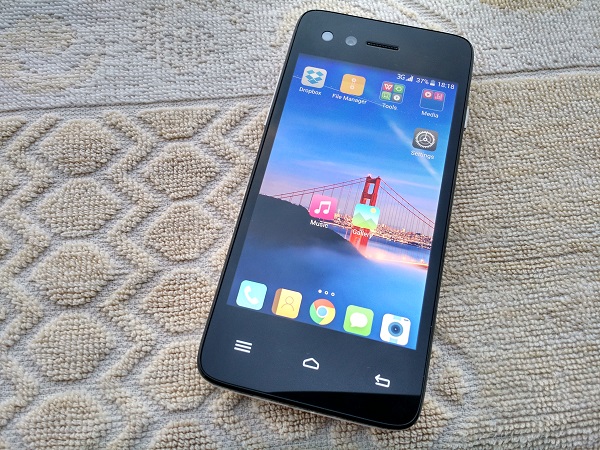
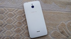
The looks. InFocus’ M2 follows a plain and run-of-the-mill design. The phone has glass all over the front and its rear cover, and which also covers the sides. As soon as you hold the device, you will notice its thick bezel and curve around the back, making it comfortable to hold. On the front, below the 4.2-inch TFT screen are the three touch keys – Menu, Options, Home and Back button – neither of these keys lit up when tapped. While on the top of the screen you have the 8 MP front-facing camera with flash, speaker grill, notification LED and sensors. The back has the 8 MP camera and flash near the top-middle, and loudspeaker placed near the bottom.

On the sides, the volume rocker is placed on the left, and the Power/Lock key on right; these keys feel quite sharp and don’t give a tactile feedback when pressed. The microUSB port and primary mic at the bottom and 3.5mm headset jack and secondary mic are at the top. Removing the back cover gives you access to the two micro SIM card slots and microSD card slot, next to the immovable battery. The phone is not large by today’s standards and is not difficult to carry around. While I won’t call it ‘premium’, it definitely doesn’t appear as a cheap knock-off.

Display. The M2 boasts a 4.2-inch (1280 x 768) LCD, same resolution as on the Nexus 4. The display is to be its biggest selling point. It shows text and images well and isn’t bad for watching HD videos either. Text appears good enough, but struggles a little under direct sunlight. From what other screens I have used from phones under 7,000 bucks, this one seems to be right up there among the brightest and best in terms of colour reproduction. You even get three colour temperature options for the screen, something we have seen on Samsung smartphones for a while.

Audio. Talking about the phone’s audio performance, it didn’t leave as good an impression as the screen quality did. The loudspeaker on the back distorts quite a lot and struggles when used for a video or game. You may feel you’re missing out on sound even after using one hand for coupling the speakers. The bundled headset is okay and better for watching videos. Don’t expect a very good output. InFocus will hopefully give audio more attention next time and put better sound drivers in place. The M2’s call quality and network reception didn’t show any issues. WiFi, Bluetooth, USB OTG function just fine and I didn’t notice any bug against any of them.

Battery. Powered by a 2,010 mAh battery unit, the phone has a decent standby time, but struggles under heavy usage. More often than not, when used for Email, Twitter, a bit of music and calls, you would have to charge it again under 17 hours, keeping one SIM card inserted (even less on 3G) and the brightness level at 30 per cent.

Camera. Here are a few sample images.

The phone’s camera actually takes good shots when in bright light. It does a good job at colour contrast, though when used in low-light, no surprise it struggles and is clearly not meant for clicking subjects in motion. It can shoot full HD videos at 30FPS. The front-facing camera is good enough for your selfie needs with its selfie smile detection and detailed shots. The camera app is simple and smooth to use. Only the usual settings are available.

Software and performance. The device runs on Android 4.4.2 with the company’s own InLife UI on top. Under the hood, there is MediaTek’s MTK6582 (1.3 GHz quad-core processor, Mali 400 GPU) and 1 GB of RAM. The user gets about 5 GB of available space, which you can expand using a microSD card.

The phone handles basic tasks like scrolling or swiping through Home screens and having a single Chrome tab open in background without breaking a sweat. But when you close and open a few apps, open multiple tabs and try scrolling through the OS, the phone clearly struggles and stutters. The notification and toggle buttons can be accessed from the same screen by swiping down. All the icons, Settings and pre-loaded apps are themed around white, pink and blue colours. These look just okay, but certainly not ugly like a few other low-priced Chinese phones do. The pre-loaded apps also work well and should cater to most users using their first Android smartphone. With your Home screens having all the icons and widgets, there’s no separate app launcher.

The lock screen allows you to keep four shortcut icons (similar to HTC phones) and even widgets in place to open them directly from the Lock screen. There’s also a launcher option with large tiles and bigger font size called EZ Launcher. It would be correct to say the phone doesn’t perform very smoothly but just satisfactorily. There’s also InFocus services Account in place, though we couldn’t find any utility for it.

InFocus seems to have done most things well with the M2, considering its price point. It has a good screen, camera and design, but its audio is clearly its shortcoming. It is still to be seen whether the company has provided any service support so far given that even the official website doesn’t mention any service centres or support number. If InFocus can get this after-sale part correct from here on, the M2 can give them a great start and make its presence felt in the online retail space.

Exit mobile version