Categories
Tech

Review: Coolpad Note 3

This new phone looks good on paper and performs well too. It is a great device, save for some glitches.
by Manik Kakra | @Manik_K on Twitter

The Chinese company that started its smartphone journey here with the Dazen1 and Dazen X7 is now out with the Coolpad Note 3. While the Dazen1 certainly provided a bang for the buck, we were a little disappointed with the DazenX7. Let’s check out if the Coolpad Note 3 performs enough to take on this already-heated price segment of under Rs 10,000.

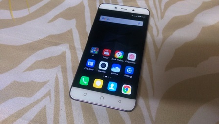
The looks. There are two White bands above the 5.5-inch HD screen that sport LED notification, sensors, ear-speaker grille, 5 MP camera at the top; and three capacitive touch buttons – Recent Apps list, Home, and Back (from left to right) – at the bottom. The phone is quite large but doesn’t feel awkward to hold given its sheer screen size and curved sides on the back. At the back, it accommodates the bio-metric fingerprint scanner around the centre, and the slightly-protruding 13 MP camera, which is surrounded by LED flash and secondary mic. The loudspeaker is located near the bottom.

On the left is your volume rocker, which is all plastic and feels just okay in terms of tactical feedback; while the Power/ Lock key is on the right and isn’t difficult to reach. The 3.5mm headset jack is on the top, and the bottom part hosts the microUSB port.

Screen. The phone sports a 5.5-inch (1280 x 720) IPS panel. The screen is great for outdoor usage under sunlight and does a good job of colour reproduction. HD videos look quite nice on it, and I didn’t spot any shortcomings while viewing videos, though high-resolution images may appear a little washed out to some coming from a high-end screen.
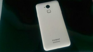
Coolpad Note 3Camera. The Note 3 boasts a 13 MP (f/2.0) camera on the back. Here are a few sample images.

The camera does a good job at focus adjustment and capturing colours, but struggles with sharpness. It is decent at handling low-light shots, and the camera app, with a bunch of usual modes to pick from, works really well for taking shots in most situations.

Battery. The phone often lasted around 20 hours with heavy to moderate usage. With light use, it can last you a full day on a single charge. This includes brightness at 20%, some Leo’s Fortune, Twitter, WhatsApp, and EMail (Gmail app) with a single SIM card inserted. The phone takes a little over 2 hours to get its 3,000 mAh battery unit fully charged, and while it supports quick charging you will need another higher capacity charger as the default charger you get in the box doesn’t support it.

Audio. The phone’s loudspeaker at the back is pretty much average and its placement doesn’t help either. It’s fine for ringing and notification alert, but don’t expect good sound for videos and games. The phone has good call quality on both sides, but I did notice a bit of performance deterioration in terms of network reception compared to other smartphones on the same network and in the same areas. The Note 3 supports 4G LTE on of the SIM slots (both require microSIM cards) and usual 3G and 2G on the other slot.

Software and performance. The Coolpad Note is powered by the MediaTek MT6753 chipset (1.3 GHz octa-core processor, Mali T720 MP2 GPU) along with 3 GB of RAM. It runs on CoolUI 6.0 that’s based on Android 5.1. The fingerprint scanner on the back is nicely mushed below the surface and works really well, about 8 out of 10 times. While some might find its back placement a bit odd, it’s not that strange after a few days of use, plus it unlocks your screen quickly.

Long-pressing the Home key brings up Google Now. You can now lock a particular app in the recent apps list, so that it doesn’t get cleared when you clear all apps from the list. The OS seems to have fixed push notifications issue with messaging apps. Performance-wise, the phone seems quite smooth and hardly lagged during use. The OS still looks and feels quite immature, like icons, default sound tracks, etc, and the theme center hardly has any options to choose from. Its basic style of having all your apps shortcuts and widgets on various Home screens is still there, though you can now switch to “traditional style” and have a separate app launcher in addition to your Home screens.

All in all, the phone that seems compelling on paper also performs pretty well to make it a good phone at this price point. It has a good screen, above average battery life, but while it struggles with sound quality and how CoolUI looks, the OS performed pretty well and a fingerprint scanner that doesn’t disappoint for daily use making it a worthy contender, with the likes of the Honor 4X, RedMi 2 Prime, Karbonn MachOne Titanium and a few others, for those looking for buy a smartphone under Rs. 9,000 or so.

(Pictures courtesy Manik Kakra)
Categories
Tech

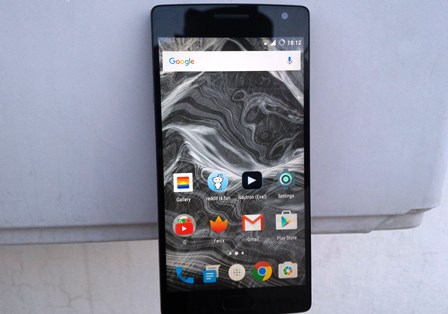
Review: OnePlus 2

We review the newest OnePlus phone and find that it has some good features while it lags behind on some others.
by Manik Kakra | @Manik_K on Twitter

OnePlus has been among the most talked-about phone manufacturers in the last one year or so – whether for a good reason or a bad one is debatable. The OnePlus One helped usher in this new era of affordable smartphones that give bang for the buck when it comes to overall performance. Does the OnePlus 2 justify itself? Let’s find out.

The looks. OnePlus 2 (A2003) follows a similar form factor, but is noticeably narrower and denser. Its Sandstone rear panel is still there, and you get unique rear cover options like Kevlar, Rosewood to add if you like. This time, the company has also added a silent/notification switch on the left side, so that you can switch between silent and alarm (as per Android Lollipop’s changed notification system) where you can choose what alerts you and what doesn’t without having to turn the screen on.

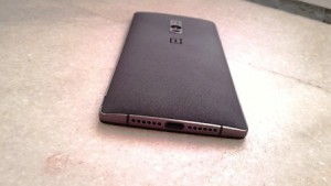
On the right, you have volume rockers and Power/Lock key. Another change is the new USB type C port (more on it later) at the bottom around the mic and loudspeaker grill at the bottom. On the back, an annoying thing, at least for me, is the metal case around the infrared laser focus, camera and dual flash. The metal ring isn’t flush with the surface, and you keep hitting it with your finger.

The aluminium chassis around the phone and thinner bezel are definitely welcome changes. The phone feels a lot more solid in hand. It isn’t a small phone by any means, but that curved back, Sandstone back cover and rounded edges help in gripping a bit more comfortably.

Screen. The OnePlus 2 boasts a 5.5-inch full HD LCD with Gorilla Glass on top. I found the screen a little brighter than the OnePlus One, and has good viewing angles and decent colour reproduction, but some might spot washed out colours coming from a better panel. Visibility under sunlight is okay and full HD videos and high quality images look pretty good on it. It isn’t the best LCD on a phone today, but certainly not bad either.

Sound. The loudspeakers at the bottom are just about okay for videos and games, but not as punchy as the best out there. It has modes like time lapse for video, HDR and Panorama for images.

Camera. On the back, there is a 13 MP (OmniVision sensor) camera with dual LED flash and an infrared laser focus. Here are a few sample images.

The camera can take good detailed shots. It struggles in low-light conditions (improved with last two updates), giving grainy shots, but performs well enough in decent lighting condition. The camera app was a little sluggish to use and had some shutter lag in the beginning, but has improved with the last update, too.

Battery. The phone is equipped with a 3,300 mAh battery unit that is not user replaceable. I found its battery life to be decent – quite a few times it lasted me almost a day for light to moderate usage; while requiring to be charged in about after 20 hours (4 hours of screen on time) with quite heavy usage (single SIM card). It isn’t as good as the OnePlus One, but not below the average Android flagship today.

The phone has a USB type C port, meaning no more juggling which side of the USB cable goes up. On the contrary, there is no quick charging, which a lot of people will miss having seen or used it on many Android phones launched earlier this year. The phone takes almost two and a half hours to charge from 0 to full.

Software and performance. The device runs on Android OxygenOS 2.1 that’s based on Android 5.1.1. If you’re familiar with stock Android (mainly seen on Nexus and Android One devices, as well as Motorola phones), you should be at home while using this phone for the first time.

There is something called Shelf on the left-most Home screen that shows weather, your most used apps and contacts and you can also all widgets on it, not of much utility at this time. You can now change the phone’s screen colour temperature (added in the latest update). Customisations options include the option to change what LED colour for a particular type of alert; using any icon pack from the Play Store in the default launcher, which is same as the Google Now launcher in most ways. You can also decide between physical touch buttons or on-screen keys, and later assign which key does what function.

Under the hood, there is a Snapdragon 810 SoC (1.8 GHz octa-core processor, Adreno 430 GPU) along with 4 GB of RAM (that’s for the 64 GB storage option; 3 GB for 32 GB storage). I found the OS to be quite smooth and stutter-free. Leo’s Fortune, a popular game, runs smoothly on it and doesn’t drop frames. Having said that, I found strange issues like the default dialer lagging, or Home button not recognising a single tap, quite a few times. Though the fingerprint scanner itself works really quickly and about 8 out of ten times. Oh, and it certainly gets a bit hot around edges and camera module after a bit of gaming and watching HD videos.

All in all, the OnePlus 2 seems like a great device under Rs 25,000, but doesn’t leave a great impression that its predecessor once did. It has a good screen, decent battery life, one of the best cameras in this price budget, but lags behind a little due to its software issues. And while you might want to buy a OnePlus 2, you still need an invite to purchase one from Amazon.

(Pictures courtesy Manik Kakra)
Categories
Tech

Review: Asus Zenfone 2 Deluxe

Not much has changed from the Zenfone’s last outing. It has an improved design at the back, but little else.
by Manik Kakra | @Manik_K on Twitter

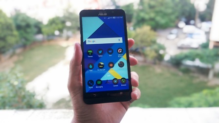
We reviewed the ASUS Zenfone 2 a few weeks back, and came away quite impressed with what the company offered under Rs 25,000. Now, there’s a slightly newer version of the device’s high-end model – the Zenfone 2 Deluxe. Let me put it this way, the only change here is its rear cover and storage options.

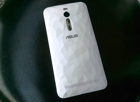
If you glanced at the Zenfone 2 Deluxe, you couldn’t tell it apart from the original Zenfone 2. With its blockish build and physical buttons, Power/Lock key at the top, brushed aluminium chin, rear-facing volume keys, there really isn’t much changed here. What is definitely different is the multi-face prism-like rear cover (see image below). The back feels really nice and is the standout feature in the phone.

Prism like back elevation on the phone

In fact, this multi-reflecting (Blue and Green) White back was the only thing people asked me about when I was using the device. The Zenfone 2 Deluxe weighs about 170 grams, but isn’t slippery, though certainly not a compact phone.

Let me tell what’s better in the Zenfone 2 Deluxe over the Zenfone 2, as there isn’t much changed here, and if you want complete lowdown in the device, you should check our full Zenfione 2 review.

Screen. The screen is the same 5.5-inch full HD panel, but this one seems a little brighter with same colour sharpness and accuracy. It’s good and works well for images and videos. For the loudspeaker on the back, it still has the same average output that does an okay job for videos and games.

Features. Basic features on this dual SIM (4G/ 3G + 2G and dual active) device like call quality network reception, WiFi, Bluetooth and USB OTG worked fine.

Camera. The camera performance, too, is a lot like the Zenfone 2 Deluxe – detailed, colours are quite sharp, but lags behind in low-light and macro shots. Though I did find the camera app to be a little quicker to take a shot in case of the Zenfone 2, the difference isn’t much. The device has a 13 MP rear camera, and here are a few sample images.

Battery. The battery performance was slightly short of the Zenfone 2 with the average being 14 to 15 hours. There’s a 2A charger bundled with the phone that charges it up in a little under two hours (0-50% in about 40 minutes).

Software and performance. There’s an Intel Z3580 chispet in place(2.3 GHz quad-core processor, PowerVR G6430 GPU) coupled with 4 GB of RAM. It runs on Android 5.0 with ZenUI on top. The overall performance on the phone is satisfactory. It handled games like FF Legacy and Real Racing 3 quite well, as there weren’t any frame drops or stuttering during playing. The phone does warm up a little near the dual tone flash, but not to an alarming extent.

Extensive customization options – icons packs, themes, icon text colour, double tap to wake and lock – are present here. Plus, four dozen ASUS apps are also present, something that really needs to be cleaned up ASAP. The only place it seemed to struggle a little was the recent apps list where scrolling isn’t as smooth and sometimes the selected app would take a while to load up, a known Android Lollipop issue.

All in all, it can perform most tasks well and hardly lagged during my usage. I used the 64 GB model that had about 54 GB of available space, which you can further expand using a microSD card. There’s also a 128 GB model priced a bit higher (and 256 GB in select markets).

It’s clear that ASUS really had one thing in mind for the Zenfone 2 Deluxe – the same content, but new packaging. It would be fair to say ASUS has done well with it. If you want a phone with a rear that is rather not boring, you should consider this phone that has a similar performance and experience as the original Zenfone 2.

(Pictures courtesy Manik Kakra)

Categories
Tech

Review: Vivo X5Pro

We take a look at Vivo’s new smartphone and realise that the phone does not match up to its price tag.
by Manik Kakra | @Manik_K on Twitter

Vivo came into the Indian smartphone market late last year. The company launched as many as five phones including the then world’s slimmest smartphone, the X5Max. The X5Pro, on paper, seems to have a lot to change that. But is it worth your Rs 27,000?

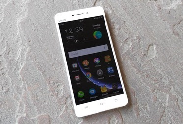
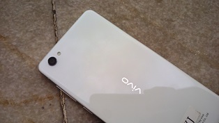
The looks. The Vivo X5Pro is among the slimmest phones out there. At just 6.4mm thickness, the phone feels elegant yet comfortable to hold. Plus, with 2.5D Gorilla glass on both sides, the device isn’t slippery. The 5.2-inch Super AMOLED on the front has 8 MP front-facing camera, speaker grille, sensors and notification LED on top, and three capacitive touch at the bottom.

The aluminium alloy frame sports slim volume keys and Power/Lock key, followed by dual SIM tray – micro SIM card + either nano SIM card or microSD card near the bottom on the right side; and the left side has been left plain. The top gets the 3.5mm headset jack near towards the left. The company says the phone has been constructed using aircraft wing-quality materials for less damage.

Screen. There’s a 5.2-inch full HD (1920 x 1080) Super AMOLED covered under Corning Gorilla Glass. There is also a crystal coating on top of the screen, which you can notice only near the edges, but doesn’t sacrifice on the screen quality. The company has done a good job with the display. Colours look bright and sharp, and darker black levels that you associate with an AMOLED panel are in place, too. It is usable under sunlight and does justice full HD videos, not compromising on viewing angles.

Vivo X5 ProCamera. The X5Pro boasts a 13 MP (f/2.0) camera on the back. Here are a few sample images.

The camera is okay for most images. It takes detailed shots and close ups, but lacks in colour contrast and overall sharpness. The camera app has quite few modes including an after effect for bokeh (defocus background) effect.

Audio.The X5Pro features a dedicated Cirrus Logic DAC AK4375 audio chip. The loudspeaker output from the bottom speakers is not bad at all. The output is loud for video or playing a game. In the box, you get a pair of white earphones, and the pair is among the best, in my opinion, you get bundled with a phone today. The audio quality is clear, handles bass and treble quite well. You won’t be disappointed with them if you’re used to default bundled headsets, and they are also comfortable to wear.

Network. The phone handles WiFi, Bluetooth 4.0, 3G, and GPS connectivity well. Voice quality is really good, while network reception wasn’t a problem either. What didn’t really work as it should is its accelerometer. Quite a few times when the phone is tilted back to portrait mode (from landscape), it just wouldn’t switch.

Battery. The phone carries a 2.450 mAh non-accessible battery unit. Battery life is a bit of a hit and miss. During first few days, it didn’t last me anywhere close to 22 hours, but upon further use and charge, I was able to get almost a day from it. The 2A bundled charger charges the device from 0 to full in almost two hours. The super saver battery feature, which allows using only phone, clock, and messaging functions, lasts a full day with about 10% on standby.

Software and performance. The phone is equipped with Qualcomm’s Snapdragon 615 SoC (1.5 GHz quad core + 1 GHz quad core processor, Adreno 405 GPU), along with 2 GB of RAM. It runs on FunTouch OS 2.1, which is based on Android 5.0.2.

The phone lags quite a bit and doesn’t really do justice to its price tag. Scrolling and swiping between apps and Settings isn’t smooth. Just a bit of gaming and playing full HD videos and the phone’s back and even volume buttons heat up, at times so much that you may not feel comfortable holding the device for long. The issue also came up after an OTA firmware update.

One major bug I found was you use Documents to attach a file inside the Gmail app, the file doesn’t get attached and the Email gets sent without one, so you would have to use a file manager (other than the pre-loaded one) to do so. The OS is a little different from what we are used to seeing from new handset manufacturers today. But that doesn’t really result into a cohesive overall look and feel. There is no separate app launcher and widgets and app icons are placed on Home screens.

Super Screenshot is one of the novelties that allows you to take a screenshot longer than a single page to stitch into a single image. The user gets about 7 GB of storage space, which you can expand using a microSD card.

Overall, the X5Pro promises a lot and delivers little. It looks good aesthetically, has a great AMOLED panel, but misses out with its heating and performance issues and average battery life and camera. At around Rs. 27,000, this phone will fight a hard battle against the likes of the G3, S5, and others, and probably not survive it.

Categories
Tech

4 ways in which Gmail is really awesome

We bet you didn’t know about these little Gmail tricks. Find them, and more, to have the best Gmail experience.
by The Editors | editor@themetrongome.in

Gmail is undoubtedly the most used email platform globally, with a host of unbeatable features. The best part is, though we’re using Gmail regularly, we’re nowhere close to knowing just how awesome Gmail is – because most of us are using only a small percentage of its features!

All we do with Gmail is send and receive emails, and run the occasional search to look for an old email. Still others are creating folders to categorise their emails, while some are adding filters and installing blocks to keep out unwanted mailers. However, there’s a big recreational element to Gmail as well, which makes the sending and receiving of emails a great experience. Plus, there are some hacks you can adopt to safeguard your privacy, protect yourself against possible phishing attacks, even reply to emails without typing out the reply.

Here’s presenting , in no particular order, 4 awesome Gmail tips:

1. Know who’s legit. Say you’ve recently opened an account with a payment gateway, and you’ve been corresponding with them regularly till your account is fully activated for use. However, one day you receive an email with the subject ‘Your ___ account has been compromised’ and asks you to open and fill out Gmaildetails in an attached document to verify your account and activate it again,

Do this: Go to Settings > Look for ‘Authentication icon for verified senders’. Enable this feature.

Once you’ve activated this feature, the first time a company sends you an email will be earmarked by Gmail. Every time a genuine email comes from this company, it will be indicated by a small yellow key. If the key is missing, you’ll know it’s a hoax mail or probably a virus.

2. It doesn’t matter if you type the Gmail ID wrong. Sure, email IDs are case sensitive and the slightest character out of place will make the email you sent bounce back to your inbox as an ‘unsent’ email. But Gmail is made of sterner stuff. If the email you are sending to the sender with the ID, say ‘ritwik.shah@gmail.com’, it won’t matter if you send the email to ‘ritwi.kshah@gmail.com’ or even ‘r.i.t.w.i.k.s.h.a.h@gmail.com’. Gmail will still send your email and it will safely reach the sender, because the dots don’t matter to Gmail’s algorithms. Plus, you can send it to ‘Ritwik.shah@gmail.com’ and the email will still reach because Gmail disregards the capital letter you mistakenly put.

Gmail is awesome3. Send a reply without typing a word. Sometimes we receive emails to which we give the same standard reply over and over again. Say you often receive email invitations to attend seminars by a reputed management college. You don’t want to attend the seminar, but you don’t want to mark their emails as ‘Spam’ because they sometimes send useful information. Nor do you want to offend them by asking to be unsubscribed from their mailing list. In this situation, simply keep a standard response ready which you will not have to type out every time they write to you. Go to Settings àLabsàLook for ‘Canned responses’ and enable this feature. After this, compose the reply you want to send and save it under ‘New canned response’. The next time you receive a pesky email, simply go to ‘Canned responses’ and select the reply you have already created.

4. Never forget to include attachments. If you’re sending an important email, you take care to compose the body text but after you’ve sent the email, you are horrified to realise that you forgot to attach the files with it. Then you have to send a follow up email informing the receiver that you forgot to add the attachment. Instead of going through this embarrassment, take corrective action: Go to Settings àLabsà Look for ‘Forgotten attachment detector’ and click ‘Enable’. Once you save the changes, Gmail will alert you every time you try to send the email without the attachment.

(Pictures courtesy www.funnyjunk.comwww.digitaltrends.comwww.makeuseof.com)

Categories
Tech

Review: LG G4

We check out LG’s newest smartphone and find that the Rs 45,000 phone has great hardware but its software needs improvement.
by Manik Kakra | @Manik_K on Twitter

For the last two-three years, LG has been one of those Android players that are slowly but steadily climbing the market ladder thanks to their improved offering. It started with the Optimus G, then came along the G2 and G3, has now culminated with the G4.

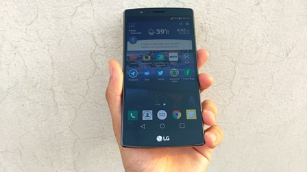
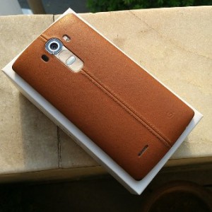
The looks. We go the Korean LG G4 (F500L) unit for review, which is different from the Indian SIM unit one. The phone follows a similar design language as the G3. With the volume rocker and Power/Lock key placed at the back, the phone carries no keys or slots on sides. It comes in plastic and leather options. The back has a nice vertical double lined stitching across the body center, which seems quite unique for a smartphone today.

The keys are more tactile and require a little getting used to. You can remove the rear cover to access the SIM slot, microSD card slot and 3,000 mAh battery unit. On the front, the phone has slightly different, less shiny chin with the LG logo. Just above the screen is the LED notification, sensors and 8 MP front-facing camera. The top has the secondary mic and small infrared port; while the bottom houses the 3.5mm headset jack and primary mic.

Apart from the curved top and bottom curvature, the phone is noticeably curved, that and less pointy edges make the G4 more comfortable to carry around. While the 5.5-inch (quad HD screen) still makes it a big phone, thinner bezels and less slippery plastic ensure it grips well.

Screen. The device sports a 5.5-inch (2560 x 1440) LCD with something called quantum dot technology. The screen is covered with Gorilla Glass on top and is quite prone to smudges and fingerprints. The screen has much better colour reproduction, brighter and just generally nicer to look at than the G3. It is also more usable under direct sunlight.

Camera. LG has been quite vocal about the G4’s 16 MP (f/1.8) camera with enhanced OIS. Here are a few sample images.

You can quickly launch the camera by double-tapping the volume down button. The camera is fast to focus. The camera app itself is okay. As for camera performance, the G4 generally performs really well. Photos are detailed, have a lot of saturated colours, and even in low-light, the camera’s wide aperture sensor doesn’t disappoint.

Battery. Coming to the battery life, the G4 carries a 3,000 mAh battery unit. I hardly got a day’s usage from the device. With brightness level set at 30%, two Email Accounts in sync, a bit of HD videos on YouTube, a lot of Web browsing and Twitter, the phone couldn’t last 24 hours on a single full charge. It supports QuickCharge 2.0 and takes around two hours to charge from zero to full.

Network reception. Bluetooth 4.1, WiFi, NFC, 3G and USB OTG didn’t cause a problem, and while Delhi has just got its first 4G LTE service (Airtel), I am yet to get my hands on a 4G SIM card here, so I couldn’t really test the phone’s 4G capability. In-ear call quality and mic perform like a flagship device should and so did overall network reception, which didn’t require any troubleshooting.

Software and performance. The device is equipped with a Qualcomm Snapdragon 808 chipset (hexa-core processor – 1.8 GHz dual core + 1.4 GHz quad-core, Adreno 418 GPU) along with 3 GB of RAM. The phone runs on Android 5.1 with LG’s new UX 4.0 on top. The G3 had its share of problems when it came to performance and software design.

Does the G4 do any better on those points? Yes and no. While the device’s general performance seems much better, the software look and design have a lot to improve on. Scrolling Settings, navigating the OS work well, but there’s still occasional stutter a few times in a day. LG’s icon, general UX design has still require a lot of work. The whole design is inconsistent just doesn’t feel like something from a company in smartphone business for this long.

While LG says a lot has been done to refine their skin, it doesn’t seem so on the ground. Home screens now have Smart Bulletin on the left-most screen that provide one-stop center for your fitness, calendar schedule, and something called Smart Settings. Through Smart Settings, you can configure your phone to open certain apps or perform tasks based on your location. For example, programme it to switch on WiFi when you are at home, or open an app when you plug in your earphones. The user gets about 22 GB of storage space, which is of course expandable up to 2 TB using a microSD card.

The G4 is one of the best smartphones out there for when it comes to hardware — fantastic camera, great screen, unique design. While the software leaves a lot to be desired, it’s not that big an issue for some considering the phone holds quite well in general day-to-day usage.

(Pictures courtesy Manik Kakra)

Exit mobile version