Categories
Tech

BlackBerry launches Z3 in India at Rs 15,990

The largest and cheapest BlackBerry in the market launched yesterday amid much fanfare. We take a look at the specs.
by Manik Kakra | @Manik_K on Twitter

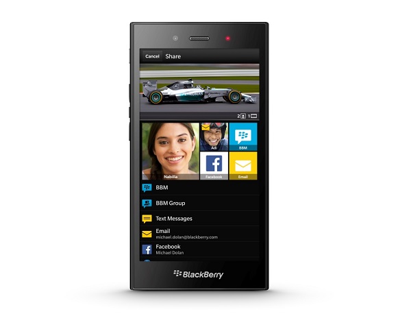
Sunil Lalvani, MD, BlackBerry India, Michael Adnani, VP-Retail & Head of...Yesterday, BlackBerry launched its new mid-range BB 10 device, Z3, in India. The phone boasts a 5-inch (540×960) screen, making it the largest and cheapest BB 10 device in the market.

Under the hood, there is a Snapdragon 400 chipset (1.2 GHz dual-core with Adreno 305 GPU), coupled with 1.5 GB of RAM. It packs in 2,500 mAh battery, and the company promises 15.5 hours of talktime on it. Further, the phone has 8 GB of on-board storage, which is expandable via microSD card.

Running on BB 10.2.1 OS, it introduces BlackBerry Maps especially for Indian users, with updated data points and destinations. On the back, there is a 5 MP camera; while the front carries a 1.1 MP camera. This is BlackBerry’s first phone to be manufactured by Foxconn after their recent agreement; the phone has a textured soft material on the back for better grip and does not compromise on the premium feel.

The phone can be pre-ordered on Flipkart or The Mobile Store, with both online portals giving buyers vouchers worth Rs 1,000. The device is available in black, and goes on sale starting July 2, 2014 across the country.

Categories
Tech

Review: Sony Xperia Z2

We take a look at the design and performance of Sony’s newest phone, the Xperia Z2, and come away impressed.
by Manik Kakra | @Manik_K on Twitter

Sony has been one of the promising Android OEMs in the last two years or so. It has come out with phones like the Xperia Z and Z1, which have looked promising on paper during their launches, but have rather failed to achieve what they had promised or beat their competitors. Now, the company attempts to change that with a device to actually get the masses excited – providing a smooth and satisfying experience. So, let’s get started with our review of the Xperia Z2.

Hardware and design

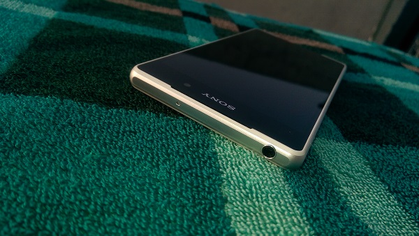
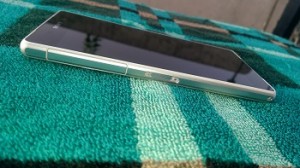
Sony’s Xperia Z2 (D6502) follows a similar form factor like the Xperia Z1. With glass on back and front, it is hard to tell the two devices apart when placed next to each other. There is an aluminum band across the sides – flaps to cover the microUSB port and SIM slot on the left, a flap to cover the microSD card slot on the other side and a dedicated camera shutter key. The front, dominated by the 5.2-inch full HD panel, has the Sony logo at the top with stereo speakers on top and bottom of the screen, LED notification light placed inside the top speaker alongside several sensors.

On the back, you have the NFC logo under glass, Sony’s logo bang in the middle, and of course, the 20.7 MP camera on the top left with the LED flash beneath to it. Oh, and if you’re not impressed with those plastic flaps, the reason might make them worthwhile for you. The phone is IP58 certified, making it water-resistant and dust-proof, and those flaps, could be irritating to deal with in your daily usage, protect the ports and body from water. It is good to see companies move to more and more water-resistant phones, and which can be used without much worrying about the phone going kaput immediately after coming in contact with water.

Camera

The phone boasts a 20.7 MP (EXMOR RS) sensor, the same we saw on the Xperia Z1. Most images seem to have rich colours and are detailed, and it’s clear Sony has done some work on the software side. Most of the times, the results are sharp, and even when used under low-light conditions, images turn out to be quite satisfying. While the superior mode tends to over-sharpen pictures many a times, the manual mode is suggested to be used more often than other modes.

Sony has also added 4k video options, and you can also shoot 720p  videos at 20 FPS. The camera key works in the double-click mechanism, make a small click to focus and then click full on to capture a photo it can open camera directly whether the screen is locked or unlocked. To sum up the camera performance, you could say it’s the best part about this device. Not only does it deliver on your expectations but more often than not, its camera UI is a breeze to  flow through and get used to.

Sound 

Moving on to the sound quality, the Xperia Z2 carries stereo speakers on the front, a trend started by the HTC One. The speakers are actually quite clear and decent, but no match if you’re expecting them to perform as well as the original HTC One. More so, the bundled headphones, if I remember correctly, are no match in quality to what you get with the Xperia Z1, which are a much better pair of earphones. As you would expect from Sony, there are a lot of options – ClearAudio, Sound Enahncer, Dynamic normaliser – to choose from in order to make sound as per your need and the type you prefer for a movie or track, and they do come in handy at times.

Call quality

The phone doesn’t disappoint with respect to voice and network reception, whether making or receiving calls, and holds well in large public areas as far as network reception is IMAG0044concerned.

Battery

The phone packs in a 3,200 mAh battery unit, which lasted for almost a day with the STAMINA mode on in our case. What this mode does is, it makes apps clear from the memory and allows very little data in background, giving you extra juice. Switching it off gave about 19 hours of battery life. Sony has also added Low Power mode that switches the phone to, as the name suggests, a very low battery-eating mode and allows to get a lot more of standby time.

Software and performance

The Xperia Z2 runs on Android 4.4.2 with Sony’s own Xperia UI on top. The phone has Qualcomm’s Snapdraon 801 SoC (2.3 GHz quad-core processor, Adreno 330 GPU), along with 3 GB of RAM.

As far as the smartphone’s performance is concerned, I didn’t have any real issues. The phone does most tasks just as well as you would like and doesn’t drop frames or stutter, as we had seen some of Sony’s previous generation phones. The on-screen keys – Back, Home, and Multi-app view – take about half an inch’s space. The Xperia UI hasn’t much evolved from what we saw on the Xperia Z1. It is still fits in very deep in the OS. So much so that you now get “What’s New” when swiping up from one of the on-screen keys, giving you options to open Google Now or What’s New.

Apart from a few useless additions like Sony Select and Game Store, you get several useful services like Privilege Movies, Sony Jive, Xperia Lounge, etc. apart from a bundle of premium services a user gets with the device. If you’ve used the Xperia Z1, you will realise the software on the Xperia Z2 is hardly different. One major improvement, though, is the keyboard, which is much improved and even supports ‘swipe to type’ now. Sony’s skin is not very heavy and does provide with nifty little options beyond stock Android. I don’t really mind the extra ‘skin’ as long as the performance and design aren’t cut short.

There are plenty of personalisation options, including Xperia themes from the Play Store, some of which are very nice and seem to be made for the Xperia Z2 from the ground up. The connectivity options work okay, and if you’ve one, you can use the device with your DUALSHOCK Wireless controller, and of course, mirror your phone’s content on another supported device. Sony has also added ‘double tap to wake’ to unlock your screen, which works well most of the time, but the same can’t be done on any Home screen in order to lock the screen.

Our verdict

All in all, Sony has produced its best Android smartphone with Xperia Z2. We have been seeing phones from the company that seem promising, but this one is surely the device that performs and performs well in pretty much all areas. You get a good full HD screen, a very good camera with a lot of useful editing options and shooting modes, decent design and build quality, average audio quality, and a water-resistant and dust proof device. Buyers also get a SmartBand, which I  haven’t used so far, plus a few premium services to make the package more attractive. The Xperia Z2 is definitely a phone you should try if you’re in the market for a high-end smartphone.

Categories
Tech

Review: Samsung Galaxy S5

Samsung is going great guns in the phone market. We review what their new flagship phone, Galaxy S5, is about.
by Manik Kakra | @Manik_K on Twitter

Looking at the phones people are using, I am quite sure a lot of phones would be made by one phone giant – Samsung. Samsung’s success, especially with the Android platform in place, has only matured over the last two years or so. Millions of Galaxy units have already been sold out, and the series continues to reach newer heights for the Korean giant.

So, Samsung’s Galaxy S5 comes at an interesting time. Many other manufacturers, just like previous years, have released their flagship device, but this time, it seems, Samsung may require more steam to reach new consumers than it has ever in these last two to three years. Without further ado, let’s check what really this new Samsung water-resistant, dust-resistant flagship is about.

Hardware and performance

Samsung’s Galaxy S5 (SM-G900H) packs pretty much the latest when it comes to its internals. As far as design and materials are concerned, it doesn’t inspire this time.
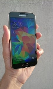
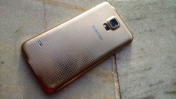
The first time you hold it, you realise the dotted, textured back is better for grip than the S4’s hyper-glossy rear. The front, dominated by the 5-inch full HD screen, with a slightly new button layout below it – Multi-app view, Home (which also equips the fingerprint scanner), and Back button – doesn’t appear very different from the S4’s.

On the screen’s top, you get the usual LED light, Samsung logo in the middle, front camera on its other side and several sensors hidden. The rear, boasting a 16 MP camera with the heart rate monitor (and the LED flash) right below it, also has the loudspeakers, which actually make the whole bottom half of the phone vibrate when playing some music or game at high volumes.

The top has the 3.5mm headset jack; microUS3.0 port (supports 2.0, too) sits at the bottom under a plastic flap; and volume rockers and Power/ Lock button on left and right side panels, respectively. If you try them a few times, you’ll soon notice the clickety sound these physical buttons – volume and Home – produce. Some people may not like this, especially the Home button, given how frequently you’re going to use it.

Coming to the phone’s 5.1-inch full HD S AMOLED screen, it is, as expected from Samsung, a fantastic panel. The AMOLED technology is now mature enough to stand with LCDs when it comes to rich colours that are not black or white. Black levels are just as good as we have been seeing on AMOLED panels, and viewing angles are not bad, either. Full HD videos look really nice on the phone’s bright screen, and this is definitely one of the best things about this Galaxy device. You’re not going to be let down by it. Oh, and if you want, you can choose from different screen modes, whichever colour gamut you prefer on the phone.

Camera

Moving to the 16 MP (fast AF) f/2.2 rear camera, Samsung seems to have put in a lot of effort to improve its camera app and also give better images from the S4, which was already a good camera phone. There are some pretty neat tricks in the camera app. Apart from the usual HDR and Burst mode shots, you can choose to switch on Selective Focus (HTC calls its own trick as UFocus) in the camera app, which allows you to change the focus subject in your image later. It defocuses according to your need, and that’s why mostly works in good lighting conditions.

Under low light, it may not capture or the option to start Selective Focus might not even show up because of low light. As far as image result goes, this is great performer. You can view a few sample images here.

The camera is capable of capturing good detailed shots, and is decent under low light conditions. You can even shoot 4K videos or HD videos at 120 FPS.

Sound

Talking about the phone’s sound quality, due to the thin rear cover, whenever you play something on higher volumes, it sort of vibrates the lower half of the phone’s body. Other than that, the phone is quite loud, clear, and in-ear box headphones are a decent pair. Call quality on the phone is top notch, and there was no issue regarding network reception during the usage period.

The S5 is IP67 certified, meaning it is dust resistant, and it can hold well when put into water up to a metre for about half an hour. Every time you switch on the phone, you are prompted to check if the back cover has been put on properly, and similarly, after you remove the charger, the phone notifies to check if there flap has been properly put or not. Just be a bit careful with that flap, it seems very delicate and might just come of the body after a few weeks.

Software and performance

The Samsung Galaxy S5 runs on Android 4.4.2 out of the box, along with Samsung’s own TouchWiz Nature UX 3.0 on top. Credit to Samsung for not shipping the phone with a previous Android OS version and providing KitKat from the start.
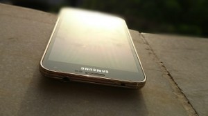
Samsung was quite vocal during its Galaxy S5 has got a much better, tweaked version of TouchWiz, and it shows that the whole software has gone a few changes as soon as you start using the smartphone. While the basic Home screen setup remains same, there are now a lot of new and improved looking icons. Even under Settings, Gallery, etc., there are a few minor changes and those are welcome.

However, the more you use it, you will see there hasn’t been much done for making the whole experience smoother or less confusing. More on this in a bit. The leftward-most screen gives you a personalised magazine where you can add you news, content as per your liking. For App launcher, again, it appears a little changed and for better. You now have to drag an app icon upwards and then to your desired Home screen, in order to make a shortcut. Folders, with your desired name and colour, can be made in the app launcher as well as Home screens. As for S features are concerned, there are loads of them, just like the S4.

The battery backup of the device was about 20 hours on an average. Samsung has added Ultra Power saving mode, which basically makes your smartphone a dumb-phone as you can only make and receive calls and text messages or set an alarm. It could be quite handy in times of emergency, giving a seriously long time of battery juice.

Moving to the S5’s much-talked about fingerprint scanner, it can be used to unlock the device. You have swipe your finger or thumb over it, or you could also opt to use an alternative password in case it the screen needs to be unlocked. When I tried to use the fingerprint scanner with my finger, it was a hit and miss case; worked about half of the times, but when I used my thumb, it worked, liked, 8 out of 10 times. The thing is, it probably doesn’t recognize various angles.

All in all, Samsung has done a good job with the Galaxy S5. If you’re looking for a new smartphone at the high-end range, this is good time to be in the market. If you’ve used a Samsung flagship in the last two years, you know the good and bad, but coming from another manufacturer, the transition might not be that smooth. The S5’s price hasn’t held too well in the market so far, and this might well be a reason to check it when doing your phone search.

Categories
Tech

Oppo’s Find 7 and Find 7a launch in India

The Android smartphones are priced at Rs 37,990 and Rs 31,990 respectively; are the company’s flagship devices after N1, R1.
by Manik Kakra | @Manik_K on Twitter

Oppo recently launched its two new Android 4.3 smartphones in India – Find 7 and Find 7a. The two devices, already available in Indonesia and China, are the company’s new flagship devices after the N1 and R1.

Oppo Find 7Both these devices pack Qualcomm’s Snapdragon 801 chipset (2.5 GHz MSM8974AC for the Find 7, and 2.25 GHz for the Find 7a, with Adreno 330 GPU), and 2 GB of RAM for the Find 7a and 3 GB for the Find 7. The phones have ColorOS 1.2 on top and come with Oppo’s new VOCCo charger technology, which allows them to be charged from zero to full in about an hour. They are equipped with 13 MP (SONY Exmor BSI) cameras; and 5 MP wide-angle front-facing cameras.

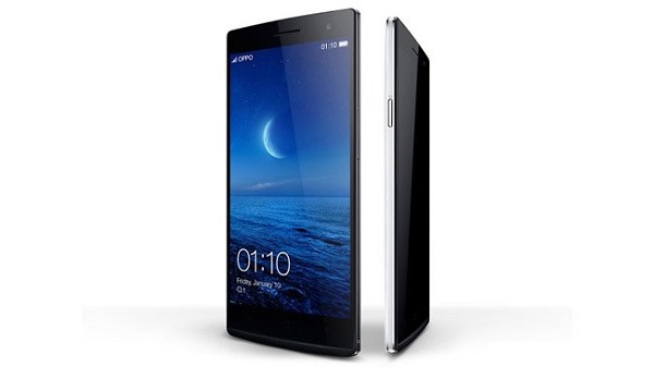
Talking about the Find 7, it boasts a 5.5-inch 2560×1440 screen, making it the first 2K phone to be launched in India. It is powered by 3,000 mAh battery, and will be available starting early next month. It also has a unique skyline notification LED under the screen

The Find 7a on the other hand comes with a 5.5-inch full HD panel, and is powered by 2,800 mAh battery. The phone goes on sale this week.

Other features include Bluetooth 4.0, WiFi b/g/n/, NFC, microUSB 2.0 (USB OTG), GPS, 3G and 4G connectivity supported for India network operators. While the Find 7 will be available for Rs 37,990, the Find 7a has been priced at Rs 31,990, available in white and black colour options.

Categories
Tech

Review: Moto E (XT1022)

We check out the latest Motorola device and come away more than impressed with a phone that is budget friendly.
by Manik Kakra | @Manik_K on Twitter

Motorola has been making quite a stir in the Indian market of late, and rightly so. Making its comeback solely via the e-commerce route, the company seems well determined to capture its lost glory, and to do this, has been on a spree of launching budget, yet good, smartphones.

First it was the Moto G – terrific performer for a phone under 14k – and now it’s the Moto E, going into the sun 8k category. Motorola has essentially taken on all the low-end Android smartphones, which haven’t been very good so far, and the likes of the popular Lumia 520. With its pricing and offering in place, let’s check out of Motorola delivers this time.

Hardware and design

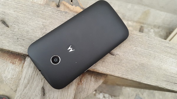
Motorola’s Moto E (XT1022) follows similar design and material like the Moto G. It has a curved, soft rubberised back, fitting pretty well into your hands. You get the Moto logo right under the 5 MP camera on the back. Once you notice the front – 4.3-inch screen (Corning Gorilla Glass 3 on top), thick bezel, and chrome rays on both the sides of the screen – forming the speaker and mouthpiece,  the similarity with the Moto G ends.

The phone feels sturdy and hefty to hold. Motorola could have done a better job keeping the phone’s bezel thinner for making it even more compact to fit in your hand, but this doesn’t mean you won’t be able to operate this phone with just one hand. Coming to the right side panel, the volume button, raised just enough from the body surface, again sports a chrome finish. The Power/Lock button sits on the same side just above the volume rocker. On the top is the 3.5mm headset jack; while the microUSB port sits right at the bottom.

Screen

Talking about the screen, the 4.3-inch (960 x 540) is pretty much what you would expect. It’s quite bright, just decent for day-to-day use and nothing outstanding to talk about. The colours do look quite good, but you will quickly realise the difference if you have been using a higher resolution phone screen for some time. Also, the phone doesn’t play full HD videos natively, but you could install a third-player app to play one. All in all, this is just a decent screen, and not a bad one for the price.

Audio

On the audio side, the phone performs well. The loudspeaker is loud, but tends to distort sound when played at the highest volume level. There was no problem in hearing or speaking during calls, and I didn’t notice any network reception issues with this phone, either.

Camera

Now for the bad – Moto E’s camera. The 5 MP snapper on the back is…well, just not the one you would really like to use. The fixed focus sensor gives average and out-of-focus shots more often than not, and this seems to be one part where Motorola has saved on cost, and the user would be disappointed if he/she would like to use the phone’s camera a lot. Only once in a while, in good light conditions, you may get a nice shot with this camera.

Battery

Coming to the phone’s battery life, it is much better than what I expected it to be. The 1,980 mAh battery unit lasted more than a day mostly, and with light usage could even touch two days. Good to see a budget handset scoring high on the battery side. The usage included lots of emails, Twitter, watching a few YouTube videos, 5 to 10 minutes of calling (single SIM). When using both the SIMs in place, the battery life is bound to take a dive, though.

Software and performance

The Moto E has got Qualcomm’s Snapdragon 200 SoC – 1.2 GHz dual-core processor, Adreno 302 GPU, along with 1 GB of RAM. The phone runs smoothly for most parts. I didn’t find any stuttering when moving from one app to another. However, with a few heavy webpages opened and a couple of apps running in the background, you will see some lags here and there compared to, say, Moto G. Having said that, this is probably the best performance we have seen from an Android phone at this price point, and Motorola deserves some credit for providing a smooth operating phone for what the phone costs.

Running on Android 4.4.2, the phone is untouched for most part, just like the Moto G. Adding a few own apps and services, like Motorola Migrate, as with the Moto G, Motorola has also built in something called Assist. This is basically an app for your assistance regarding putting your phone in silent mode when you’re in a meeting or during your sleep hours, etc. There’s also something new called Alert, which allows the user to quickly send an SOS-like message to a pre-defined number in case of an emergency. Sounds useful, doesn’t it? Retaining almost all of what we have been seeing on stock Android – lock screen, app launcher, fonts, notification center, Motorola hasn’t touched most of these aspects, and also guarantees users at least one update to this phone.

Concluding the review, the Moto E is a great phone for the consumer, not just from buying an Android phone for this price, but also for making other manufacturers pull up their socks and offer better phones and not just the ones that appear fancy in advertisements. Motorola’s Moto E scores well with respect to battery, build quality, audio experience, even though it is not outstanding when it comes to the camera or even the screen, this is certainly a phone to watch out of you’re looking for a budget smartphone, or maybe buying your first smartphone. This, along with Windows Phone devices under 10k, makes for the low-end smartphone segment to become more interesting, better choices for the buyer, which will hopefully bring more phones that do not compromise on the experience side.  That is why this phone is important for this segment. The likes of Micromax and even HTC will probably gear up to bring phones that provide a richer experience under Rs 10,000 in the Indian market.

Categories
Tech

Nokia’s Lumia 630 launches in India

Nokia’s newest phone is priced reasonably at Rs 10,500. Meanwhile, the Nokia XL will go on sale later this month.
by Manik Kakra | @Manik_K on Twitter

The Lumia 630 packs a 1,830 mAh battery pack, comes with 8 GB of internal storage, which is expandable up to 128 GB, and weighs around 134 grams.

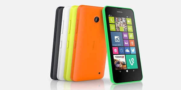
The phone comes in green, yellow, white and black colour options, and has been launched at a price of Rs 10,500 for the single SIM variant and Rs 11,500 for the dual-SIM variant.

Nokia-XL-Dual-SIMNokia’s second Android-based phone (AOSP 4.2), the Nokia XL (in pic on left), got showcased in India a few days back. The phone, which was first unveiled at this year’s MWC in Barcelona, has got dual-SIM capability and has the same Fastlane UI in place seen on the Nokia X.

This budget (4.2) device has got a 5-inch (800×480) LCD touchscreen and has got the popular Nokia Glance Screen to view time, notifications while the screen is locked. Connectivity-wise, there is Bluetooth, microUSB 2.0, WiFi b/g/n, FM Radio, and 3.5 mm headset jack.

Under the hood, there is a Qualcomm Snapdragon S4 SoC (1 GHz dual-core processor, Adreno 203 GPU), along with 768 MB of RAM. It packs in 2,000 mAh battery and 4 GB of internal storage, which is expandable (up to 32 GB) via a microSD card.

On the back, there is a 5 MP (f/2.8) camera with an LED flash; while the front has a 2 MP camera. Some of the pre-installed apps include the usual HERE Maps, Nokia MixRadio, OneDrive and Skype (not pre-installed) – includes 1 month of free worldwide calling from your Skype Account.

Exit mobile version