LG’s new phone is a serious, welcome addition in the Indian smartphone space. But we still have some gripes with it.
by Manik Kakra | @Manik_K on Twitter
LG has been up to some great work in the last one year or so. The G3 can quite simply be shown as a device to represent LG has a player in the smartphone race. Let’s try and find out what the G3 is about.
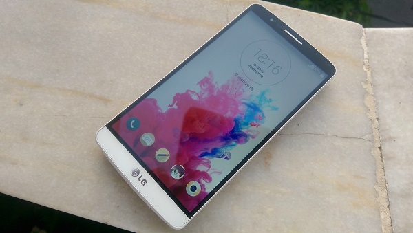
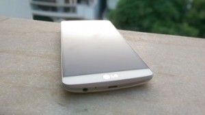
LG’s G3 (D855) boasts a 5.5-inch 2560 x 1440 screen. Thanks to its thin bezels, you can see the phone isn’t at all larger from the S5 and One (M8). It’s still hard to say that the user would find it comfortable to operate it in one hand, despite the curved back. Other than the thin bezels, another noteworthy feature would be the phone’s chin. This part is made out of aluminum. Interestingly, this is the only place on the front that has some metal, and it is no doubt going to be among the most used or worn places on any phone (despite this phone’s onscreen keys).
Just above the screen, you can see the 2.1 MP camera, notification LED, sensors and the receiver speaker in the middle. Neither of the side-panels sport any buttons or ports (there’s only a small back opening slot on the lower right), both the 3.5m headset jack and microUSB port are placed at the bottom along with the primary mic, the top has just the secondary mic and Infrared port. There’s a slim silver band running across the edges, which feels a little glossy and different from the rest of the phone’s body.
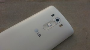
 Coming to the back, the rear panel is made out of hard plastic with brushed aluminum prints. It won’t be hard to say that many people might thing that LG wanted them to think it’s aluminum when it is clearly not. The back sports the 13 MP camera with its dual LED flash and the unique laser beam. The volume rockers and Power/Lock key are, again, placed, right below the camera sensor. The keys are slightly different to look and touch than what we saw on the G2.
After Oppo, LG is the second manufacturer to launch a Quad HD screen phone in the Indian market. The 2560 x 1440 resolution is really high and to pack those many pixels in a screen this size is not a small feat. The G3’s screen is quite bright. You are going to like reading text on it, and surfing the Web. But when it comes to viewing high quality videos and Images, which, I suppose, is among the best ways to make use of this screen, you might notice that the screen pales a little. Videos and Images just don’t pop out as well as you might have hoped at first. It does perform like the first crop of quad HD mobile screens, which it obviously is, and that’s mainly why you won’t be missing out much if you are using a good HD panel like the One, S5 or LG’s own G2.
For instance, at times, the phone doesn’t allow you to increase brightness beyond a certain level. Why? Because of the current temperature. The phone might have been in use for a while and the panel could well have raised the temperature, not allowing us to increase the screen brightness. This resolution jump appears to be the next big thing in the mobile space, it is not that significant a difference from going 1080p to 1440p than what it was from 720p to 1080p.
Moving on, the G3 also has quite a unique camera kit in place. It is equipped with a 13 MP f/2.4 (OIS + software optimisation) camera with dual LED flash as well as, what LG likes to refer, laser beam for better focus. Here are a few sample images.
As you can see, the G3’s camera produces detailed images. Most of the times, images came out with sharp colours, less noise and are more natural to look at. Performance under low-light is also pretty good; you can try and use the camera in low-light without too much hassle. But LG seems to have cut a few corners with the camera app – the setting options are not as extensive as most of the Android flagships out there. The basics one are there, but you cannot change ISO, white balance and shutter. On the other hand, this camera is fast to focus as well as to snap a shot, and I am not sure if that’s only because of the laser beam in place. You can opt to take a picture by just tapping anywhere in the screen, or you can try voice shutter. Magic focus has also been added to the camera, by which you get the option to change an image’s focus later on, which seems to be the rage this year with smartphone manufacturers.
The G3 houses a 1w (single unit) speaker at the back. The company has been quite vocal about how better this is from what others offer, and it shows. The speaker unit is pretty loud  and clear for most part. It is certainly better than the G2, but the placement isn’t better. It’s still on the back (lower half), so you lose out when viewing videos or playing a game. While you may not feel the need to cup your hand around the speaker grill to make out for the loss because how better this speaker is from LG’s previous attempts, there is not really a doubt there experience would have been even better had LG placed it at the front. The in-ear sound quality, using the bundled headsets, is satisfactory.
Now to another important part – battery life. The G3 packs a 3,000 mAh battery and you can replace it by opening the rear panel (where the microSD card and microSIM card slots are also located). The phone’s battery life leaves a lot to be desired. During my usage, I couldn’t get the phone to last at least 20 hours on a stretch without having to plug it in. With brightness level at 35 per cent, almost always connected to WiFi, around 5 to 10 minutes of calling, lots of Emails, Twitter, and a couple of 5-minute YouTube videos mean that the screen is going to take a lot of juice of that battery cell. Quite disappointing, to sum it up. But the phone takes up under 2 hours to get charged from 0 to full.
The G3 packs a lot under the hood – Qualcomm’s Snapdragon 801 SoC (2.5 GHz Krait 400 quad-core processor, Adreno 400 GPU), along with chunkier 3 GB of RAM (using the 32 GB model). Running on Android 4.4.2 with LG’s own Optimus UI in place, the phone runs the almost latest Android version. LG has done a lot of work on its software. First of all, the icons and font seemed to have given an overhaul. They appear much nicer and uniform to work with. There are less cartoonish characters within LG’s UI and many more mature-looking elements and smoother edges.
The biggest and best two improvements LG has done are the notification centre and their keyboard. The notification centre, just like the entire UI, now sports green with black in base. It appears much better and nicer to use. You can access toggle buttons, QSlide apps, Settings and change brightness from there as you could earlier, but can now also change volume from there. The keyboard has been made much better to type quickly, given better predictions, keys spaced out better for an improved experience. The G3, apart from three default Home screens, also gives you a Separate screen (on the left) for LG Health and Smart Tips if you’re interested, you can pair you fitness gizmo for more information and checks in place, or can get tips from the service. For those not, you can remove this from your Home screen. It is no doubt a step in the right direction by LG with their Optimus UI.
Other little touches include long-pressing the Back button to open two apps at once on the screen, changing how the multi-app (or recent app) thing works, changing the on-screen buttons’ pattern and functionality, among other things.
The G3 has all the bells and whistles when it comes to software and hardware for today’s flagship device, but my biggest gripe with the phone is that it doesn’t quite cut it when it comes to performing smoothly. Every now and then you can notice a lot of stutters when accessing the notification bar, or drop in frames when accessing widgets. The phone is quite smooth if you just open the browser, Email and a couple of apps more. But in daily use, with a lot of apps and in trying to go from one app to another, the phone tends to lag, which is not expected from a flagship this huge.
All in all, the G3 is a significant step from LG to go a leap forward from others. The company surely needs to do improve on a couple of things with this device. I hope LG gives some needed firmware updates for performance and battery management improvement.


